So you have a great website that has great content, your SEO is on point, and you are regularly producing excellent content, but why aren’t you able to convert?
This is a question several business owners and marketers ask themselves every day. Sure, driving traffic and search engine performance is one thing, but converting visitors into paying customers is a whole other ball game. This is where Conversion Rate Optimization (CRO) comes into play.
The basic premise of CRO is simple: to make the most of the traffic you are driving on your website. CRO techniques can be viewed as a complementary aspect to make sense of your SEO efforts. After all, what’s the point of having thousands of people visit your website if you cannot get them to purchase your product/service?
While the concept may feel new, it has been around for quite some time. Rebranding websites, switching landing page designs, moving banners within a landing page to showcase offerings/discounts have been known CRO strategies for years. However, recently, CRO has witnessed a data-driven revolution.
How does modern CRO work?
To understand how CRO works, it is first important to understand what is meant by a ‘conversion’.
A ‘conversion’ happens when a user visiting your website performs the desired action. That means, if your objective is to get more email signups, a conversion would be the user giving you their email address. Similarly, if your objective is making a sale, a conversion will happen when a user completes their purchase.
CRO typically involves coming up with (research-based) ideas to improve elements on your landing page or website. These ideas are then tested through A/B testing or multivariate testing for data-driven validation. Once an idea has been validated, it can be applied to the webpage and displayed to all your visitors to (hopefully) improve conversions.
Simply put, you come up with a hypothesis about improving one or more elements on your landing page, test that hypothesis, and make informed decisions based on the results. While this may seem like a straightforward process now, it is quite complicated once you begin optimizing your conversion rates.
Moreover, if you are an online business, almost all of your competition is doing the same. While that is true, it also means that there are several CRO techniques that work, but are currently being overlooked by marketers. The average rate of conversion of by a website is 2.35%. However, the top 10% of the businesses are able to achieve 3-5 times higher conversion rates. So what is the top 10% doing differently?
Let us look at some overlooked but trusty CRO techniques:
Understanding your consumer
Doesn’t seem much like a technique, does it? After all, every blog you have read talks about the same thing. The reason behind that is simple, once you understand your audience or buyers, you can design optimal marketing tactics, and in the case of CRO, your hypothesis, around that knowledge. Remember how we talked about a data-driven revolution in CRO, this is where the data matters most.
Before you form any kind of hypothesis about an element on your page or think about testing any variations, support it with facts. Look at competitor landing pages and how they are tweaking their elements to drive results. Are their tweaks driving results? As a user, do you think their changes have improved your experience on their page?
While analyzing competitor pages can be a great way to gain some insight about customer behavior, it does not give you concrete data to work with. There are, thankfully, several ways to obtain factual data about consumer behavior on a webpage.
- Pools/Feedback Forms: Want to know what your customers want? Simply ask them! Detailed feedback forms and polls are some of the simplest ways to gain insight into what a consumer expects when they visit a landing page. Not to forget, if crafted with due diligence, the polls can be used to obtain information that will help you improve several aspects of your digital presence.
- Heatmaps: Heatmaps are a great tool for presenting complex data in a visual way. They have found applications in science, technology, weather reporting and now, to understanding the way a consumer behaves when they visit your website. Heatmaps highlight the areas of your webpage with which, a visitor interacts the most. In the following example, this would be the space where the user has to enter their email address.
- Scrollmaps: Similar to heatmaps, scroll maps tell us which parts of a multiple fold page get the most amount of attention from the users. This information is critical to understanding which elements of your page are really working, and which are not. Here’s what a scroll map looks like:
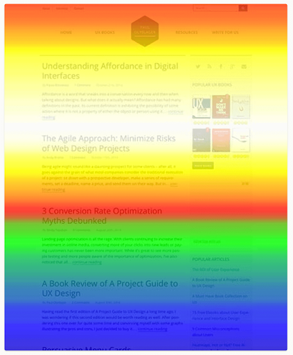
Once you understand which parts and elements of your page get the most attention from users, you can utilize this information to de-clutter your pages and direct every visitor towards a conversion.
Improving website load speed
This “hypothesis” does not need any testing. Conversion rate optimization is nothing but consumer experience optimization, and a faster loading webpage is bound to improve the user experience. Not to forget, even search engines love quick-loading webpages.
Apart from ranking higher, page load speed directly correlates to the bounce rate on your pages. Google released a report in February which showed how each second in your page load time affects bounce rates:
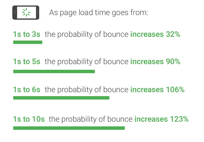
Higher bounce rates are toxic for both conversions and search engine performance. In fact, the load time of your website matters throughout the purchase cycle. That is, users expect your website load speed to be top-notch, right until they complete a purchase.
Almost 70% of carts are abandoned before completing a purchase. 67% of UK users and 51% of US users say the prolonged loading time of a website is their top reason for abandoning a purchase. Here’s how your page load speed affects your conversions:
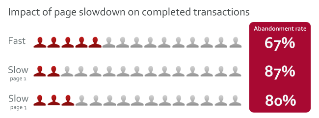
This means simply having a fast loading landing page is not enough; users expect a lightning fast, seamless experience throughout your website. If, by now, you are convinced you need faster loading web pages, here are a few things you can start doing right away:
- Use a content delivery network (CDN)
- Enable caching
- Reduce or eliminate heavy elements such as high-resolution images or videos
- Minimize script size
These changes should improve your page load speed almost instantly and should have a direct effect on your conversions.
Introducing focus in landing pages
Landing pages are meant to convert and should drive the users’ focus to the action you want them to take. Sure, experimenting with color, placements, and sizes of CTA buttons may seem like a great way to test your pages for better conversions, but more elements will create distractions that may drive the user away from where you want them.
Search engines, along with users, want to look at pages that instantly solve their problems. For this reason, overloading your pages with information or elements can result in higher bounce rates and diminishing organic search performance.
This means two things:
- Having too many elements on your landing page may not be the best idea. Clutter on a page will distract the user and may also negatively affect your page load speed.
- You should never try to advertise/show multiple products/offerings on a single landing page. Sure, doing so may seem easier and by some logic, more efficient but the case if quite the opposite. Studies reveal, that businesses may experience a 55% increase in lead generation when they increase the number of landing pages from 10 to 15. This is a clear indication of how focused landing pages convert better.
Longer landing pages convert more
Drawing from the last point, Google’s objective is to present their users with exhaustive information about their query. The chances of longer content having a better answer to a user’s query are higher, and so, Google ranks longer content higher.
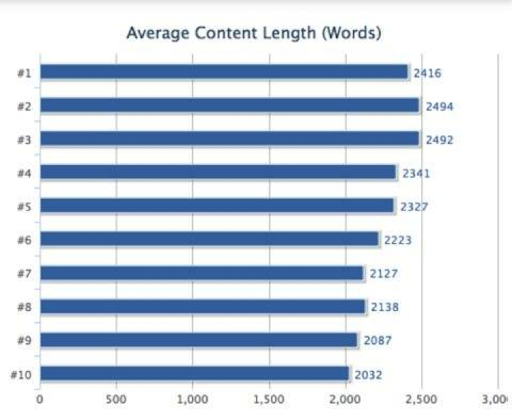
While this may seem like a contradiction to the previous point, as it talked about building focus, studies prove that longer landing pages have the potential of generating up 220% more conversions.
That being said, don’t stuff your landing pages with useless information to make them longer. Remember, CRO is aimed at improving customer experience. Keeping that in mind, use the extra space to tell the visitors more about your product, and how it can help them solve their problems, including trust signals such as customer testimonials. Increase the number of CTAs on the page to make sure the customer doesn’t lose focus while they skim through your content.
More CTA buttons on your landing page will help you target customers in different stages of their purchase journey with one landing page. Here’s how:
- Customers that are at the bottom of the funnel should come across a CTA button right above the fold. If you have done your conversion funnel right, you have created some sort of urgency and if the customer is certain about your offering, they would want to make a purchase without wasting any time.
- Below the fold, if you have a section highlighting the USPs of your offering, they might work for convincing customers at the top and middle of your conversion funnel. Having a CTA right below the USP section will again drive their attention towards the action you want them to take.
- Going even deeper within the landing page, if you have customer testimonials describing how your offering helped other individuals, it will be a social proof which may convince the visitor to make the purchase. Thinking in terms of better UX, placing another CTA button below the testimonial section may reinforce the thought of making a purchase.
The takeaway here is that while longer landing pages may convert better, they need to be stuffed with relevant information that is not only useful for the visitor but directs them to the right point so it fulfills the objective of the landing page.
Conclusion
While the above-mentioned strategies have shown promising results, the smart thing to do is to test each one against your current strategies. One learning that can be derived from CRO is that the same thing may not work for everyone. 56% of marketers are using A/B testing to determine the effectiveness of their CRO endeavors, we suggest you do the same.
Don’t forget to share the results in the comments below!


Leave a reply or comment below