Online shopping is different from shopping in the real world for both sellers and consumers. It does not guarantee a completed purchase even when visitors cannot stop filling their carts. Shopping cart abandonment is a common thing for eCommerce according to the latest stats. The average rate is nearly 74%.
It is not a catastrophe for the industry although it results in million-dollar losses for the global eCommerce marketplace and some online stores in particular. If you want to prevent your business from losing revenue, you might want to optimize the purchasing experience for potential customers.
Here are some handy tips on how to reduce your cart abandonment rate without special techniques or knowledge. But first, let’s have a closer look at current stats. Does the problem look so threatening?
Cart Abandonment Rate Reasons and Stats
As we have mentioned before, the average rate of cart abandonment is nearly 70%. Some experts consider such a rate to be absolutely natural for small online stores as well as huge marketplaces like Amazon. On the other hand, that percentage grows rapidly turning the problem into a huge threat. 3/4 of all online carts are left abandoned. It means that 4 out of 5 potential buyers will actually leave your store without purchasing anything although they have filled their carts with products. Most store owners simply fail to overcome this stumbling block.
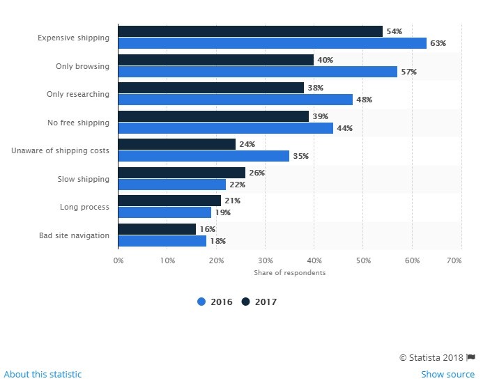
What is the problem? Why do most people leave their carts full? What are the crucial reasons for website visitors to leave their carts abandoned? Have a look at the image below.
As you can see, most customers are looking for lower prices in addition to free shipping features. At the same time, usability also matters as well as reputation on the web, safety means established by the website, etc. Knowing the reason for carts left abandoned it will be easier to overcome possible obstacles and reduce the cart abandonment rate.

Tip #1 – Free Shipping Opportunities
The online shop owner can come across various stumbling blocks on the way to conversions. High shipping costs are among the main obstacles to higher revenues. More than half of all visitors leave the website and items in the cart due to expensive shipping. The situation has improved a bit if compared with 2016. This is due to the fact that 64% of webstore owners consider free shipping to be the most effective promotion tool.
Another huge plus in favor of low or zero shipping costs is higher user engagement. The stats depict site visitors spending 30% more time in a shop that does not charge for shipping. The more time a visitor spends on the website, the higher the possibility he or she will complete the purchase.
Of course, you cannot completely eliminate shipping costs, but the idea is to show the customer that you can provide 100% fulfillment without the customer needing to pay a penny for the delivery. This means you will be taking the cost of shipping onto your business.
In some cases, shop owners simply cannot afford free shipping for their customers. This is where you can use some of the following tools:
- Scheduled Promotions – choose a specific season or time of the day when you can afford to cover the delivery cost.
- Establish a Predefined Threshold – a good idea is to cover shipping costs if the total sum of the order reaches a defined amount that still lets you keep a decent margin.
- Use Discounts – they always work.
Free shipping is a powerful marketing tool that will let you increase sales by 10-20%.
Tip #2 – Ensure Cart Visibility
Imagine yourself stepping in a grocery store. You choose some products and put them in your cart. The possibility of leaving any of the items abandoned is minimal. The situation with online shopping is a bit different. Your customer has plenty of interfering factors from an unexpected phone call to Wi-Fi disconnection.

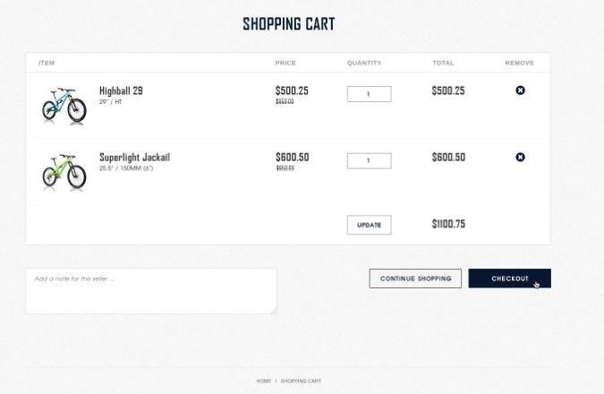
This is where you need to ensure your cart visibility. On the one hand, it will keep your customers aware of what they are actually buying. On the other hand, they will find it easy to navigate the list of products, add new items, check the list of recently reviewed items. etc. The latest research shows that a visible and well-designed shopping cart will let your sales jump up.
Here are some simple ways to keep the cart as visible for the customers as possible:
- Ensure a simple way to check out after adding a product to the cart.
- Make the digital cues stand out from the product list to drive the buyer’s attention.
- Place the checkout section in a visible area. Some consumers face difficulties going to the checkout stage directly from the cart.
The task might appear to be difficult especially for non-technicians. It requires a good knowledge of website building technologies unless you hire someone to build a website for you. Summing up, the list of products in the cart must drive attention and be followed by a simple checkout procedure.
Tip #3 – Registration-Free Checkout
Online shopping is all about convenience and speed. The less time a purchase takes, the higher the conversion rate is. The stats prove that almost 30% of all buyers who leave their carts abandoned did so because they do not want to register on a site. Some websites require signing in before checkout. Few customers appreciate this approach. The account creation is associated with obligations. Moreover, it slows down the purchase process. Shops that usually do not require registration may benefit from a 45% higher conversion rate.
On the other hand, account creation comes with some obvious benefits. You can collect emails from your visitors as well as send personalized offers and promotions. Shop owners do not have to eliminate account registrations. All they need is to make the feature optional.
Tip #4 – The Fewer Steps, The Better
 More than 20% of visitors leave their carts abandoned due to a long checking out process. It will be wise of you to make the procedure shorter and less time-consuming. Reduce the number of stages in your purchasing funnel. Some shops implement award-winning functions like a one-click purchase.
You need to be 100% sure that the feature runs smoothly. Some A/B testing will be a good idea as well. Always keep in mind that the same feature may work well on some websites but not others. It may be perfect for a small clothes shop, but not necessarily for a larger business. On the other hand, some studies show that the lack of required information by the website can look also confusing for the visitor.
Implementation of various strategies and analytics is the key to success. Try to generate as much feedback as possible to pick the best variant for your particular online store.
Tip #5 – Checkout Progress Indicator Bar
Dr. Brad Myers of the University of Toronto described the importance of progress indicators back in 1985. In his work, Myers proved that people were eager to have progress indicators when interacting with a computer interface.
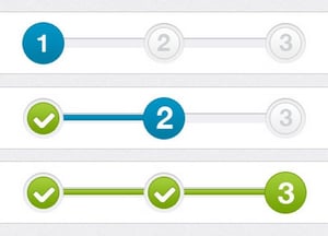
In other words, people are eager to know at what stage they are and how many steps are left to complete the task. We should forget about pop-up blocks asking if a client is sure and ready to proceed. Those are pretty irritating and interfere with the purchase process even if you ask about promotion codes or discounts. A progress indication bar is a good solution to avoid any irritating issues and will keep customers aware of where they are. It ensures that visitors do everything right and there is nothing to worry about.
Tip #6 – Ensure Reliable and Safe Transactions

Trust logos are not simply for fun. They result in a better reputation and increased level of trustworthiness. According to the research more than 60% of customers leave their carts abandoned due to trust logos missing on the checkout page.
Some website owners often underestimate the transaction process. They consider this step as nothing but a mere formality. If a customer already got to this stage, why would he ever give up? Well, a transaction form appears to be a vital element that affects the cart abandonment rate.
Every time you ask a visitor to pay for a product by filling the checkout form, you actually establish trusted relations and make them indicate their personal info that goes far beyond simply a name and an email. You need to make your buyers feel safe every time they write in the credit card number in the space provided. Adding security and SSL logos to a checkout page would be a great idea.
Tip #7 – Offer Various Payment Methods

Limited payment methods appear to be the reason for more than 6% of customers abandoning their carts. You need to be more flexible and follow the latest trends like Apple Pay. Allowing mobile payments will add more purchasing opportunities for your customers. You can opt for:
- Credit Card Payment solutions like PayPal or Stripe.
- Opt for third-party digital wallets like Amazon Pay.
- Implement mobile payment options, like Apple Pay.
The integration process is very simple. You do not need to have any special skills. Moreover, modern website builders let newbies come up with a solid digital store from scratch. All you need is to choose the best-matching website building platform.
Tip #8 – Use Remarketing
If a user leaves without buying anything, it does not mean he or she is lost for your shop. A proper implementation of retargeting tools may do the trick. The process requires some marketing and advertising experience, as it mainly comes through email and targeting campaigns. You can follow the example of some popular online shops and do the following:
- Set an automated process of AdWords retargeting bidding with the help of Return on A Spend
- Use Remarketing List of Search Add for customers who left their carts abandoned within the last week or month.
- Use Gmail-sponsored promotions for users who visited your website but made a purchase in another shop.
Looks pretty tough, right? However, if you do everything properly, you can increase revenue by 15%. All you need is to follow several simple steps:
- Divide all the occasions of cart abandonment into groups and categories. They may include the cart value, new buyers and returning visitors.
- The second step is to choose the best-matching ad platform.
- Set monitoring tools like tracking pixel for detailed stats.
- Set the period for your campaigns depending on the demographics, session time and other parameters.
- Test and launch the campaign.
The Bottom Line
Each website has its own unique features. It means that the same strategy might not work well for two different digital stores. However, the reasons for almost 70% of people leaving their carts abandoned are pretty clear. We know the core problem as well as means to overcome it. Some simple steps will allow you to increase your total revenues by 30-50% within a short period of time. All you need is to work with website usability, add some trust to the checkout process and never forget the customers who left the site without buying.


Leave a reply or comment below