


Running an e-commerce business means keeping your eye on the ball. If you know how many sales have been made or how big your conversion rate is, you can reveal weak points and identify where to invest more. Data is what provides the answers to all of these business-related questions and more.
The quality and speed of data-driven decisions often depend on how the data is structured and fed into the decision-maker’s brain. That’s why digital dashboards are so in-demand; they provide visual snapshots of crucial metrics and let you track the business’ health. Today we’ll show you how you can build a digital dashboard for your e-commerce business in Google Sheets, and how to make the dashboard live using a data importing tool, Coupler.io.
E-commerce Metrics to Place on the Digital Dashboard
Every metric matters, but you should not overload your dashboard. Pick the most crucial values to track the efficiency of your e-commerce business model, be it an online store or a service hub. For example, here is a good selection of 7 e-commerce metrics that you can use to track your business. You may add some more if you are using e-commerce email marketing.
For this blog, our dashboard will be based on the data of a small e-commerce retailer, which is selling sandwiches across the San Francisco Bay Area online.
The marketing metrics we chose are:
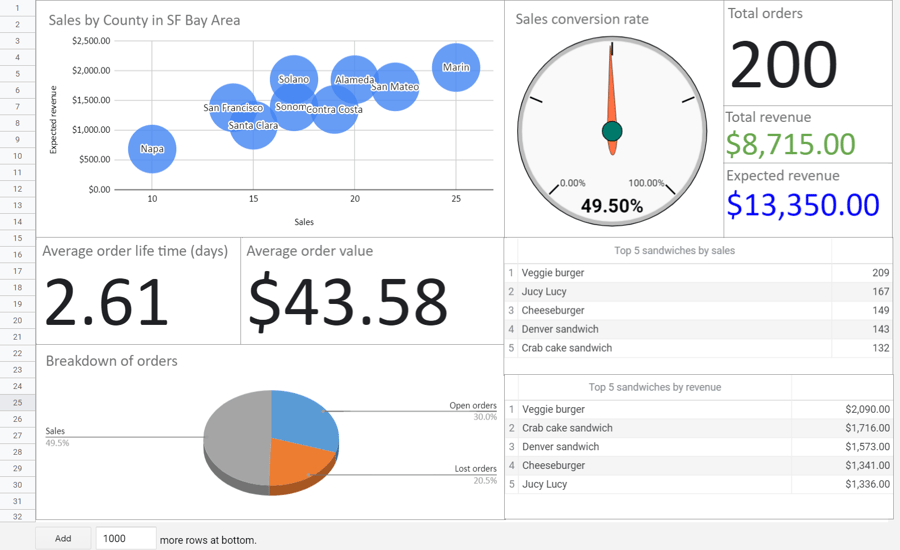
- Breakdown of Sales by Region (County in the SF Bay Area)
- Total Revenue & Expected Revenue
- Total Orders & Sales Conversion Rate
- Average Order Value
- Average Order Lifetime
- Best Performing Products by Sales and by Revenue
Raw Data for the Digital Dashboard
To calculate each metric on the dashboard, you’ll need specific data:
1. Data for the Breakdown of Sales by Region
This metric shows how many sales have been made and the revenue in different counties in the SF Bay Area.
Required Data:
- Information about each sale
- Information about each customer
2. Data for the Total and Expected Revenue
Your total revenue is the sum of all sales. The expected revenue is the sum of all sales plus open orders.
Required Data:
- Information about each order
3. Data for Total Orders and Sales Conversion Rate
The total orders metric is the sum of all orders placed, including the lost ones. Sales conversion rate is the ratio of sales to the number of qualified leads.
Required Data:
- Information about each order
- Information about each sale
4. Data for the Average Order Value
Average order value is the ratio of the total revenue to the number of orders.
Required Data:
- Sum of all sales
- Information about each order
5. Data for the Average Order Lifetime
The average order lifetime shows how long it takes to make a sale.
Required Data:
- Information about each sale
6. Data for the Best Performing Products
For this metric, we’ll sort out the top five of sold products (sandwiches) by sales and revenue.
Required data:
- Information about each sale
- Information about each product
Where Can I Get All This Data?
If your online store operates on an e-commerce platform like Shift4Shop, most of your data will be there. If your e-commerce business uses other channels (if you sell on Instagram or have a portfolio website, for example) you can store your business data anywhere. For example, many entrepreneurs use Airtable as a database for the information about products, customers, sales, bank accounts and so on. Your marketer’s tool stack may include other actionable tools and services, for example:
- CRM Apps, such as HubSpot or Pipedrive, to manage customers and sales.
- Analytics Tools, such as Google Analytics, to analyze website traffic, customer behavior, and more.
- Email Marketing Services, such as Mailchimp or Moosend, to get in contact with your customers.
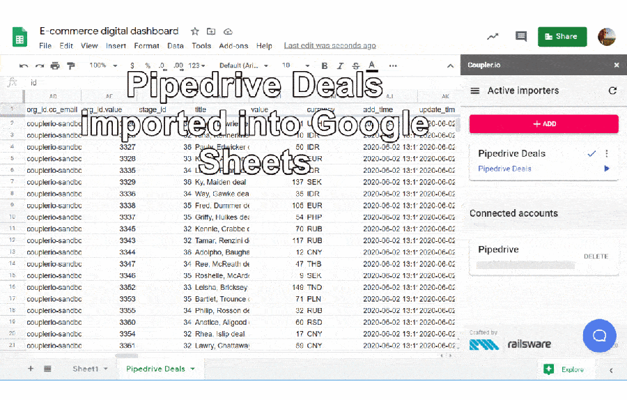
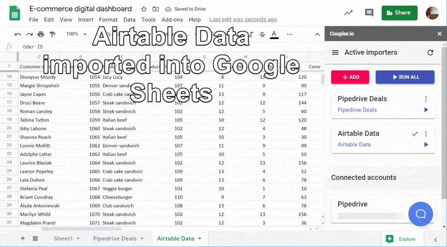
Our assumed e-commerce retailer uses Pipedrive CRM to manage the sales pipeline and Airtable to store the information about products and customers. So, these are our data sources.
How To Import Data Into Google Sheets
- Manually: You’ll need to export a data set from your data source in a supported file format and import it into Google Sheets.
- Automatically:You can use a specific tool, such as Automate.io or Coupler.io will help with data export to Google Sheets, and your data will be synchronized automatically
Since we’re building a live digital dashboard, the automatic option will do. We’ve picked Coupler.io for our use case because:
- It pulls data from different sources including Airtable, Pipedrive, HubSpot and more.
- It automates data imports on a schedule (every hour, every 3 hours, daily, etc.).
To import Pipedrive data into Google Sheets, we need to select the data category (this is Deals in our case) and connect the spreadsheet to Pipedrive.
To import data from Airtable, we need a shared view link of our Airtable data source. This data is required for the Best Performing Products metric.
Once the raw data is in the spreadsheet, we can get to building our dashboard.
Building an E-commerce Dashboard in Google Sheets
Let’s go section by section and check out the formulas we used to calculate each metric. In this spreadsheet, you’ll see each section introduced in a separate sheet. This will let you master the flow efficiently.
Breakdown of Sales by Region
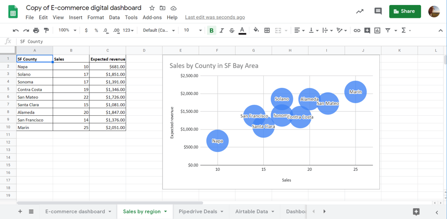
Step 1: “SF County” Column
Apply the following formula to the A2 cell:
=unique('Airtable Data'!$B$2:$B)
Interpretation:
'Airtable Data'!$B$2:$B is the range with the names of regions per each sale. The UNIQUE function will return all unique values from this range.
Step 2: “Sales” Column
Apply the following formula to the B2 cell and drag it down to the range end:
=countif('Airtable Data'!$B$2:$B,A2)
Interpretation:
The COUNTIF function will count sales by each county.
Step 3: “Revenue” Column
Apply the following formula to the C2 cell and drag it down to the range end:
=sumif('Airtable Data'!$B$2:$B,A2,'Airtable Data'!$I$2:$I)
Interpretation:
'Airtable Data'!$I$2:$I is the range with the amount per each sale. The SUMIF function will sum the revenue by each county.
Step 4: Insert a Bubble Chart
Select the range A1:C10 and go Insert=> Chart. Pick a Bubble Chart type.
Sales Conversion Rate
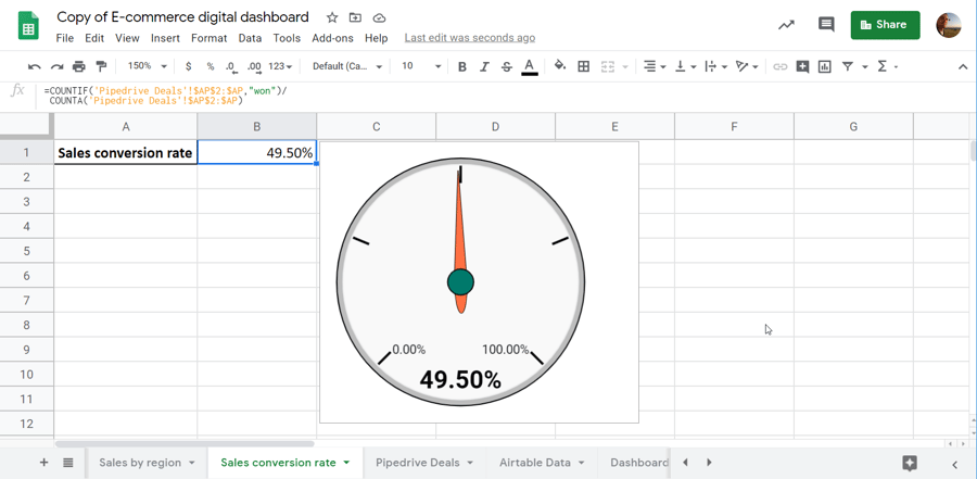
Apply the following formula:
=COUNTIF('Pipedrive Deals'!$AP$2:$AP,"won")/
COUNTA('Pipedrive Deals'!$AP$2:$AP)
Interpretation:
'Pipedrive Deals'!$AP$2:$AP is the range with the order status: open, won, and lost. The COUNTIF function will count all orders with the status "won". The COUNTA function will count all orders. Divide one to another and you’ll get the sales conversion rate.
Select the cell with the value and insert a Gauge chart type.
Total Orders & Total and Expected Revenue
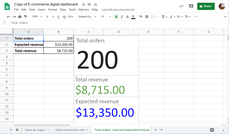
Step 1: Calculate Total Orders
Apply the following formula:
=COUNTA('Pipedrive Deals'!$AP$2:$AP)
Interpretation:
'Pipedrive Deals'!$AP$2:$AP is the range with the order status: open, won, and lost. The COUNTA function will count all orders.
Step 2: Calculate Total Revenue
Apply the following formula:
=SUM(
Filter('Pipedrive Deals'!$AI$2:$AI,'Pipedrive Deals'!$AP$2:$AP="won"))
Interpretation:
'Pipedrive Deals'!$AI$2:$AI is the range with the value of each order. The FILTER function will filter orders by status "won". The SUM function will sum the won orders only to calculate the total revenue.
Step 3: Calculate Expected Revenue
Apply the following formula:
=SUM(
Filter('Pipedrive Deals'!$AI$2:$AI,'Pipedrive Deals'!$AP$2:$AP="won"),
Filter('Pipedrive Deals'!$AI$2:$AI,'Pipedrive Deals'!$AP$2:$AP="open"))
Interpretation:
In this formula, the FILTER function will filter orders by two statuses "won" and "open". The SUM function will sum the won and open orders to calculate the expected revenue.
Step 4: Insert a Scorecard Chart
You’ll need to insert a Scorecard chart for each metric separately.
Average Order Lifetime & Average Order Value
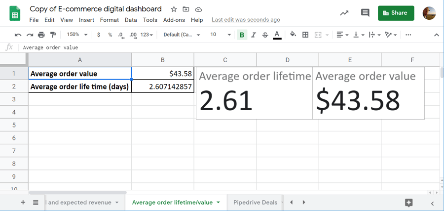
Step 1: Calculate Average Order Value
Average Order Value = Total Revenue / Total Orders
Apply the following formula:
=SUM(
Filter('Pipedrive Deals'!$AI$2:$AI,'Pipedrive Deals'!$AP$2:$AP="won"))/
COUNTA('Pipedrive Deals'!$AP$2:$AP)
No interpretation is needed since both total revenue and total orders have been explained above.
Step 2: Calculate Average Order Lifetime
To calculate average order lifetime, we need to learn how many days have been spent for each sale. For this, go to the sheet with Pipedrive deals, insert one column at the beginning of the sheet and apply the following formula to the A1 cell:
={"Days per order";ARRAYFORMULA(IF(ISBLANK(AY2:AY),"",
MINUS(AY2:AY,AK2:AK)))}
This MINUS function will calculate the difference between the order creation date (AK2:AK) and the order closure date (AY2:AY).
Now, get back to the dashboard and apply the following formula to calculate the average order lifetime:
=IFERROR(AVERAGE('Pipedrive Deals'!$A$2:$A))
Interpretation:
'Pipedrive Deals'!$A$2:$A is the newly created range with days per order. The AVERAGE function will return the average value of the specified range.
Step 3: Insert a Scorecard Chart
You’ll need to insert a Scorecard chart for each metric separately.
Breakdown of Orders
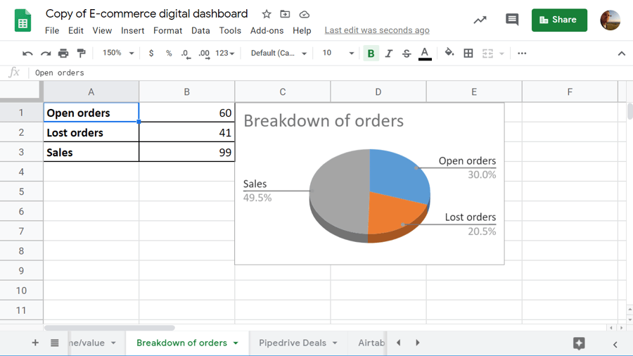
Apply the following formulas to break down orders by status:
- Open Orders:
=COUNTIF('Pipedrive Deals'!$AP$2:$AP,"open")
- Lost Orders:
=COUNTIF('Pipedrive Deals'!$AP$2:$AP,"lost")
- Won Orders (Sales):
=COUNTIF('Pipedrive Deals'!$AP$2:$AP,"won")
Interpretation:
'Pipedrive Deals'!$AP$2:$AP is the range with the order status: open, won, and lost. The COUNTIF function will return the number of orders sorted by the chosen status ("open", "lost", or "won").
Select the values of all orders by status and insert a 3D pie chart.
Best Performing Products
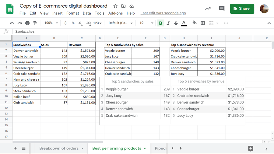
First, let’s filter out all products and calculate sales and revenues per each product. The following UNIQUE formula will extract all products from the product column ('Airtable Data'!$E$2:$E) exported from Airtable:
=unique('Airtable Data'!$E$2:$E)
Now, calculate sales per each product with the following SUMIF formula:
=sumif('Airtable Data'!$E$2:$E,A2,'Airtable Data'!$H$2:$H)
Drag it down to the end of the range. Then, do the same with the SUMIF formula to calculate revenues:
=sumif('Airtable Data'!$E$2:$E,A2,'Airtable Data'!$I$2:$I)
You should get a table with three columns: Products (A1:A11), Sales (B1:B11), and Revenues (C1:C11). To extract the best performing products, we’ll use the SORTN function. Here is the formula for top 5 products by sales:
=SORTN(A2:B11,5,1,B2:B11,false)
And here is the formula for top 5 products by revenue:
=SORTN({A2:A11,C2:C11},5,1,C2:C11,false)
Select the resulting tables and insert a Table chart. This should be done separately for each table.
Wrapping Up
The main idea of this blog post is to show the power of Google Sheets’ functions and features. We’ve built the dashboard based on the data exported from Pipedrive and Airtable, but you can apply this experience to your own e-commerce case study. Many add-ons and tools allow you to sync spreadsheets with almost any data source. This will let you add versatile metrics to the dashboard and keep more actionable data in one place. So, go ahead and good luck with your data!


Leave a reply or comment below