Being the owner of an online store, you must be familiar with the term “cart abandonment.” To put it in simply, cart abandonment refers to a visitor leaving your site without completing their purchase. Of course, this could be a detrimental experience for a seller.
The average cart abandonment rate can get as high as 65.23%. That’s right. But, are you familiar with the impacts it can leave on your website?
The higher the abandonment rate, the lower your revenue. It’s as obvious as it can get. If people aren’t purchasing enough, you won’t be able to achieve your goals and targets.
And then, it can even hamper the overall credibility of your online store. With less purchases, you won’t be able to gain enough attention towards your store. In this way, there are several repercussions that you may have to face.
But, don’t fret. Here are the most proven and seamless ways through which you can reduce your shopping cart abandonment rate.
1. Build Trust in Your Transaction Forms

While purchasing something from your eCommerce store, a customer is going to invest a lot of faith in your credibility. After all, handling over personal and financial information isn’t child’s play, right?
Moreover, after a massive security breach in 2014, where the credit card data of more than 31.8 million customers was compromised, people have become more attentive and vigilant.
According to one study, it’s said that 61% of customers don’t complete their purchases only because the logos of trust are absent. Thus, to reduce the cart abandonment rate, you’d have to improve the trust among your target audience.
To do that, you can:
- Display a valid SSL certificate on the site
- Show authorizations
- Put trust symbols on the transaction page from credible sites
Keep in mind that reassurance is an important aspect that can help you gain more revenue.
2. Progress Indicator on Checkout Pages

The longer it takes to checkout from the store, the more irritated your customers will get. Especially so, millennial customers are much more impatient than any other customer group. They don’t like to move towards an end zone blindly.
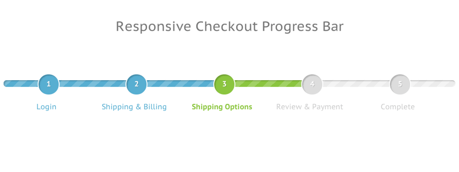
One of the best ways to avoid this mistake is by installing a progress indicator on the checkout page. By clearly showing the consumers how far they are from completing the purchase, you can effortlessly reduce your cart abandonment rate.
Also, make sure that you’re keeping the indicator as short as possible. If you want, you can even conduct an A/B test to figure out what your customers prefer.
3. Thumbnail Product Images Throughout the Purchasing Phase
Sometimes, customers forget how the product that they’ve just put in their cart looks. This may happen most frequently if your customers are too busy navigating through a lot of products on the site.
Once they’re tired of searching and navigating, going back to the cart merely to look at products that they have can be tiring. So, a technique that can reassure them and keep them hooked is showing thumbnail images throughout the purchasing period.
It will keep your customers on the right path to completing their purchase as soon as possible.
4. Simplify Navigation Between Cart and Store
The more clicks your customers has to make on your site, the more likely they are to abandon it completely. It’s quite evident from a report that says 25% of people abandon carts only because the navigation is complex.
Although you do want traffic on all of your pages, confusing visitors isn’t the way to do so. Keep the navigation as smooth as possible. Your visitors should be able to:
- Select a product
- Add it to the cart
- Click the Checkout button
Make sure that you’re keeping your categories organized. And, a quick preview to the cart would always be better than forcing visitors to visit the page.
5. Multiple Payment Options

When developing an online store, you wouldn’t want to leave any stone unturned that may impede your growth, right? But, if you’re only providing one payment option, you might be putting obstacles on the way of your customers.
No two people act or think alike. Their choices differ, and their preferences vary. So, only supporting a single payment option may lose you a majority of customers who don’t use that option.
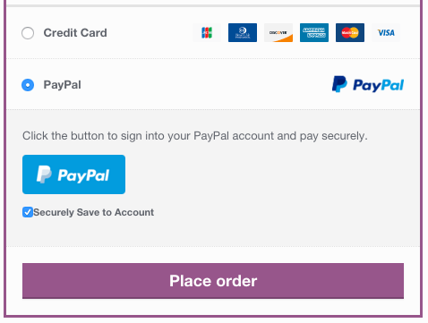
Therefore, it’s essential to offer as many choices as you can. Right from internet banking to credit card payments, cash on delivery, online wallets, and more; keep your options open.
6. Strong Call to Action on Checkout Pages
There is an innumerable amount of websites that fail to add an attractive CTA on their checkout pages. All of your other pages may have a strong call-to-action button, but there are chances that visitors won’t go through the entire site.
Therefore, placing a CTA button on the checkout page could be your best shot. Also, make sure that, while developing such buttons, you’re keeping the message strong and consistent.
If the CTA message’s tone stands apart from the rest of the website content, your customers may have a tough time grasping this alteration. If you’re unsure on how to approach your CTA, you can also consider testing the buttons to ensure efficiency.
7. Saving Carts Effortlessly
The process of shopping online doesn’t seem to be as simple as buying something from a physical store. Thanks to the stored buying history, your customers may want to take advantage of purchasing one item again and again.
Or, they may even want to return to an ongoing purchase. So, to make the conversion seamless, you need to make sure that you’re making it effortless for them to return to their in-progress cart.
For customers, saving a shopping cart should be easy. To make this happen, you can:
- Ask users to log in
- Save their browser cookies
- Ask customers to remember their credentials
Ideally, if you’re saving the cart for later, it may save your customers some time. And, it may encourage them to return.
8. Guest Checkout Options
Not every other person would be interested in filling out a monotonous, long form just to sign up on your website. And, studies have shown that 14% of people don’t complete their purchase only because they were asked to sign up or log in.
You cannot force your customers to create an account. Not just because this consumes their time, but it can also turn them off instantly. So, instead of welcoming them with an unnecessary form, you can provide a guest checkout option.
All of the information that you’d have asked in the account creation form, you can collect it for shipping. This way, you’ll get their details and save them from wasting time as well.
9. Money-Back Guarantee (Or Other Assurances)
Uncertainties and hesitations are two major aspects that can kill your online sales instantly. If your customers don’t have anything substantial to hold onto, they won't feel that it’s worth it to spend money on your products.
Therefore, as a seller, it’s your responsibility to provide them a reason to buy from you. One good technique for this is a money-back guarantee. Who wouldn’t buy from you if they know their money could be returned in case the delivered item is defective?
Likewise, you can even offer them other assurances, such as 24-hour delivery, no shipping cost, easy returns, 24/7 support, and more.
10. No Surprises with Hidden Charges
One of the primary reasons why customers abandon the cart is unexpected charges. Typically, this aspect is related to shipping costs that aren’t displayed until the very end of the checkout process.
If you want your customers to complete their purchase, make sure that you're transparent in terms of costs, irrespective of the purpose. Also, it’s recommended if you can add a shipping calculator on the checkout page.
It will help decrease surprises, and your customers will know whether you’re charging fairly or not.
11. Discover Leaky Spots in Your Conversion Pathways
Through Google Analytics, you can seamlessly gain amazing insight into your visitors’ behaviors. Therefore, rather than spending time and effort on making assumptions of what’s wrong, you can simply assess your visitor flow and conversion pathways.
These will display the issues your product pages are facing and the points where traffic is dropping off the most. From this data, you can fix the mistakes and enhance your pages to make improvements.
It will also allow you to be in the shoes of your customers and figure out why purchases aren’t happening as they should.
12. Optimize Your Page Load Times
According to a report, every second of delay in the page loading causes a drop of 7% conversions. If your web pages are slower in speed, it may increase the level of impatience in the shoppers, and they might abandon the site.
Regardless of the reason, you shouldn’t be neglecting this factor. So, make sure that your web pages, including the checkout page, are loading as quickly as possible.
Conclusion:
All in all, these tips aren’t just to enhance the conversion rate and to decrease the cart abandonment rate. Following these techniques can also help you provide a better user experience to your customers.
And, if you’re able to achieve that, success won’t be far from your online store. So, follow these tips and ensure that your site isn’t lacking in any way.


Leave a reply or comment below