A cart page is where the buyer’s journey, in terms of conversion. It is like a basket that potential customers use to add anything he or she likes throughout the course of browsing your store. They keep on adding things but may consider removing or replacing some items when they decide to pay for it.
Here, their decision may depend upon different factors. Price plays a major role in whether they’ll prefer one item over another. The user experience on the cart page needs to be customer-centered. A quick cart view, popup, or mini cart is a game-changer as it keeps them informed throughout their shopping experience. They can view and match the items with their needs and budget.
The checkout page is a continuation of the cart page, which is even more critical to making customers convert. Therefore, it must carry the same ease provided in previous steps. In this blog, I’m going to discuss the different methods that you can use to improve your cart and checkout pages’ user experiences.
Why Do Carts & Checkout Pages Need Improvement?
A user may come across several problems when it comes to online shopping. A merchant or webmaster can only help if he or she understands the common problems their customers may face. To give you a quick review, let’s go through a few of the most common problems that customers encounter at checkout:
- Unable to see all cart items
- Mandatory user registrations
- Remembering login credentials
- Hidden charges
- Irrelevant fields to answer
- Time-consuming checkout process
- Trust issues
- Inconspicuous Calls to Action
- Difficulty in entering addresses
How to Improve Cart and Checkout Pages
The scope of making changes to the shopping cart for better user experience is widespread. You may start with reconsidering the layout and design of the checkout altogether, then move onto making a few changes, and then finally increasing its functionality. Let’s go through some of the proven strategies for effectively improving your online store’s cart and checkout pages.
1. Add a Mini Cart
Your potential customers may not see the items they add to the cart, the quantity, and the total amount without clicking and visiting the cart page. To ease them with a quick view, you can add a mini cart and improve the shopping experience.
The mini cart constantly shows the cart items and amount so that the customers can add more products mindfully. It shows as a popup and displays a cart summary over-top the current web-page.
2. Allow for Guest Checkout
Making it mandatory for customers users to sign-up and create an account is tantamount to asking them to leave your website. The majority of users won’t bother registering on your store and may not want to keep their personal data with you for long.
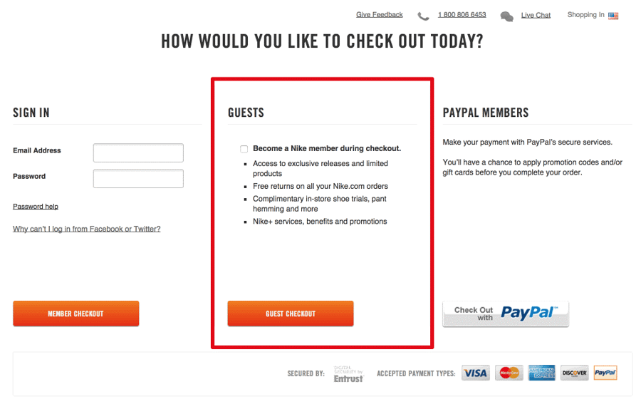
Provide them with the same courtesy and convenience that they’d find at a brick-and-mortar store. Display the products, elaborate with a description, and get the payment – that’s it. There is no need to force them into filling out a lengthy sign-up form. Let them have what they want and set them free; they will return if you are selling the best of the best products and/or services.
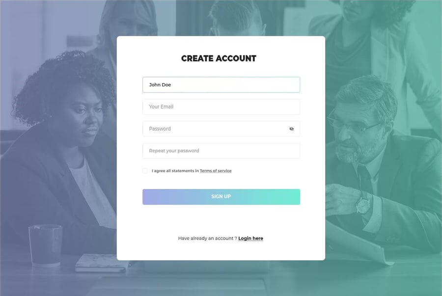
3. Simplify Sign-Up and Login
In addition to guest checkouts, you can work on improving the sign-up procedure itself. You can simplify sign-ups by allowing easy registration via their preferred social media profiles. For example, customers can register with their Google, Facebook, or Twitter accounts.
This will encourage your potential customers to register for an account without creating a login ID and remembering the password. All they need to do is to make sure their social accounts are logged-in.
4. Be Transparent About Additional Charges
One of the most major checkout issues cited by customers is the failure to display additional charges for an order. It may be layaway charges, surplus shipping because of long-distance deliveries, value-added tax, insurance charges, etc.
Improve the user experience by highlighting any additional costs on the cart and checkout, rather than displaying on the final payment page. Pursue fairness in charging your customers, whether it’s in terms of extra shipping charges or a kind of tax. Make it clear what the total amount they have to pay is so that they checkout while keeping it in mind. As a result, you gain a credible image, which can turn your customers into loyal ones.
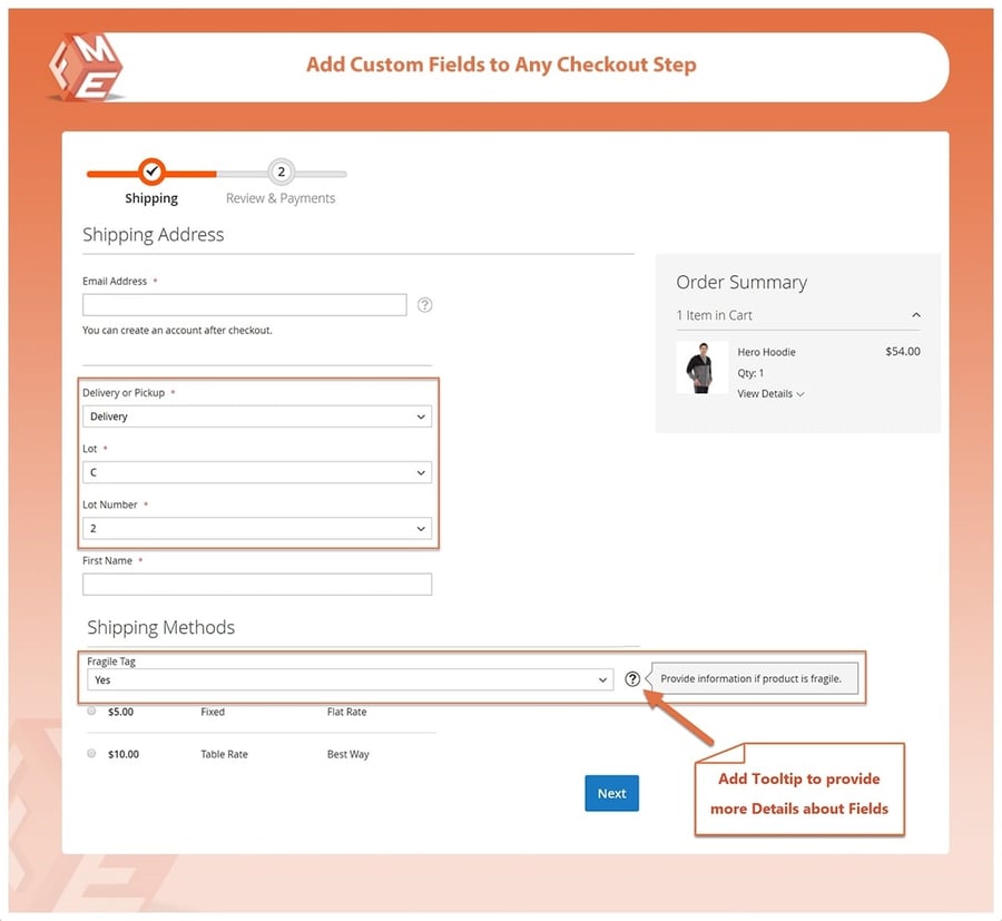
5. Add Custom Checkout Fields
The default checkout page may not possess every field that you need for the specific niche you are doing business in. For example, you may want to ask the age and gender of customers to showcase products accordingly in your gift shops, whereas a gardening shop may need to know the other interests and hobbies of their users.
Therefore, a default personal details page may not suffice the needs of all. Use tools to customize checkout fields by removing the unwanted options and adding relevant fields. Magento-powered online stores can add custom checkout fields by installing an extension. You need to select a plugin that allows creating a variety of field types so that you can acquire data relevant to the question you ask.
6. Try Different Checkout Types
A conventional checkout process is comprised of multiple stages that appear one after another. This can be time-consuming and full of distractions, leading to a high abandoned cart rate. To shorten the process, you can try different checkout types. Some of them include:
- One-Page Checkout – This requires the users to fill out all required details and finish the transaction on the same page. There is no need to wait for each page to load and provide the data one-by-one.
- One-Click Checkout – This ensures a smooth and distraction-free shopping experience. Signed-in users can place orders straight away from the product or cart page while skipping the checkout altogether.
- Accordion-Style Checkout – This is one of the best alternatives for improving the mobile user experience for the checkout of your online store. It shrinks the rest of the phases and allows the users to fill out their details at their leisure.
7. Use Graphics to Display Checkout Progress
While checking out for a product, customers like to know how many steps are left until completion. Making your customers fill out personal details and taking them towards billing and shipping details without showing a progress bar may turn them away.
They may stop to think about how much data you still need for a mere checkout. To ease their worries and encourage them to complete their order, you can use a graphical progress bar. This simple visual cue keeps them going, as they are now fully aware of how much more information you’ll need.
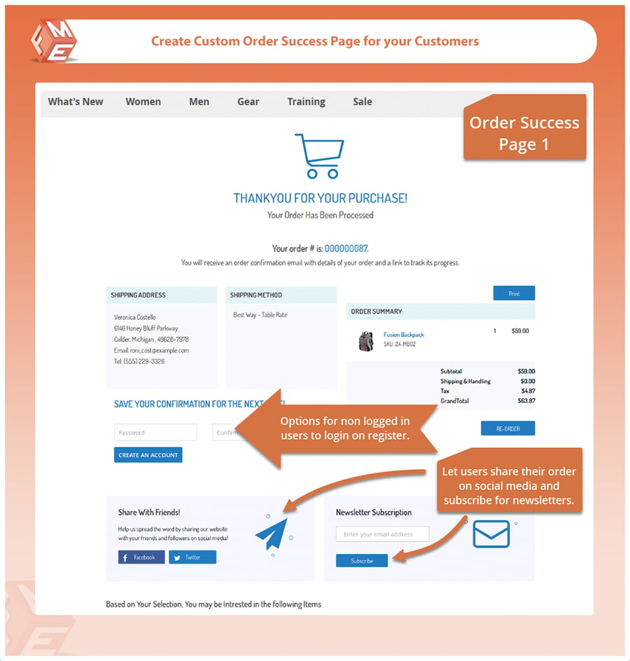
8. Confirm with A Checkout Success Message
What if you buy a wallet from a shop and the seller does not thank you before saying goodbye or greet in other ways? Will you ever visit him again? Without a doubt, the answer is no. You need to bid a friendly farewell to customers after every purchase, whether online or offline.
To say a friendly goodbye to the customers on your online store, you can create a checkout success page that not only confirms their order placement but also ensure that they’ll consider returning to shop more. You can easily create a custom checkout success page to compose an entirely different response for the users who have recently converted into a customer.
9. Ensure and Communicate Security
One of the biggest concerns that online buyers have is the security of the platform they are about to provide their personal and financial details with. Take multiple measures to ensure the cart and checkout pages are safe for the end-users. This should include SSL certificate and PCI compliance.
Combined, these security measures make your store a safe place to shop around – but, your customers need to know that. Be sure to display secure trust logos to exhibit that your store is a reliable space for making payments online.
Let your customers know about the security measures you have taken for them to make purchases in a safe, encrypted environment.
10. Try Changing Calls to Action
A call to action button, or CTA, is the driving force behind a user’s understanding of the action they need to take. The text, color, font style, and size of the CTA button are major factors that you have to customize according to common industry standards and your specific business niche.
For example, your competitors may be using a variation of CTA button colors on checkout pages. For some, a yellow button may work well, but for others, a blue or green button will be more rewarding in terms of conversions.
Try different types of CTA buttons with A/B testing to determine what works best among your customers. In the end, you may find an option with optimal returns.
11. Use an Address Suggestion Tool
Filling in personal details is a cumbersome job – especially completing a shipping address. To ease this tedious task, you can install an address suggestion tool that predicts the customer’s street address or city as soon as they start to enter the house or office number.
As an alternative, you can allow customers to provide only the house number and postcode and automatically start searching for the rest of the address. The tool will retrieve 3-4 results for the customers to select the one that belongs to them. This saves a lot of time and ensures the addresses are valid and free from human errors.
Final Thoughts
Pave the way for your customers by assisting them in making easy purchase decisions and swiftly going through the payment phase. Every option or improvement that you make to the shopping cart counts towards boosting conversions and repeat customers. However, do remember that some things may work for others that don’t work for your online store. Take the time to test out different features and strategies and find what works best for your business.


Leave a reply or comment below