
In 2019, the average eCommerce abandonment rate was almost 85%.
The shoppers who reach your store's checkout page are likely highly qualified visitors—they have engaged with your brand and have decided to make a purchase. So, why are so many of them abandoning their carts?
The checkout stage of the purchasing funnel can and does have a huge impact on your conversion rate.
If you're selling on Shopify, you've probably noticed that its checkout has some significant limitations. To customize your customers' checkout experience, you're forced to upgrade your plan to Shopify Plus, which is out of reach for many small businesses.
Keep reading to learn more about the importance of controlling your checkout page and how you can see increased conversions by choosing the right sales platform.
Why Do Shoppers Abandon Carts?
If you're experiencing high cart abandonment rates, take solace in the fact that you're not alone. Online businesses worldwide are scratching their heads, trying to determine why they're enduring the same thing.
Why is it that more than 75% of online shopping carts are abandoned?
Well, there are plenty of reasons this happens. Maybe a stay-at-home mom is distracted by a crying child in the background. Perhaps a young professional didn't have time to get through your checkout process or create an account on your website before their next meeting.
Someone else might decide that the price is suddenly too high when they see their final total, including shipping fees.
Checkout Conversion Rate
Your cart abandonment rate measures the top of your checkout funnel's performance, while checkout conversion centers on the middle and bottom.
Checkout conversion rate (CCR) shows the percentage of customers who initiate and fully complete the checkout process.
The bottom of the checkout funnel is arguably the most data entry-intensive and complicated area. If you don't make it as user-friendly and painless as possible, you'll continue to lose sales.
Limitations of the Shopify Checkout
So, you now know that checkout is a vital part of your customers' journey through your eCommerce store. You're excited to fully optimize your store's checkout and create a better experience for your customers.
But if you have a basic Shopify plan, checkout customization is off-limits.
It's not that Shopify's basic checkout page is ugly, but it's not necessarily attractive, either. Your store's identity may be lost by the time your customer gets to the most crucial step of their journey.
Locked Checkout Functionality
While you can alter your checkout's front-end look, you can't alter functionality or add custom fields. This lack of customization is frustrating if you want to add specific address fields or make country-specific customizations — it would be hard to sell across borders with this limitation.
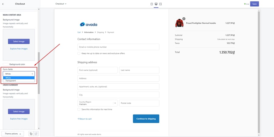 Source: Avada
Here is an overview of features that you can't change within Shopify's settings:
- The layout of the checkout page
- Adding elements to the header or content areas (such as banners, logos, promotional images, or plain text)
- What fields are required to complete the checkout
- Switching to a one-page checkout
- How the order summary panel performs on mobile
- The location of the gift card or promo code input box
- Adding your website's full header with navigation
Many businesses use Shopify as their eCommerce platform because it's easy to build a website and get started. Still, these checkout limitations prevent you from maintaining control over your entire customer journey.
The primary reason for this is that the checkout pages are shared across the platform, making it impossible to add design elements, scripts, customize the fields, and more.
Shopify's solution is to upgrade to Shopify Plus, which starts at $2,000 per month — a cost most businesses can't justify.
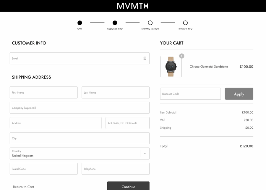 Source: Statement
Luckily, there are other ways you can increase conversions with the right eCommerce platform.
How to Increase Checkout Conversions
It doesn't matter how much traffic your website generates or how good your product photos are if you can't make a sale. The number of sales you receive directly impacts the success of your business.
So how do you prevent visitors from abandoning their carts and encourage them to make a purchase?
Offer Guest Checkout
Yes, you want to know as much about your customers as possible. If every visitor creates a profile, you can monitor their browsing behavior and make suggestions based on their purchase history.
Complete customer profiles make it easy for you to segment your audience based on location and add subscribers to your email lists. Profiles also make it easy for customers to make repeat orders with only a few clicks.
However, there's a big distinction between encouraging the creation of customer profiles and forcing it. Requiring customers to make a profile before purchasing may hurt your conversions.
Still not convinced?
23% of consumers say they've abandoned purchases due to having to create an account.
You should provide a guest checkout option to improve the customer experience. Registration seems like a big commitment and stretches out the process. It also hinders mobile purchases, as many customers won't take the time to fill out fields required to create an account on a smaller screen.
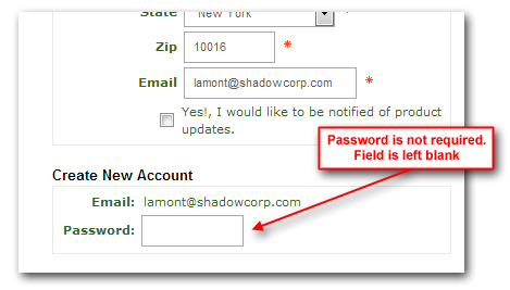
You can still offer a signup field at checkout. Customers are much more likely to decide to register at the end of the process after they've already entered all their information. Unfortunately, this doesn't work well on Shopify. There's no registration option at the end of checkout — instead, the customer is sent an email suggesting they create an account. Workarounds require editing code, and none of them are fully convenient to the customer as they are not sent seamlessly back to checkout. The way Shopify halfway implements registration at checkout is awkward enough to remove much of its benefit.
Give Customers an Alternate Way to Log In
One fantastic compromise between guest checkouts and customer account creation is to let customers log in with their existing social media.
For example, Facebook login would let the customer instantly create an account on your store by using their Facebook information. Rather than need to enter any details, they'd only have to click or tap a couple of buttons.
Some eCommerce platforms, like Shift4Shop, will set up a Facebook login for your online store for a one-time fee. The developers work directly with Facebook staff to create, approve, and install a connection between your store and Facebook. Customers will then be able to log in with their Facebook information (and if you're on Shift4Shop, can even share their purchase as a bonus feature).
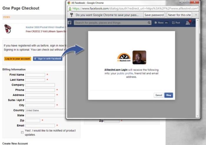
Unfortunately, getting Facebook login for Shopify always involves paying a monthly fee for a third-party app. This is a less reliable solution because the Facebook connection is built by a different company rather than directly between Facebook and your Shopify store. The monthly fee means you'd also end up paying more, in the long run, than you would if you'd paid a one-time fee. Remember that you'd have to commit to using the app for the lifetime of your business.
Display Shipping Costs Up Front
Display your shipping costs up front by including a shipping calculator at the beginning of the checkout process.
Surprises aren't good for conversions. The majority of abandoned carts are due to shock over shipping costs. If your customer selects a product that's listed for $25 and costs add up to $40 with taxes and shipping, they'll change their mind.
On your "view cart" page, make sure real-time shipping costs are visible. This will eliminate the sudden surprise the customer experiences at the end of an order.
Besides being transparent about your shipping costs, consider adding free shipping once shoppers spend a certain amount of money. As customers add items to their shopping cart, they're reminded how much more they need to add to their cart to meet the threshold.
Simplify the Checkout Process
The average checkout process has 14.88 fields — this is twice as many as necessary. 21% of consumers have abandoned online orders due to a complicated checkout process.
A customer who adds an item to their cart is ready to buy something — their mind is made up, so don't give them a chance to change it. If you have a lengthy checkout process, your conversion rates will suffer. The more unneeded steps you eliminate, the more money you'll make.
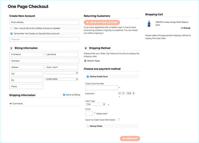
Ask yourself what information you truly need from each customer. Sure, you need their name, but do you need to ask for it multiple times? If they have to type their name to process their payment information, make it easy for them to fill out shipping fields. They should be able to check a box stating that their shipping and billing addresses are the same.
However, sometimes you do need an extra field or two, specifically if your business requires extra information at checkout to fulfill orders properly. Or maybe you just want to give customers the option to add a gift message if they're ordering for someone else. You can't adjust checkout fields on Shopify without Shopify Plus.
Show Trust Symbols
Your customers put a lot of faith in you as a retailer when they decide to make a purchase. They're about to give you their personal and financial information, and they want reassurance that their personal data is secure.
If you have unnecessary steps in your process, you may spook potential customers. You must show them that they shouldn't fear shopping with you by displaying trust symbols.
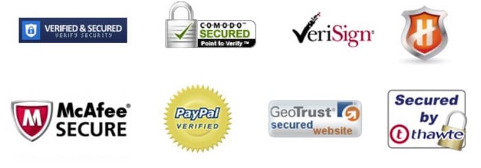
Display well-known security logos for the securities you offer, such as McAfee Secure or VeriSign Secured.
Also, make sure you have a valid SSL certificate. If you don't, your customers will see a warning message from their browser, alerting them that their connection may not be secure.
Incorporate Cart Abandonment Emails
If someone makes it to the end of your checkout process but doesn't complete it, you likely have their email address.
Take the time to capture these email addresses and set up an autoresponder sequence to notify customers that they've left items in their cart. Your initial email should be followed up by two additional emails spread out over the next day.
In the email, show them the item they've left behind, and include a call-to-action that encourages them to return to your website and complete the purchase. Consider offering a promo code in the email to provoke a sale.
Increase Conversions with a More Flexible eCommerce Platform
You now know how essential it is to have control over your website's checkout pages and process. With a basic Shopify plan, you're stuck with basic checkout and almost no customization options.
If you use Shopify, you're already at a disadvantage because of Shopify's limitations on promotions. There are severe restrictions on how you can run a promotion with Shopify, which might already be affecting your business plans. Being unable to customize your checkout (without paying $2,000 per month) makes it even worse, and makes your store even more forgettable.
Pick a platform that offers flexibility in promotions and a wide range of options for customizing each page of the checkout process. Before setting up your store, check out the limitations of the platform you're considering, and make sure they allow features we've discussed, such as custom styles, custom form fields, one-page checkout, and more.
With a flexible eCommerce platform like Shift4Shop, you can customize your checkout pages to fit your business. If the standard tools aren't enough, you can explore custom development with programmers trained to create the features, functions, and tools necessary to take your online store to a new level. However, Shift4Shop's checkout is already so much more advanced than Shopify's that you might be surprised at how much you can do.
If you're looking to grow your online business, you can do so with Shift4Shop's built-in features and an SEO-ready online store.





Leave a reply or comment below