In ecommerce, your goal as a marketer is to both convert new visitors, as well as drive frequency of purchases from repeat buyers.
And as you likely already know, owning a direct email relationship with your leads and customers is critical in achieving these goals. Increasingly, you’re likely seeing more and more websites using popups to capture leads and display promo codes.
Why is this trend coming back so quickly? Because it works, and it works really really well. There’s really three types of email capture popups:
- Sign-up campaigns. This is a simple “join our email list popup” that may mention the subscriber can expect specials, offers and announcements, but refrains from using a specific offer to incentivize the subscription.
- Offer campaigns. Just like it sounds, an offer backed-popup uses the promise of a specific promo code or coupon, after the visitor signs up.
- Sweepstakes campaigns. This is more of a “enter to win” type giveaway. Where at the end of the campaign schedule, a winner, or group of winners will randomly be selected.
Depending on your brand, margins and campaign goals, one or all of these popup types could be worth exploring. We looked at 100 million data points around popup conversions by content type, and found the following.
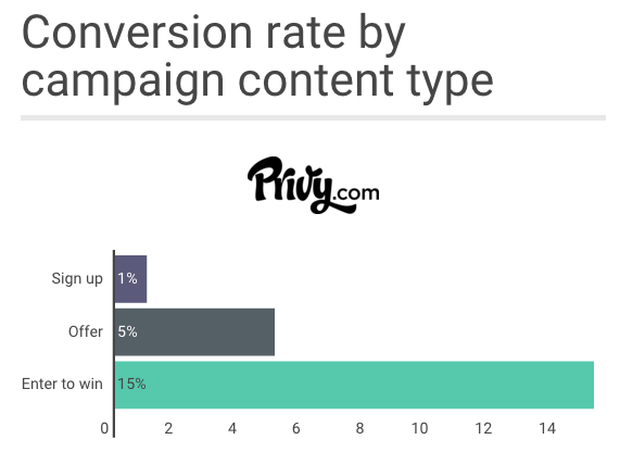
Clearly, sweepstakes driven popups offer the most incentive to join and convert at 15%, followed by offers which convert 5%, then sign up campaigns which convert at 1%. Clearly, the higher the incentive, the higher the conversion rate.
For most businesses, sweepstakes don’t make sense, so it’s best to focus on targeted offer campaigns. After analyzing hundreds of millions of data points from email capture campaigns, here’s our recommendation for high performing, targeted popup campaigns for ecommerce sites:
Welcome Offer
Have a nice, branded popup that you target to first time visitors, offering them a small promo code in exchange for joining your list. It’s important that this looks great on desktop as well as mobile. It’s fine for the desktop version to use nice images and your logo, but just be sure the popup loads quickly on mobile. Having a simplified mobile version of the campaign is also a good idea.
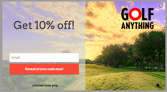
Desktop welcome offer.
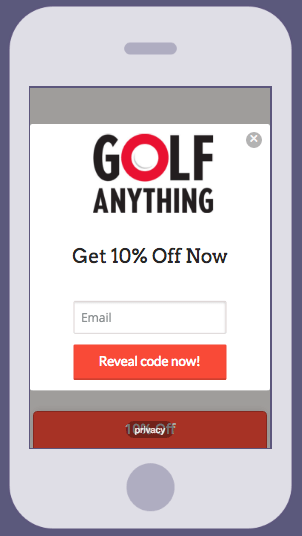
Mobile version of the welcome offer. This site used an welcome offer to convert over 10% of first time traffic to the site. The shape of the mobile popup is 350 pixels wide by 400 pixels tall.
Abandoned Cart Offer
Most ecommerce marketers have abandoned cart emails configured, and that’s great. But that only works in scenarios where you have the customers email and they are abandoning cart. What if it’s a first time visitor, and you haven’t yet captured the lead?
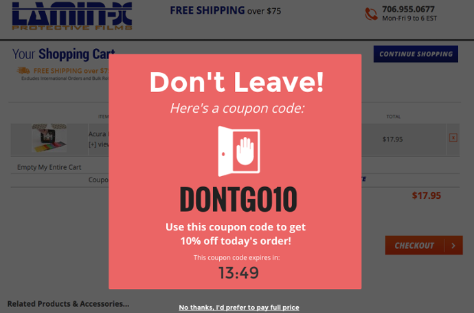
Have a second, targeted offer that displays to visitors who have added a product to their cart but are “leaving” the site before completing a purchase.
In this scenario, you’ll want to be sure you can capture their attention with a simple popup promising an offer they can use immediately if they complete the purchase. Since they could be exiting your site quickly, you’ll want this popup design to be quite simple, and stay away from high resolution images. This sort of offer backed popup will help you reduce your cart abandonment rate significantly.
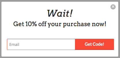
Abandoned cart offer. This site used an abandoned cart offer to convert over 15% of users not completing the purchase funnel.
Here is some additional data around designing and targeting your campaigns to help you grow your email list faster.
Popup, Banner, or Bar? The Impact of Display Type on Email List Growth
Marketers love to A/B test campaign creative, yet for the most part the tests are restricted to a single display type. We looked across the three most popular form display types to examine which performs best. First let's understand each display type:
- Popup: Likely does not need explanation. Popups, also known as lightboxes, typically display in the center of the website, or sometimes as "fly outs" in the corner.

- Bar: A full width bar that typically sits either on top of your site, or at the bottom.

- Banner: A more subtle interaction that sits at the top or bottom of a site, but starts in a "hidden" state until triggered, then rolls into sight.

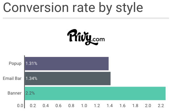
The banner style outperforms both the popup and email bar. It's easy for site visitors to get frustrated by a popup, and immediately close it down. We've also noticed that email bars are perhaps a bit too subtle, and it's easy for visitors to glance over them entirely, similarly to a traditional embedded form.
Display Triggers: Timers, Exit Intent, and Tabs
These days, you can use a spattering of different triggers to determine when a visitors sees your list growth campaign. We looked at the three most popular campaign triggers, to understand how each trigger impacts conversions. Let's first understand how each trigger works:
- Timer: The time trigger simply enables you to determine when to display your campaign, based on how long a visitor has been on your site. It could show immediately when a visitor lands, 10 seconds later, etc.
- Exit intent: This trigger is growing in popularity. Exit intent tracks your visitors mouse movement, and if the visitor appears to be leaving or "exiting" your site, you can use that as a trigger for your campaign.
- Tabs: Tabs, or other visual calls to action can be customized to fit in with your site layout, and when clicked, trigger your campaign to display.
![]()

Though time based, and exit-intent campaigns are most frequently used, the conversion rate of tab triggered campaigns is orders of magnitude higher than the other, "automatic" triggers. We certainly expected that the intent behind a site visitor proactively clicking on a visual cue would lead to higher conversion rates, but we never realized how much more impactful that could be. In an ideal scenario, you're using several of these triggers in conjunction with one another to maximize your opt-in rate.
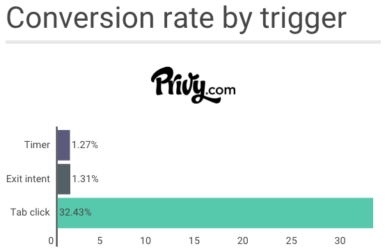
Note that this conversion rate is measured based on campaign views resulting in signups by initial trigger, not total site traffic resulting in signups.
Exit intent:
Timer:
All in all, targeted popups that demonstrate your understanding of visitor behavior, can really help you grow your customer list and drive revenue.


Leave a reply or comment below