The quality of your subscriber list is not rooted in the number of emails in your database –it’s only as valuable as the quality of subscribers you have.
After all, what’s the point of having a massive email list that doesn’t engage with your brand or become a (hopefully, recurring) customer? You’re just paying to send emails to indifferent inboxes.
As a marketer you’ve probably realized that treating each subscriber and customer as an individual leads to greater success. Gaining their email address in the first place should be just as much of a personalized experience as well.
You’re working hard to attract traffic to your site, so of course you don’t want to lose those visitors – perhaps you’ve considered using a popup to grab their email address before they exit the site. But by optimizing these opt-in forms, you can continue growing your list just as rapidly, while ensuring more high-intent subscribers are being added.
Design your forms as customer touch points
There are a few different form types you can use on your site, and if it makes sense for your brand, you can use a few simultaneously for maximum results. By triggering various display types at different times and locations on your site, you can be sure you are engaging with site visitors at different points in their shopping journey.
What works best for your brand will depend on your unique customers, but by aligning appropriate, specific, opportunities to sign up throughout their journey, you can increase the likelihood that quality leads will opt-in.
Think about your traffic flow, from how visitors got to your site to what they are doing on each page.
If a first-time customer lands on your homepage from a Facebook ad, you may want to welcome them with a subtle banner that gives them a first opportunity to sign ups for exclusive deals and discounts.

A visitor adding products to their cart could be very different than someone spending time reading your blog. Treat them individually with different opportunities to signup – perhaps with a free shipping bar for the shopper, or a box that pops up after the blog reader has scrolled through 50% of the page.
Both visitors have different behaviors, yet both are expressing interest in your brand. By taking care to target each individually, you’ll ideally be adding both types of high-intent subscribers to your email list, and have an opportunity to communicate with their specific interests and needs going forward.
Don’t bombard visitors though. Use your discretion to only display forms where they really offer value. Users who are truly interested will opt-in, and you only want interested subscribers after all.
Craft messaging to incite action
There’s a fine line here though, between not bombarding your visitors and not being pointed enough. No matter which form type you are using, concise writing, a clean design, and an effective call to action will increase the number of viewers who do actually opt-in.
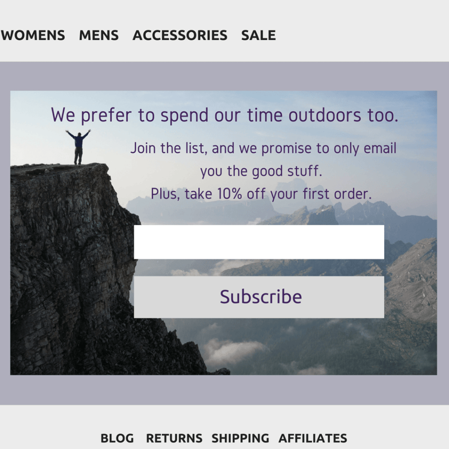
On top of using action-inducing phrases, clearly defining the benefit of signing up to receive emails can make or break a sign up. You can incentivize a sign up by offering a coupon, exclusive content, or other benefits in exchange for signing up. But often times, just letting subscribers know what they will be receiving, and how often, is enough for them to trust your brand and opt-in.

Another way to incite a signup is by showing visitors just how relevant your emails will be to them. This is where it doesn’t hurt to get specific when designing your email collection campaigns. By using detected attributes, such as the traffic source or geographic location of your traffic, you can tailor messaging to those unique segments.
For example, a customer arriving on your site from an Instagram ad for your new luggage sets might be keen to sign up for emails to receive your Millennials Guide to Travelling the World newsletter series.
Or, if a visitor is returning to your site for a 15th time and still hasn’t signed up for emails or purchased, mix things up a bit by displaying a discount on their first purchase in exchange for their email address. Or, maybe tell them they’ll be the first to know of sales if they join your subscriber list.
Especially in e-commerce, growing a list of high-intent customers is incredibly attainable when you take these few simple steps to optimize your signup opportunities. Don’t be afraid to get really specific when designing your opt-in forms as customer touch points. Try out a few targeted approaches, then consider AB testing to maximize performance for your site’s visitors.
This is a guest post from Privy. Privy’s email list growth platform allows you to focus on design and create on-brand experiences, integrates directly with 3d Cart, and is just as simple and code free to use.


Leave a reply or comment below