


Is your online business experiencing low conversion rates, abandoned carts, and poor sales figures? Rather than putting more money into ads in an effort to generate leads, chances are that you could optimize your website’s performance by redesigning it with UX in mind.
UX stands for user experience. It’s the design discipline that focuses not just on the outward appearance of a thing or its end purpose, but on the actual experience of using it. UX design for websites is geared toward ease of use and facilitating a frictionless browsing experience.
In the world of eCommerce, a well-thought-out user experience can mean the difference between visitors bouncing on the landing page and continuing through the customer journey to make a purchase.
The point at which a visitor decides whether to leave or remain on a website is referred to in the field as the “moment of truth”. There are many of these moments of truth, or key customer decisions, in a typical eCommerce customer journey. They include adding an item to your basket, clicking the checkout button, subscribing to a mailing list, and, most important of all, finalizing a purchase.
In this article, we’ll be looking at seven ways you can enhance your website’s UX to achieve more of these moments of truth.
1. Have a Search Bar on Your Landing Page
If your eCommerce website is underperforming, your landing page should be at the top of your list of considerations when thinking about the user experience. As the first thing visitors see when they arrive on your site, landing page design is critical. Choosing whether or not to continue past the landing page and start browsing is itself a moment of truth.
The best landing pages are uncluttered and make forward navigation clear and easy. Rather than offering a detailed sitemap straight away, many websites opt to make a search bar one of the main features of their landing page.
In addition to the visibility of the search feature, the design of your search function itself is key. There is no point in drawing attention to a search bar that doesn’t return useful results.
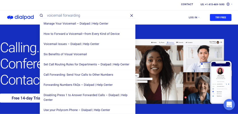
A good example is the dialpad.com landing page, which features a small but prominent magnifying glass icon that expands to a full search bar when hovered over with the cursor. It’s eye-catching enough to be obvious for those who need it, but doesn’t distract from the important ‘free trial’ and ‘pricing option’ calls to action.
What’s more, the dialpad.com site search provides an intelligent prediction and suggestion feature. For example, entering the term “voicemail forwarding” offers several useful links including one to their how to forward a voicemail blog entry, without having to navigate through multiple pages.
2. Add a Similar Items Panel
In the previous example, the website in question was designed largely to provide information and sell Dialpad’s main products, namely PBX and VoIP telephone services. But for some online retailers, their range of products might number in the thousands.
To help customers find exactly what they’re looking for, many websites now include a “similar items” or “suggested for you” section as part of their product pages.
Recommendation panels are especially effective at creating moments of truth for undecided or “just browsing” type visitors. These are potential customers who may have stumbled across your website by chance or because an ad caught their attention. They don’t have a specific product in mind, but have already been convinced to navigate beyond the landing page and peruse your products.
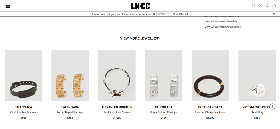
Smart suggestions can be based on previous buyer data such as the “frequently bought together” format popularized by Amazon. They can also show products that belong to the same category, such as LNCC’s “view more” panels demonstrated below.
3. Design for Browser and Mobile UX
The COVID-19 pandemic has seen the global normalization of a new employment paradigm that allows people to work from anywhere thanks to a suite of digital communication tools.
Alongside the new remote working norms, a whole host of other activities that were previously welded to specific physical and psychological spaces have been distributed across a wider range of instances.
Whereas online shopping might have once been an activity reserved for the comfort of our own homes, in 2015, mobile eCommerce traffic matched desktop browsing for the first time, and this trend has continued ever since.
With mobile shoppers now making up more than half of visitors to eCommerce websites, there’s no excuse for neglecting design for mobile browsers in your UX considerations. Yet, although the majority of browsing is done from a mobile device, most of us still prefer to make the final purchase from a computer.
The modern customer journey might involve visiting different versions of a website, so you want to make the experience of switching between these as seamless as possible. Ensure uniformity across viewing modes by enforcing graphic design principles and clear branding.
Knowing the variety of screen sizes and dimensions, your website should be programmed to intuitively adapt to whatever device it’s being viewed on to provide the most user-friendly experience. This type of design is referred to as responsive design, due to the responsive nature of the website and its elements.
Your web design should also be tap-friendly, making sure all buttons and links have the appropriate size and margin to prevent frustration.
Since mobile websites are usually viewed on the go and on much smaller screens, remember that visual content such as graphics and videos will be more impactful than lengthy text.
4. Make Options and Availability Clear
Have you ever left a website because of an irritating pop-up or banner? Customers can be easily put off if they find a website annoying or if their smooth experience of it is somehow inhibited. Guide visitors toward purchasing by avoiding these points of frustration.
There are few things more frustrating to the user experience than deciding on a product you wish to purchase, only to discover at selection that it’s out of stock. Avoid this by clearly labeling when things are sold out and making it easy to see which options are available.
In the above example, taken from hellomolly.com, simply hovering over a product thumbnail reveals which sizes are available. This makes for an effortless browsing experience, uninterrupted by unnecessary clicks or the disappointment of discovering the variation you want is out of stock.
5. Take Advantage of Personalization
These days, learning to ignore digital distractions is one of the most important time management strategies people are using. While this is good news for productivity, it can make digital marketing a challenge. That’s where personalization comes into play.
Browser cookies are an eCommerce retailer’s best friend. Not only do they allow you to direct targeted ads by showing leads products they’ve already looked at after they leave your website, but you can use them to personalize each individual user experience.
A great way to personalize your store’s UX is to adjust the site’s navigation to suit each visitor. Cookies can allow the site to remember what someone was looking at on a previous visit. They can then be coaxed back toward that page by dynamically adjusting the navigation options when they return.

When developing your personalization strategy, keep in mind that privacy concerns and a public reaction against overzealous web tracking have already drastically changed the way cookies are used, with more changes likely on the way. The EU’s GDPR had a massive role to play in this shift, and with Google now phasing out third-party cookies, the changes we’ve seen there are likely to be instituted on a global scale.
The good news is that this cookieless future doesn’t have to spell an end to website personalization – it just means the focus will shift to first-party data. In the nascent model, customer engagement is the new currency of personalization, and collecting customer details through contact forms and user accounts is more important than ever.
6. Implement Live Chat
A critical moment of truth is when a potential customer has some hesitations about a product and seeks further information or reassurance.
For fashion retailers, something as simple as listing what size the model pictured is wearing can be enough to assuage any doubts and encourage a purchase. But more complex concerns might require a more in-depth response.
If visitors to your website have questions they can’t immediately find an answer to on the product page, they may decide to get in touch with their query. Alongside having a dedicated customer support team and running a comprehensive call center QA program, implementing live chat on your site is one of the best ways to make this process as easy and simple as possible.

Live chat is a web-based form of communication that allows you and your website visitors to chat in real-time. There is a range of tools and website plug-ins available to help you deliver this on your website.
A live chat function allows your customer support staff to double up as salespeople and respond to questions in a way that can boost conversions. And because there’s no time delay with live chat as there is with email, you can use it to convert website visitors while the product is still at the front of their minds.
7. Streamline Your Checkout Process
Checkout is the ultimate moment of truth in most customer journeys. Generally speaking, the easier it is for people to make a payment, the more likely they are to do so. If your checkout process has unnecessary hurdles to finalizing the transaction, it’s likely to be losing you sales.
When Asos removed the need to sign in or create an account to purchase in 2011, they saw cart abandonment decrease by 50%. That’s not to say there aren’t advantages to asking your customers to create an account, but it should be an option, not a necessity.
Accepting payment through PayPal and taking advantage of automatic sign-up procedures available from Facebook, Google, and others can reduce transaction stages to a couple of clicks. Alongside ensuring all your forms are optimized for auto-fill, these design considerations can drastically streamline your check-out.
On the topic of forms, it’s a good idea to place the labels above or in front of the entry boxes rather than in them. In-form labels disappear when the customer starts to enter their information, meaning that if something distracts them, they might forget what they were meant to be entering and have to start again.
Don’t forget to A/B test any changes you make to your checkout procedure to keep track of which ones work well. Be vigilant when it comes to quality control too. A buggy or glitchy checkout may arise unexpectedly during development but can be a catastrophe for your website’s UX.
Making things easy for leads is just as essential as having as many leads as possible. If you’re not happy with the number of leads you’re getting, you can consider buying leads. Doing so might boost sales and increase your revenue.
Conclusion
By implementing the seven tips we’ve shared, you can catch customers at those key decision-making points in the customer journey and turn them into conversions. Are you ready to improve your conversion optimization strategy with these UX-focused tips?


Leave a reply or comment below