
There has never been a better time for mobile eCommerce. You can now shop the latest UK fashions while sitting in the US, or order lunch via Uber Eats while stuck at the office. Mobile is increasingly the preferred touchpoint shoppers have with a retailer. At the same time, eCommerce companies are reaping major rewards on the mobile side. It’s a win-win.
If your eCommerce company offers a mobile app to customers, you’ve picked the perfect time to take advantage of this opportunity for your brand. But with thousands of eCommerce mobile apps vying for consumers’ attention, you need to stay one step ahead of your competitors and attract more users to install and engage with your app. In this competitive market, throwing darts at a wall and seeing what sticks won’t cut it. You need to build a mobile app strategy that gets results.
Let’s take a look at four key tactics that you can use to boost the growth of your eCommerce mobile app in 2019:
#1 Get to Know Your Customers
Above all, the first thing that any eCommerce company should do is invest time in getting to know their customers well. This means having a clear understanding of them — who they are, how they think, and what challenges they’re facing — and then relating that to the solutions their eCommerce app can offer. Many eCommerce companies don’t take the time to nail down their personas, but it’s a mistake that can cost much more in the long run.
In an interesting article on the importance of creating personas for your app users, Hannah Levenson, of the mobile analytics company Appsee, shares the following insight:
“You have to know a lot about your users, such as their intrinsic needs, desires, opinions and so much more. Creating user personas is one of the greatest ways for you to achieve that knowledge and ultimately fortify your app’s user experience. … The ultimate objective of creating user personas is for you and your team to have quick and crystal-clear representations of who you will be building relationships with.”
You have to know who you’re building your product for before you start building. It only makes sense. Otherwise, you’re going in rather blindly, and that’s not bound to result in anything good.
#2 Prioritize the User Experience
The user experience is where most eCommerce apps go wrong. Despite knowing that a cluttered interface and a buggy checkout process won’t entice people to come back, companies still offer a poor user experience and assume it’s good enough. It’s not.
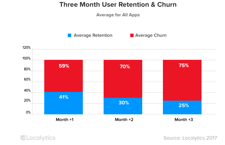
The app retention numbers for eCommerce and retail apps bear this out. According to Localytics, 59% of users ditch apps one month after downloading. By three months, that number grows to 75%.
That's why it’s crucial that your company’s eCommerce app is easy — and fun — to use. Ultimately, it should be pleasurable to use all around.
Aaron Walter’s pyramid of design is a great starting point while conceptualizing app design and UX. The pyramid is a revamped version of Maslow’s Hierarchy of Needs translated over to interface design concepts.

Nick Babich, a User Experience Expert, explains why pleasure should be at the top of design thinking. He says:
“Designing for the user experience has a lot more to it than making a product usable. After all, user experience is about how users feel when they interact with a product. By focusing on creating good aesthetics, designers show users that they care.”
Here’s a list of “rules” to ensure that your mobile app elevates the user experience:
- Design for mobile, not for the web: There’s a reason people are using your app and not your website. Respect the medium and give them what they’re looking for.
- Invest in personalization: Personalized experiences are becoming the norm, and eCommerce is no exception. But there’s a proper way to inject personalization into your mobile app so that it doesn’t overwhelm (or creep out) the user.
- Use high-quality images to showcase products: Good images with clear zoom help users envision what they are buying. In the absence of high-quality images, users may go through mental fatigue and drop off instead of making a purchase.

- Remove barriers to browsing and buying: By ensuring that your app launches quickly, providing clear product descriptions, and making it easy to see shipping costs and other crucial info, you can take away barriers that might discourage a potential buyer.
- Simplify the checkout process: If you’ve ever found yourself stuck during checkout, you know how frustrating it can get. You don’t want to lose a customer who intended to buy something because the process is complicated or confusing. Apps should be designed to avoid friction and stir up positive feelings about your brand, not the other way around.
- Keep key functions within the thumb range: It’s simple: If you put key features and functionality out of easy reach, you sabotage your chances of converting.
#3 Invest In Technology
It’s official: consumers prefer mobile apps over mobile websites. Here’s the proof:

There are several reasons for this. Ease of use and flexibility are obvious ones, but one of the factors that stands out the most is the availability of “app-only” technological integrations that brands can play with. These can, in turn, boost engagement. Starbucks and Sephora are two awesome examples of brands that have used app-only integrations.
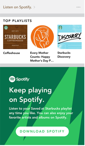
Apart from its generic eCommerce functionalities, the Starbucks app makes good use of integrations with other platforms and services. Not only can a user order and pay for their latte, but they can create a Spotify playlist within the app. In 2016, Starbucks launched yet another integration, this time with Lyft. Riders who connect their Starbucks rewards account with their Lyft account earn stars for each ride. First-time Lyft riders earn enough stars to get a free coffee.
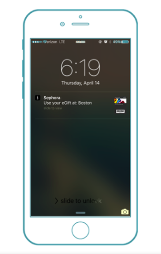
Geofencing is another smart tech tool for eCommerce companies, especially those that also have a brick-and-mortar setup. For example, Sephora uses geofencing to send push notifications whenever its app users pass one of their stores.
#4 Fix Your Content Flow
One of the biggest misses with eCommerce app development is poorly-connected content flow. Despite having an app, users are often taken to a web browser when they try to use a mobile device to open a link. This leads to bounce-offs and an unsatisfactory user experience that leaves a sour taste.
Instacart, the leading grocery delivery app, once faced a similar challenge. With over 70% of emails being opened and clicked through on mobile devices, it was crucial for them to ensure that their users were sent directly to the app if they clicked on a product within their newsletter.
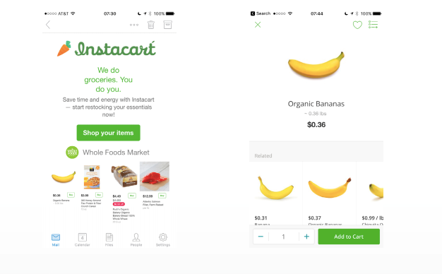
The company used a contextual deep-linking solution which increased its click-to-purchase rate from email sixfold, and also raised the app engagement rate from email to 30%.
#5 Polish Your Marketing
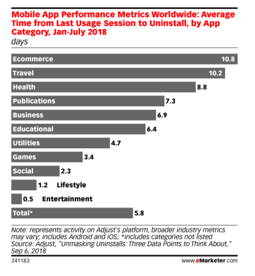
Marketing an eCommerce app can be a challenge, so instead of carefully crafting an app marketing strategy that will boost engagement, marketers often resort to shortcuts. Here’s a silver lining for marketers: A recent study by Adjust found that of all app categories, users kept eCommerce apps on their phones the longest before deleting — 10.8 days, compared to the average of 5.8 days.
App marketing may be a challenge, but it isn’t rocket science. By understanding the do’s and don'ts — and refusing to take shortcuts — you can successfully attract users to your eCommerce app.
Here are a few things to remember:
- Do optimize your app store listing. ASO is critical for your mobile app’s visibility — insert new keywords into your metadata, build a semantic dictionary and pick the right keywords.
- Don’t abuse push notifications. Instead, use them strategically — here’s an article that shows examples of this method done right.
- Do invest in email marketing — it delivers for a reason. If you have an email list tied to your eCommerce website, make use of it and tie it to your app as well.
#6 Keep Customers Engaged
Offering discounts and coupons is common practice in the eCommerce space. It’s an easy win for everyone! Brands can extend the same offers in-app that they would in-store — referrals, coupon codes, etc. These in-app engagement techniques keep customers coming back for more.
The best example of in-app referrals comes from Airbnb. The company always had a referral system in place, but people weren’t using it as they had hoped. Because word of mouth is a huge source of growth for Airbnb, they decided to bring referrals to their mobile app, encouraging people to invite their friends to the app. The sender and recipient both received $25 of travel credits to use at Airbnb when the invited user completed their first trip.

The end result? A massive increase in the service’s user signups and bookings by over 300% per day.
Wrapping It Up
Now’s the time to invest in mobile. If you want to see your eCommerce app grow this year, you need to be intentional about your app design and marketing.
These four key tactics can help you put together a winning mobile app strategy. What are the tactics that you’ve used to keep your eCommerce mobile app users coming back for more?
Share it with us in the comments below!


Leave a reply or comment below