The checkout process is the point of no return for eCommerce websites. Online shoppers can either breeze through checkout or get frustrated and leave your site entirely.
Since around 70% of people abandon their cart on average, mastering the eCommerce payment page is essential to ensuring a seamless customer experience.
Because the checkout experience is pivotal, you must implement strategies to mitigate cart abandonment. Businesses can maximize customer retention and sustained growth by addressing the factors contributing to this statistic.
In this blog post, we will explore the best practices for designing a seamless and user-friendly payment page that boosts conversions and enhances overall customer satisfaction.
1. Simplify the Form Fields
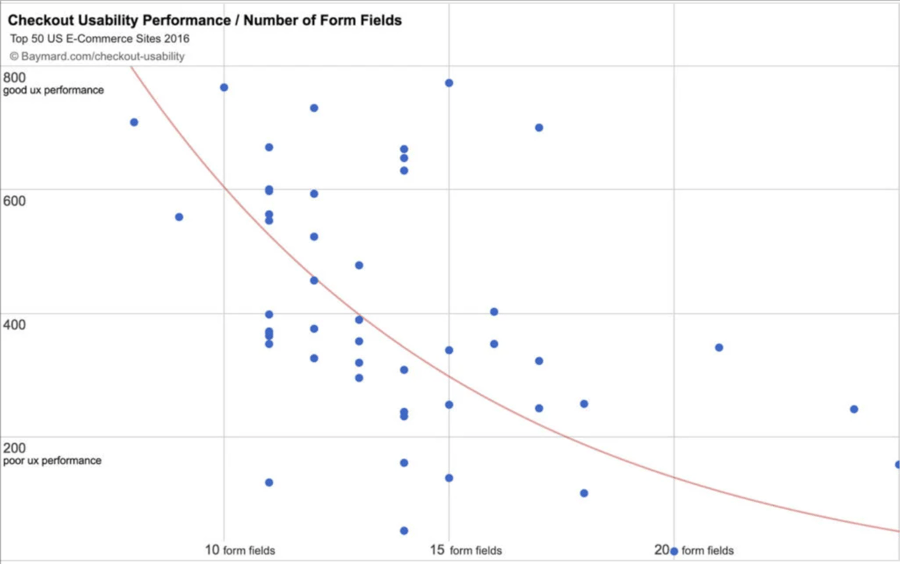
Simplified form fields are a critical component of any effective payment page, enhancing the overall user experience and potentially boosting sales.
Keeping things simple can significantly reduce friction in the checkout process, fostering a more streamlined and user-friendly journey. The key lies in only asking for information needed to complete a purchase, rather than overwhelming customers with a lengthy form.
On average, a fully optimized checkout flow can be distilled down to as few as 12 form elements and 7 form fields for the best performance.

Source: Drip
To optimize the form field in a checkout flow, stick to the basics:
- Name: Request only the customer's full name. Avoid additional titles or unnecessary details. Use a single field for the name to keep it straightforward.
- Shipping Address: Ask for the shipping address with a clear and concise form. Consider using auto-complete or address lookup services to speed up the process.
- Billing Address: Include an option for a billing address if it differs from the shipping address. Provide a checkbox to copy the shipping address to the billing address easily.
- Payment Method: Offer various payment options, but display them in a clean and organized manner. Use recognizable icons for credit/debit cards and other payment methods.
- Contact Information: Request a valid email address and phone number for order updates and communication. Clearly state the purpose of collecting contact information to build trust.
- Design and Layout: Arrange the form fields logically and in a user-friendly order. Use a clean, straightforward design with ample white space to avoid visual clutter. Group related fields together to create a cohesive and intuitive layout.
- Progressive Disclosure: Consider using progressive disclosure to show additional fields only when necessary. For example, show the billing address fields only if the user selects a different billing address.
- Error Handling: Implement real-time validation to catch errors as users input information. Provide clear and concise error messages with instructions on how to correct them.
- Mobile Optimization: Ensure the form is optimized for mobile users with larger touch-friendly buttons. Use responsive design to adapt the form layout to different screen sizes.
- User Testing: Conduct usability testing to get feedback from actual users. Identify any pain points or confusion in the form and make adjustments accordingly.
2. Guest Checkout
Recognizing the diverse preferences of online shoppers is paramount in optimizing the eCommerce checkout process. Not all customers are willing to create an account before completing a purchase.
To create a quicker and more straightforward experience, it is imperative to provide a guest checkout option. This approach significantly streamlines the process, allowing users to swiftly input the necessary information and finalize their transactions without creating an account.
Being forced to create an account is the second most common reason people abandon their carts during checkout. This data reinforces that a mandatory account creation step can be a significant deterrent, causing potential customers to abandon their purchase altogether.
3. Visual Progress Indicators
A visual progress bar can give customers an idea of where they are in the checkout process and how long it will take to complete the process. This makes the checkout process simple and keeps the customer engaged because they can see how much longer it will take.

Source: PageFly
These steps could include:
- Cart review
- Shipping information
- Payment details
- Order confirmation
Ensuring your checkout process is straightforward is one of the most effective ways to reduce cart abandonment.
4. Responsive Design
Your eCommerce checkout page is the bridge between visitor and customer. If your eCommerce store doesn’t have a responsive design, you’re turning mobile customers away. To ensure your checkout page is mobile-friendly, you want to focus on a few things.
First, you want to make sure your payment page is optimized for speed. If a page takes more than three seconds to load, 57% of shoppers will abandon it.
You also want to ensure the payment page is optimized for mobile devices. You can use Google's mobile-friendly test to ensure the speed of your checkout page.
Lastly, your navigation should be smooth and easy to comprehend for the average customer.
5. Multiple Payment Options
Offering different payment options is an effective way to cater to customer's needs. Because most shoppers have preferences when it comes to payment methods, allowing customers to use their preferred payment method can reduce cart abandonment. This works because 40% of shoppers abandon purchases if they do not have a choice of payment methods online.
Offering more payment options, such as credit cards, debit cards, digital wallets, and other popular payment methods, can make your eCommerce business more accommodating — resulting in more sales.
This aligns with the principle of customer-centricity and is a practical means of increasing the likelihood of completing a purchase.
6. Security Assurance
Establishing trust is paramount in the online shopping experience. One effective way to achieve this is by prominently displaying security seals and disclosing how sensitive customer data is handled. In a digital landscape where privacy and security concerns are prevalent, transparency regarding the protection of sensitive data is crucial for alleviating customer apprehensions and encouraging them to proceed with confidence.
One study from CXL found that 98% of respondents make online purchases at least once per week. However, it's noteworthy that nearly half of these frequent online shoppers express concerns about security at least half the time.
This data underscores the pervasive nature of security apprehensions among consumers, highlighting the need for eCommerce websites to address and alleviate these concerns.
Prominently displaying security badges, SSL (Secure Socket Layer) certificates, and other trust indicators on the payment page communicates a commitment to safeguarding customer information.
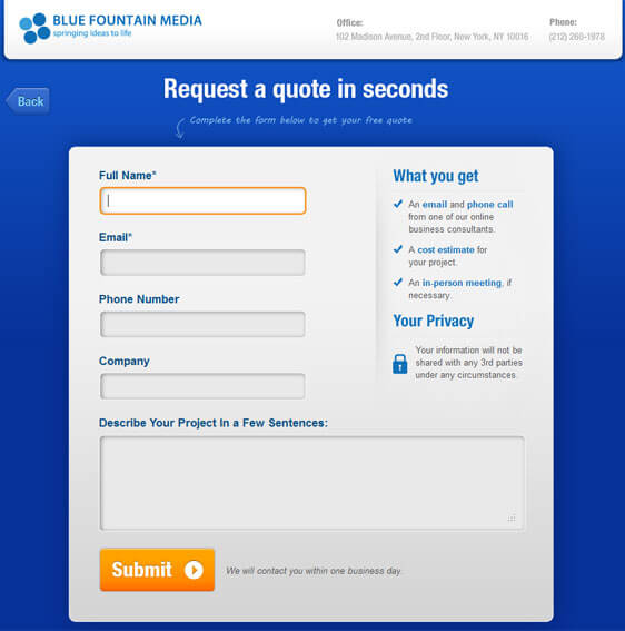
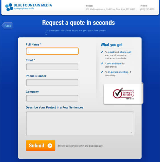
Furthermore, Blue Fountain Media conducted a study where they didn’t make the VeriSign trust badge on their signup list visible. Then, they tested it again with the trust badge visible, and the results are as follows.
Below is the page they tested first, which included no trust badges.

Source: CrazyEgg
Now, below is the second page they tried. As you can see, the VeriSign trust badge is visible.

Source: CrazyEgg
After examining the sales data, Blue Fountain Media noticed a 42% increase in sales after simply placing the trust badge on their signup list.
7. Real-Time Validation
Implementing real-time validation for form fields, especially when inputting payment information, is a crucial step in enhancing the user experience and reducing friction in the checkout process. Additionally, this will help prevent spam form submissions and add another level of security.
Real-time validation instantly checks the accuracy of the information users enter and provides immediate feedback and guidance. This proactive approach prevents users from submitting incorrect information and eliminates the need for them to go back and correct errors, significantly improving the overall user experience.
Approximately 87% of online consumers will likely abandon their cart if they encounter a complex or frustrating checkout process. Real-time validation directly addresses this concern by offering a seamless and error-free interaction during the crucial stage of inputting payment information.
8. Transparent Pricing
Transparent pricing is fundamental to creating a positive and trustworthy eCommerce experience. Displaying the total cost, including taxes and shipping costs, upfront without any last-minute fees is essential for ensuring that customers make informed decisions during the final stages of checkout.
The impact of surprise charges on cart abandonment is a significant concern for online retailers, emphasizing the importance of clear and honest pricing strategies.
Approximately 60% of online shoppers cite surprise fees as a primary reason for abandoning their carts. This underscores the critical role that transparent pricing plays in retaining customers and facilitating successful transactions.
When the total cost is prominently displayed early in the checkout process, customers feel more in control and confident about their purchase decisions. Transparent pricing builds trust by demonstrating a commitment to openness and honesty. It establishes a positive perception of the brand, indicating that the business values the customer's trust and is dedicated to providing a straightforward shopping experience.
9. One-Click Checkout
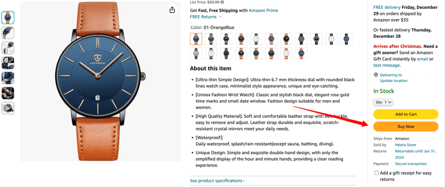
Integrating one-click checkout options for returning customers is a strategic move that streamlines the purchasing process and enhances the overall checkout experience, fostering customer loyalty and encouraging repeat business.
Recognizing that returning customers have already provided their information in previous transactions, this feature eliminates the need for redundant data entry, reducing friction and saving valuable time.
One-click checkout has proven to be highly effective and boosts conversion rates.

Amazon, a pioneer in implementing this feature with their patented "1-Click" ordering, reported a substantial increase in sales attributable to the convenience of streamlined one-page checkout instead of multi-page checkouts for returning customers. Amazon's one-click ordering system was estimated to have boosted their sales by as much as 5%.
The convenience of one-click checkout is rooted in its simplicity. Returning customers, having already established trust with the platform, can finalize their purchases with just a single click, bypassing the traditional multi-step checkout process.
Securely storing customer information and payment details expedites the transaction for loyal customers and creates a hassle-free experience. If customers close a page, their data is still saved, so they can come back and buy again with one click.
10. Post-Purchase Confirmation
Ensuring a positive post-purchase experience is crucial in facilitating a smooth checkout process. After a customer completes a purchase, it is essential to provide a confirmation message. This confirmation is a valuable communication strategy, offering reassurance to customers and setting the stage for a positive post-purchase journey.
A well-crafted confirmation message should include comprehensive order details, ensuring customers have a record of their purchase for future reference. This includes purchased products, quantities, prices, confirmation numbers, and applicable discounts or promotions.
Including estimated delivery dates is another critical element. This proactive communication manages expectations and adds a layer of anticipation, enhancing the overall post-purchase experience. Customers appreciate knowing when to expect their items, and clear delivery information like tracking numbers can help build trust and satisfaction.
Additionally, you can include post-purchase emails, promotions, and promo codes. More than 82% of consumers are highly motivated to buy again when they receive post-purchase coupons, discounts, or enrollment in a loyalty program.
A marketing and promotional email tool can be used to send these emails. Then, marketing data platforms can be used to examine the data.
Furthermore, if you're selling high-ticket products and someone has abandoned a cart, you can follow up by sending a cold email with cold email software to offer them a promotion.
Moving Forward with a Better Payment Page
Mastering the eCommerce payment page is a continuous process that requires ongoing testing and optimization.
By implementing these best practices, you can create a seamless and user-friendly checkout experience that boosts conversions and fosters customer loyalty. You can check your eCommerce platform’s reports and see your progress.
Stay attuned to user feedback and industry trends to ensure your payment page remains a key asset to your eCommerce success.


Leave a reply or comment below