
Ecommerce owners typically focus on the design and interface of their websites to encourage customers to move down the purchase funnel. However, the eCommerce checkout process is ultimately where visitors will convert.
The eCommerce checkout process refers to the steps a customer will take to fill a shopping cart and complete its purchase. A good checkout process will have a clear flow and enable seamless buying with minimal friction.
Buyers with intent may enter the checkout flow but may not complete their purchase if it’s cumbersome or slow. Small UX design errors could lead to cart abandonment and consequently, a loss of sales.
Did you know that the average online shopping cart abandonment rate is 69.8%?
While a large amount of cart abandonment occurs because people were simply window-shopping or saving items for later, a study of the other reasons for abandonment is insightful. It offers clear indicators as to why customers are leaving.
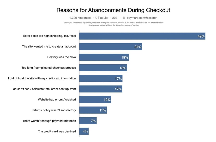 Source: Baymard
Furthermore, Baymard Institute estimates that eCommerce websites can increase conversions by 35.26% solely by improving checkout flow and design. This rate translates to lost orders worth $260 billion.
Thus, you should optimize your checkout process as much as possible to recover the revenue your business needs to grow and succeed.
8 Tips to Optimize your Checkout Flow
You must give your customers all the information they need during the checkout process to reduce your cart abandonment rates and boost sales.
Let’s look at eight ways you can optimize your checkout process:
1. Offer multiple payment options.
A direct obstacle to completing the checkout process is not having adequate payment options available. Provide as many payment options as possible to give your customers the flexibility to pay at their convenience.
Since it is expensive to set up multiple payment options, prioritize the most popular payment methods. This will allow you to capture more sales.
The three most preferred global eCommerce payment methods are digital/mobile wallet (44.5%), credit card (22.8%), and debit card (12.3%).
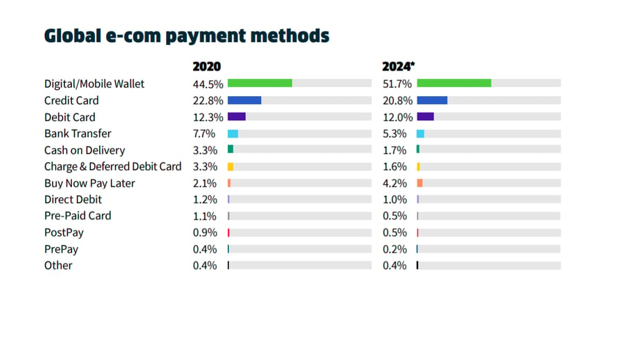
Source: The 2021 Global Payments Report by Worldpay
As you scale your business, you can expand the payment options available to customers to broaden your customer base.
Customers can be particular about the payment method they use. Many customers will use the best option available, but some will pay only via their preferred method.
A payment method that is becoming popular with younger, new-to-credit consumers is "buy now, pay later." Established eCommerce platforms like Shift4Shop offer buy now, pay later solutions like Sezzle, Klarna, Affirm, and PayPal Pay Later.
Customers can buy an item now and pay for it within a fixed interest-free period in three or more installments.
A recent study found that 51% of respondents used a buy now, pay later service during the COVID-19 pandemic. Ease of payment, flexibility, and lower interest rates were among the top three reasons for choosing buy now, pay later services.
The buy now, pay later global market share is 2.1% and is estimated to increase to 4.2% by 2024.
2. Optimize for mobile-friendly UX.
In 2021, 72.9% of all retail eCommerce is expected to be generated from mobile commerce (shopping through a mobile device). Your checkout page should be optimized for mobile usability, or else you’ll lose out on a large chunk of sales.
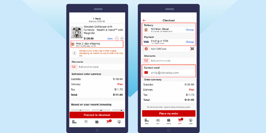
Source: CleverTap
Here are a few tips to help you optimize for mobile eCommerce:
- Ensure responsive design when creating your layout.
- CTA buttons and form fields should be tappable and have plenty of white space. You could make the CTA button sticky to aid navigation.
- Use collapsible menus that take up less space and minimize the amount of scrolling required.
- Use auto-fill wherever possible. Reduce the number of form fields because it is cumbersome to type on a mobile device.
- Place labels above each form field to provide context to customers as they type their information.
- Reduce the number of checkout steps and show checkout progress to help customers navigate easily.
- Use guest checkout to reduce the number of clicks a customer needs to make to buy from you.
- Offer mobile payment options or leverage device-specific capabilities like using the camera to scan payment cards and displaying the best keyboard to fill in forms.
- Ensure your checkout app remembers customer data to protect against browser crashes and unexpected page reloads.
- Alternatively, you can integrate error notifications to warn customers that they’re about to lose their data or they’ve entered incorrect information.
- Address security concerns by adding your contact details and trust badges to the checkout page.
3. Offer guest checkout.
Baymard shows that requiring customers to create an account (24%) is among the top three reasons for cart abandonment.
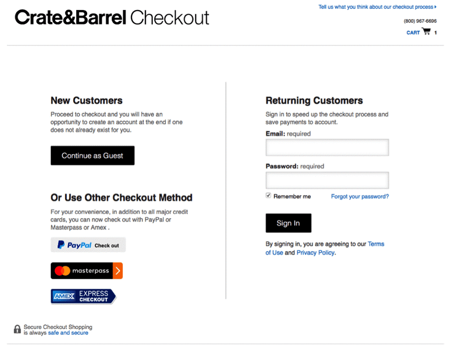
Source: UserZoom
The need to fill registration forms is a source of customer friction. Even though it is important to gain repeat customers and boost retention, you don’t want to discourage one-time shoppers from completing their purchases.
You can reach out to them later through email marketing and retargeting strategies.
Offer customers a guest checkout option so that they can input their email and continue with their purchase. The checkout process seems faster as they can move on to entering payment and shipping details.
Mobile users are 1.2 times more likely to choose guest checkout than log in to their accounts.
You can choose to give customers the option to create an account after checkout and incentivize them to do so with discounts or promo codes.
4. Avoid surprise costs and fees.
Extra costs like shipping, taxes, and fees are the top reason for cart abandonment.
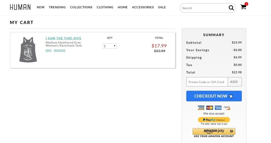
Source: Business 2 Community
Customers tend to leave when they find out about additional costs later when they’re about to complete the purchase. They may also second guess the value of their purchase.
Here are some tips to avoid putting off customers with surprise extra costs:
- Provide all details upfront — subtotal, shipping fees, taxes, and final order amount — directly on the shopping cart page.
- Offer free shipping wherever possible. If you do offer free shipping or fast delivery, display it prominently on every page of your eCommerce site.
- If you cannot offer free shipping, display dynamic shipping rates at the beginning of the checkout flow so customers are aware of extra costs.
5. Highlight security and trust signals.
17% of people abandoned a checkout flow because they didn’t trust the site with their credit card information.
To create a positive perception in the minds of customers, you should prominently display security badges and trust signals.
Customers are often driven by how “visually secure” the website looks, so displaying trust signals builds confidence in the eCommerce site’s security. You can also make the credit card area stand out by using contrasting shades.
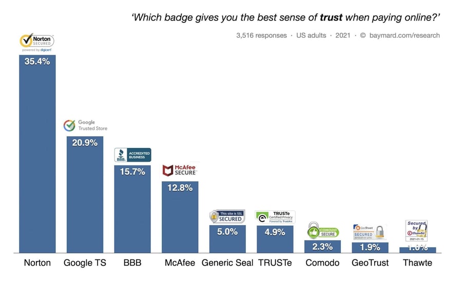
Source: Baymard
You can display three types of trust signals to assure your customers:
- SSL Seals: These are issued by SSL certificate vendors like Norton, Geotrust, Thawte, Trustwave, and Comodo to indicate that the connection between your browser and the eCommerce site is encrypted via the Secure Socket Layer (SSL) protocol. Thus, your site is technically secured and can handle sensitive information.
- Trust Badges: These are issued by a trusted third party like TRUSTe, Google, or BBB to indicate that your eCommerce site is legitimate.
- Visual Symbols: These are graphical symbols like “100% Money Back Guarantee” or “Secure Checkout” or padlocks to reinforce the perception that the eCommerce site is safe to use.
6. Simplify the checkout process
An unnecessarily long and complicated checkout process annoys customers and adds friction to the checkout flow. 18% of people abandon their carts because they found it inconvenient to complete a long checkout process.
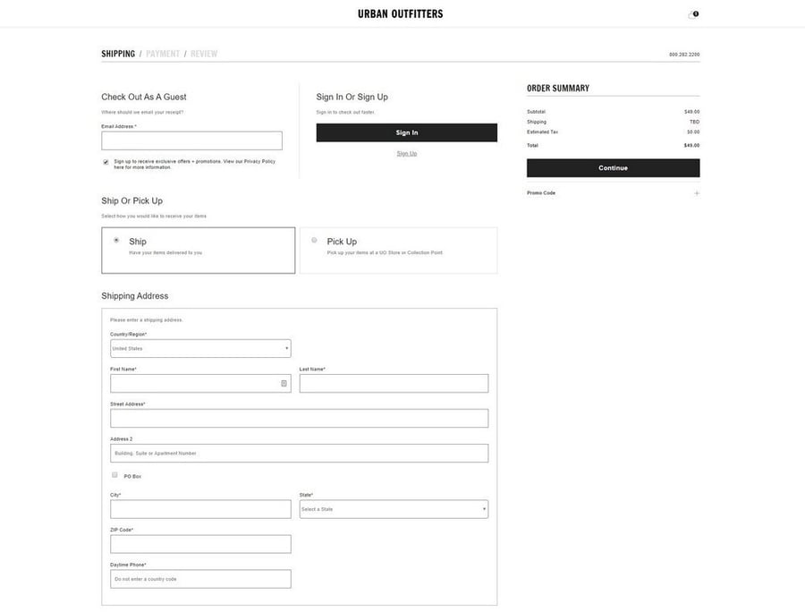
Source: Ecommerce Booth
Here are a few tips to make your checkout process quick and simple:
- Only include necessary custom fields. Eliminate extra steps as they add to the time the customer takes to input information.
- Use auto-fill forms to retrieve information stored in the browser or password manager.
- Use an address lookup service or address predictor tool to automatically find addresses and zip codes.
- Use an autofill feature for shipping and billing sections (if they’re the same) so the customer doesn’t have to enter it twice.
- Add a summary of cart details on the order confirmation page so customers can be reminded of which items they’ve ordered.
- Make the next steps, such as choosing the shipping method, self-explanatory.
- Save customer data so that repeat customers don’t have to input their information again.
- If you ask customers to create an account before or after checkout, ensure that your password requirements are not cumbersome.
- Prominently display CTAs on the checkout page and remove distractions in the header or footer.
- Use a progress indicator to guide checkout.
A clean design will keep customers on track to complete their purchases and prevent them from leaving before they’re done.
And while some platforms like Shift4Shop offer a single-page checkout by default, others like Magento will require you to install a One Step Checkout extension for Magento 2 stores to achieve the same functionality.
You can also consider adding an exit popup in order to convert abandoning visitors into email subscribers or paying customers without disrupting your visitors’ onsite experience.
7. Enable social sign-in.
Social sign-in is an alternative to registration and can make the checkout process easier for customers. It gives customers the option to sign in using their social media accounts like Facebook, Twitter, or Google.
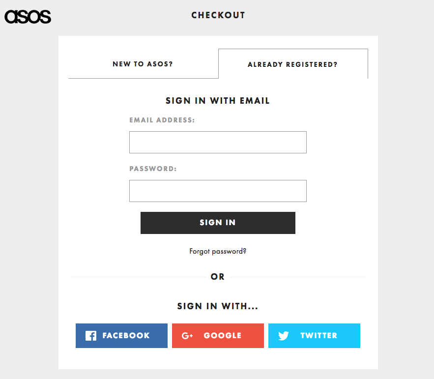
Source: Sale Cycle
It also avoids issues with forgotten passwords and tedious password retrieval steps because customers are more likely to remember their social media login information.
Social sign-in allows you to capture their email addresses earlier on in the checkout flow. Once customers sign in, their identity gets verified and the address fields also get auto-populated.
Faster checkout using social sign-in improves the customer experience and encourages customers to return to your eCommerce site.
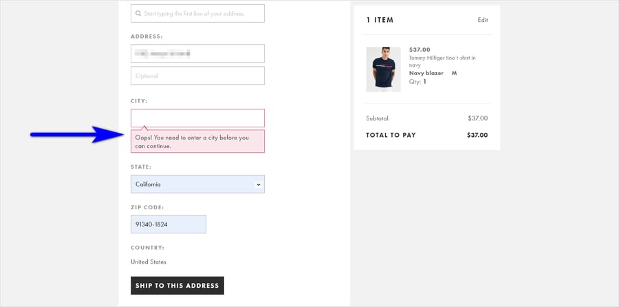
8. Use form validation and error notifications.
By enabling form field validation in real-time, you can help customers reduce input errors and speed up the checkout flow. Accurate customer information also helps validate transactions.
Web browsers like Chrome store the information and auto-populate form fields.
Source: Site Tuners
International merchants also find form validation services helpful to recognize IP addresses and automatically change the currency according to the country of the customer. Payment method availability can also be displayed based on the IP address.
Also, clear error notifications alert customers about input data that cannot be accepted and explain why the error occurred. This allows customers to go back and fix the error without having to start filling the form fields from scratch.
Wrapping up
Your eCommerce checkout page and your checkout flow are the most important aspects of your business.
You exhaust a lot of time and effort to get customers to your checkout page. Once you get them to the stage where they are ready to buy, you should do everything you can to smooth their path to conversion.
Unfortunately, customers often leave due to complex checkout processes, surprise costs, or poor site design. While you may never be able to convert 100% of visitors into buyers, you can optimize your checkout process to reduce cart abandonment rates.
Get feedback from your customers about their user experience on your site and identify areas of shopper friction that you can optimize.
If customers find shopping on your site pleasurable and quick, they are bound to return.


Leave a reply or comment below