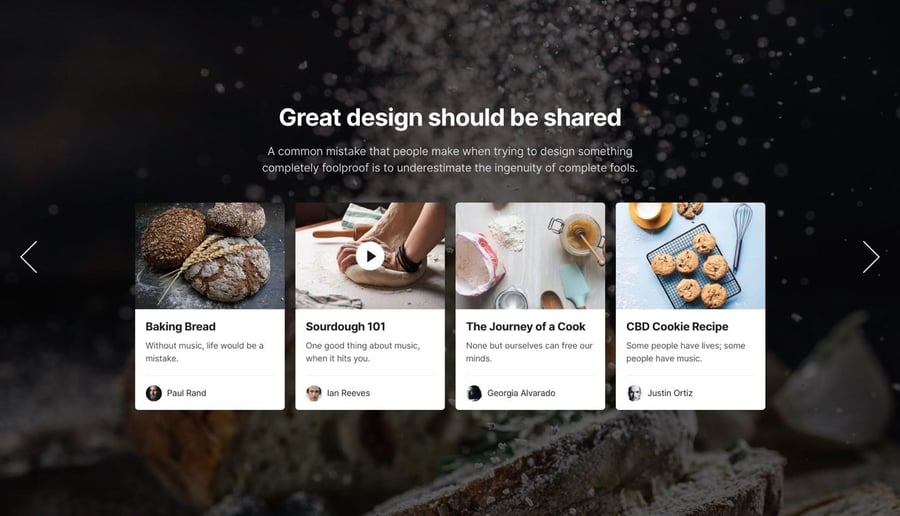
Using sliders in web design is a largely divisive tool for UX design. There are a lot of parties on both sides who either hate or love sliders. But at the end of the day, it’s up to you to decide whether or not they are suitable for your needs.
For specific applications, sliders are a fantastic and interactive way to present information quickly and simply. They’re most useful when comparing content or showcasing portfolios. It’s also a great way to present updates for new products or features.
Let’s learn about why you should (or shouldn’t) use sliders, and the best ways to do so.
Defining Sliders
Sliders are the reference term for an image slideshow with a rotating display of photos. They are not to be confused with a carousel. A carousel rotates the same image in 3D so that you can see it from every angle possible. You are also able to move the photo in a circular manner. A slider, on the other hand, is not meant to be 3D and is used to slide a series of images either horizontally or vertically.

Despite the controversy surrounding their use, sliders are highly regarded for how well they save space without sacrificing the amount of information presented. If you don’t have a lot of space on your site, you can structure your pages neatly and compactly with easily digestible bits of information presented to the reader.
Sliders are also a good way to organize your web page by category, style, etc. Not to mention that if you’re in the hospitality or retail industry, sliders also give you the opportunity to add in testimonials or reviews from previous customers without making it as obvious.
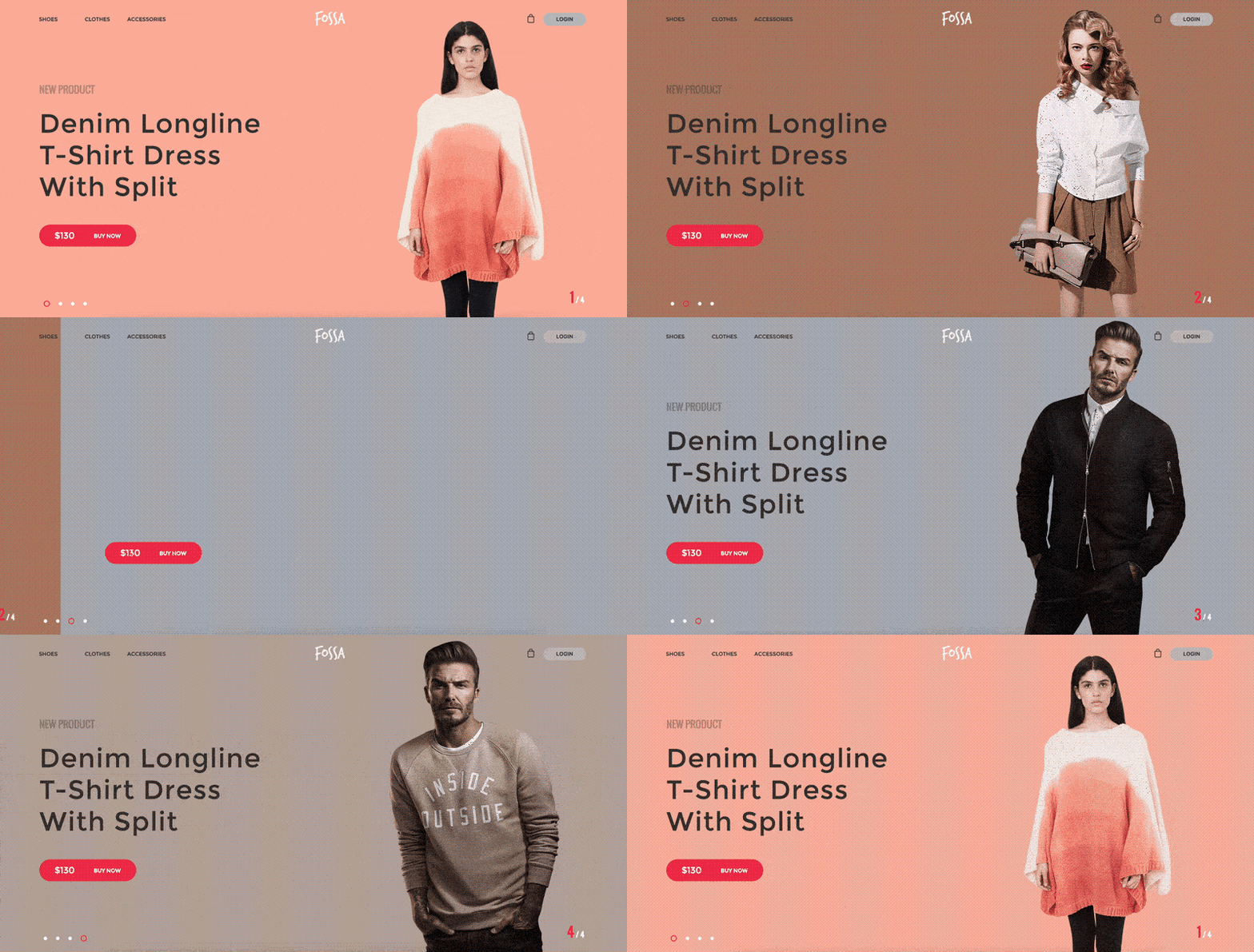
If you run an e-commerce site, you can use sliders to rotate a display of new or popular products. That’s perfect for a home page or landing page, but you can take it a step further on more specific sales pages. Say for example, having one group of sliders in the women’s section of the page, and one in the men’s section. This also means people don’t have to endlessly scroll through hundreds of products to find what they are looking for.

A photo carousel can show your products from various angles or in use, so customers get a better sense of what they’re looking at. It demonstrates the important features and prospects you’re using to sell your goods. After all, you’ve worked hard on your products, so you want to make sure they are viewed from every angle possible.
This lets you make stronger impressions and reinforce your key points. Sliders help you meet your marketing goals with a unique, customized approach. They could be created easily using a Slides website builder or with a built-in carousel feature.

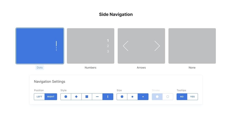
Some tools also allow you to choose from different type of sliders.
Sliders Can Be Attention Grabbing
These days, it can be incredibly difficult to catch the attention of a potential client or customer. This is because social media has conditioned us to mindlessly scroll or swipe without even taking a moment to process what we’ve just seen.
To make matters even more difficult, research has proven that 38% of people will refuse to engage with a web page if they think it is unattractive. Sliders are a guaranteed way to make your website that much more interesting.
Sliders are also a good way to get your information across without losing your audience’s attention after only a few seconds. Not to mention, you can split up text between slides, making it easier to read.
Unlike slideshows, sliders stay on the screen until the user is ready to move on. As a result, they can spend more time on one slide, or move on at their own pace.
Simply put, sliders are just more visually appealing and provide information without dragging on or having to use a large block of text.
Slider Mistakes to Avoid
Sliders do need to be added with care. If they’re not designed well, they might detract from the overall presentation of your website. This means that the quality of your text and of the image you choose need to be on the same level.
Before you make a decision about your web page, make sure to check latest web design trends to weigh your options and consider if a slider is ideal for the product you are trying to sell or the message you want to get across.
Sliders can hurt SEO and conversion rates if used improperly. They store more information and have a longer load time, which slows your pages down. Sliders often don’t transition well to mobile, which limits a segment of website visitors. Sliders can also cause web pages to crash, which won’t go over well with users. That’s why it’s important to not overwhelm your website with too many sliders.

Source: Alan Menken
It’s believed that visitors to the site will ignore sliders, in a similar way that they do with embedded videos. If they’re used as one of several methods, they’re viewed as unnecessary while using up space that could better present information elsewhere.

Source: Designmodo
If too many photos are added to the slider carousel, it could give the impression that the company did not know what to display. It comes off as if their strategy is disorganized and disjointed. If that occurs, visitors will leave without a clear understanding of your company’s goals. That’s why it’s so important to add images that are relevant to the message you are trying to get across.
Many users may also confuse your sliders for ads, causing what is known as trigger banner blindness. This is essentially having tunnel vision, but for ads. You can avoid this by making sure your information is clear and using language that doesn’t sound too gimmicky.
Tips for Using Sliders
When used properly, sliders are a fantastic design tool. When done well, they can enhance your UX design and strengthen your user’s trust in your brand. They encourage visitor interaction, which keeps them engaged. They linger at one section of your page and control the content at their own pace.
Visitors can skip to the relevant information presented to them. They can also quickly grasp what they're looking at. Not to mention they're able to more easily find what they need. Again, most people have short attention spans these days, so a slider is the perfect way to get people to read your content without getting bored.

Source: Harvard
To determine if sliders would be useful to your site, analyze your visitor’s goals on each part of your website. Then, craft your sliders to help them achieve their goal. Distracting and confusing sliders will detrimentally impact your site conversions.
Make sliders easily navigated with arrows for desktop or a swipe feature for mobile users. A soft fade between images will make transitions more pleasing to look at. Furthermore, use the smallest image size possible to optimize your pages’ load time and avoid damage to your SEO. Be careful with this though – an image that is too small could end up pixelated or blurry.
Quickly Show Off New Content
It's important for new site visitors to quickly understand what your website is offering. A slider on your homepage provides a quick, appealing overview so anyone can decide instantly where to go to find what they need.
Sliders are also a good way to present a sale or package you may be offering for a limited time. They will automatically draw the eye’s attention, so the most important information should be placed in a slider.
Additionally, sliders can be very effective when it comes to presenting numbers. Numbers can be a huge turn off for people, especially when percentages are involved. But using a slider may take some of that anxiety away and actually keep users more interested in what you have to say.

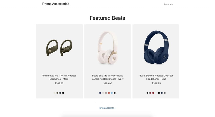
Source: Apple
Make a Beautiful Tour of Your Products
It’s a lot easier for visitors to process images than it is for them to read through a block of text. Sliders allow you to combine images with brief descriptions to explain the process of using your products, or the product variations available to them.
Say for example, you have a product that comes in different colors. A slider will allow the user to see what colors they can choose from without having to leave the webpage. Or perhaps you are selling a shoe that is available in different styles. Sliders can easily help you display them without taking up too much space.
This saves them the time they would have spent reading through a description while allowing visitors to process relevant information more quickly. The less time they spend reading, the more time they’ll have to shop or consider the products you’re selling.
Display a Collection of Photos in a Slider Gallery
If you’re in a luxury line of goods, or if you sell items that require more thought to purchase, you need to present as much information as you can to visitors. Whether you sell homes or vehicles, or high-quality kitchen knives or equipment.
Product photo galleries allow your visitors to scroll through a series of photos that offer a comprehensive impression of what’s offered and the quality that comes with it.
A perfect example of slider use is to display a collection of photos in real estate. When people are interested in purchasing a home, they want to be able to see as much of it as they can without actually having to leave their couch. Sliders can be used to display every nook and cranny in the home, saving both you and the potential client a whole lot of time.
Alternatively, perhaps you are an up and coming fashion stylist. A slider would be the perfect way for you to showcase your portfolio. Simply upload photos of all the different looks you’ve styled and voila, a simple and easy-to-read portfolio.
Conclusion
Sliders are most effective when they give users a sense of control. It’s better yet if you can tell a story that users can explore interactively. Use colorful text, lots of images, and fun language to get people to be even more interested in what you have to say.
Many people may be curious to know just how well their sliders are doing. Luckily for you, there is a way to find out.
The best way to know for certain that your slider is effective is by testing and comparing different slides with an A/B test campaign. Check which version brings a higher conversion rate or pairs with increased revenue. Track user-interaction and click-through rates on your existing slider, paying attention to where clicks decrease.
Every site is different, bringing in different types of visitors. When used properly, you can accomplish your goals and implement new strategies to create the most immersive and effective user experience.
You’ll be amazed to find out how many more people are interacting with your website than they were before!


Leave a reply or comment below