You’ll often hear people talk about the newest graphic design trends as if they are some sort of law that you have to abide by – that’s absolutely not the case. Instead, you should take inspiration from everywhere and create a style that is workable for your brand.
Your design style should feel like a constant evolution of your brand, with your graphics shifting and stretching what your brand style is without ever being a complete overhaul. Different types and styles of graphics have different purposes and it’s important to find a style that works for you.
Every year, the talented team at Venngage pulls together the top graphic design trends that you should be aware of for the coming year. Today, I’m going to show you how to adapt those trends to work for your business.
Here are the top 8 graphic design trends for 2020.
1. Muted Color Palettes
Muted color palettes are probably the easiest design trend to adapt for your business. Changing up your secondary color palette requires very little design time and opens a whole world of more modern, on-trend graphic possibilities.
When we talk about muted colors, we’re referring to colors that have had white or black added to them to create a less vibrant, almost dull color swatch. 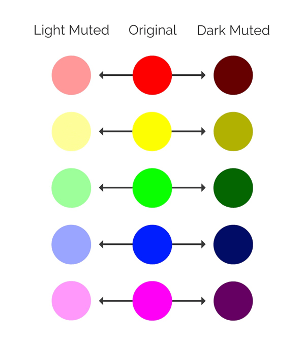
Source - Venngage Graphic Design Trends
You can easily create a muted color palette based on your existing brand colors by adding varying amounts of white or black to your main brand colors.
Muted colors work best digitally. Whilst you can use muted colors in your print materials, be cautious of how you print - if the color space isn’t optimized for your printing method your colors may not print correctly, and instead look washed out and (frankly) kind of bad.
On social media, muted color schemes can be a welcome break from the overwhelmingly bright graphics that brands often rely on to grab our attention. Nothing breaks up a feed of overly saturated hues like a more soothing, calmer colored post.
2. Color Gradients
No, it’s not the 90's; but yes, color gradients are back. We’ve been seeing a gradual return of gradients over the past few years. However, gradients have gone the same way as colors - muted. Whereas in the past few years gradients have been bold and dominating, in 2020 gradients will be used as a subtle design enhancer.
Watch out for gradients as a subtle background effect, as a texture in an illustrated design, or sitting inside shapes to enhance photos or text.
Color gradients can be a difficult trend to incorporate into your existing output unless your brand leans heavily on illustrated elements. Apply subtle uses of gradient to your header text in social graphics, or as a background in product shots to keep this trend feeling natural.
Whilst you want to update your graphics and keep your brand looking fresh, it’s super important to remember who you are and what your brand is before jumping in the deep end.
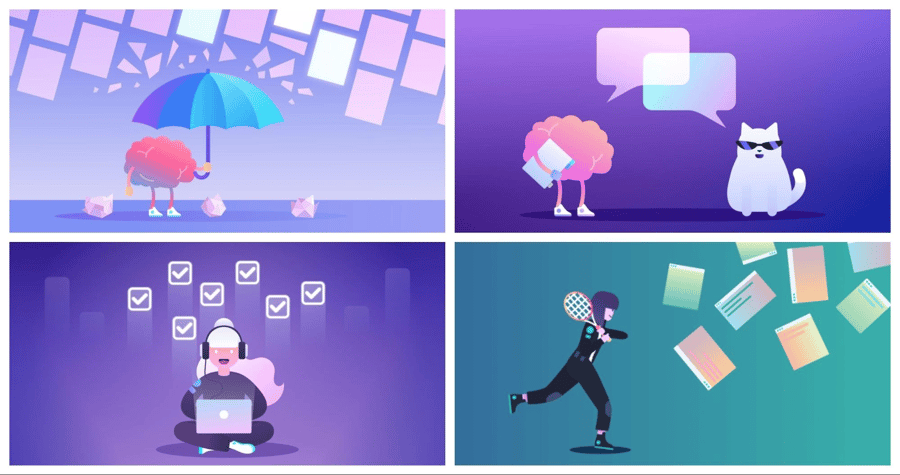
In this example, we can see that productivity software company Trello have used subtle gradients in lieu of a solid color in their illustrations. The result isn’t over powering, but it still looks fresh.
Source - Trello
3. Abstract and Dreamy Illustrations
Abstract and dreamy illustrations is the third trend on our list, and it’s one of the more difficult ones to incorporate into your brand if you aren’t already relying heavily on illustrated elements in your design.
By abstract and dreamy illustrations, we mean illustrations that are a bit more… out there. The proportions and dimensions of the drawings won’t reflect real life, and the colors will be strange and bizarre, giving the illustrations a dream like effect.
If you brand guidelines is strictly photography and text, you can probably give this trend a miss. But if you’re already using drawn elements on your website or social media, try mixing up the colors used for a modern, trendy update.
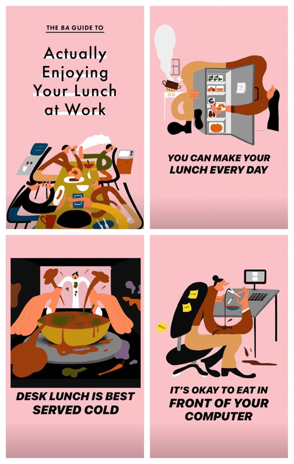
This style of illustration has been adopted across industries, but particularly within the tech industry. Check out these examples from Bon Appetit:
Source - Bon Appetit
The people have odd proportions and the situations are implied - with desks and fridges seemingly floating without a background - but it works. Bon Appetit also used the muted color palette we covered in trend 1 and they also adhere to trend number 4, which is…
4. Heavy, But Simple Fonts
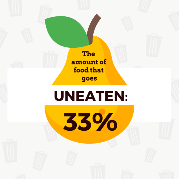
Fonts are broadly broken into descriptive categories. Serif fonts are fonts that have the little flick on the corner of letters, while sans serif fonts lack those extra features. Heavy fonts refer to fonts that are thicker and more weighted; think bold and extra bold.
Heavy, but simple fonts are going to be one of the most noticeable trends of 2020 as it’s so easy put into action. Heavy fonts are a particularly versatile graphic tool as they can be almost any font, including the ones that you’re already using!
Heavy fonts are great for drawing attention to a particular word or phrase within your design. Use them for headers or for emphasis, or to highlight a certain element of value that your business prides itself on. Your audiences’ eyes will automatically be drawn to your heavy text, so make good use of this trend.
Source - Venngage infographic maker
5. Beautiful Flowing Shapes and Lines
If abstract and dreamy illustrations was the expert level trend, beautiful flowing shapes and lines is its younger, more accessible sibling.
The best thing about this trend is that it can be incorporated into your existing output easily without ever feeling too overpowering. Try adding decorative wavy lines to your social media graphics or using a blob-like shape as the background for a photograph.
Think of these flowing shapes and lines as graphic decorators - elements that you can add that enhance a graphic rather than change it. A simple squiggle can be added to underline important text, or a plain background can be updated with various flowing shapes.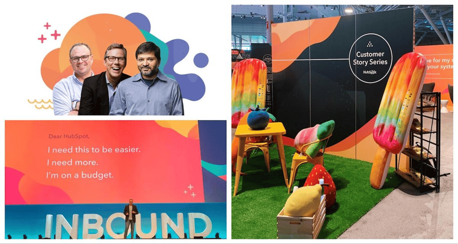
Source: Inbound
HubSpot made full use of this trend at their annual Inbound conference, adding flowing shapes to presentation backgrounds, social media graphics, and even pop up booths. There’s no doubt that this gives HubSpot a modern and fresh look whilst still working for their target audience.
You don’t have to fully commit to everything being flowing to jump on this trend either. Look how our in-house Venngage designers used squiggles, lines, and blobs to illustrate our graphic design trends infographic: 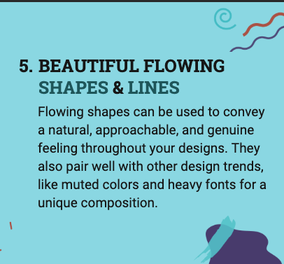
Source: Venngage Graphic Design Trends
6. Genuine & Neutral Stock Photos
In the past few years, stock photos have tended to lean towards being highly staged with strong contrasting colors and brilliant bold visuals. But in 2020, much like color palettes, stock photography will be much more muted.
Stock photography is very much a ‘love it or hate it’ thing, with some companies using stock photography as often as possible in their marketing materials, and others avoiding it like the plague.
If your company uses stock photography already you can pivot to less posed, more natural looking photos for an on trend look. Try to avoid any photos where the model is making direct eye contact with the camera, and don’t use any photos where the colors are highly saturated. Look for photos that have a base color of beige or grey.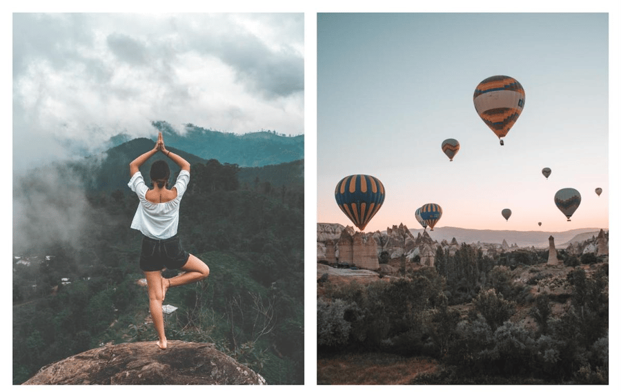
Source - Venngage stock photo library
If you don’t currently use stock photos but you still want to embrace this trend, think about your product photos or company culture photos instead. Switch up the editing style and use interesting neutral (not just plain white) backgrounds, like ceramic artist Baked By Lou uses to showcase her pottery. Your eCommerce brand will benefit from interesting-looking product photography, making this trend a great way to stand out from your competitors.
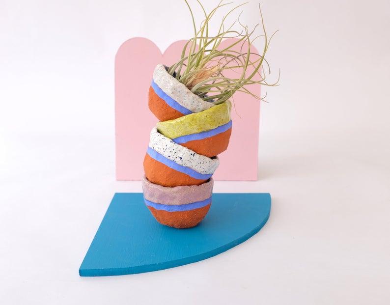
Source: Baked By Lou
7. Minimalist Landing Pages
Landing pages are an interesting area to apply trends to, as they have a very clear and defined purpose: to convert visitors to customers. So, any trends that are applied to landing pages must help achieve that goal – minimalist landing pages make a lot of sense as a 2020 trend.
Using a minimalistic design helps achieve a couple of things. First, it really helps with your SEO. The less stuff on the page, the quicker your page load speed is. Page load speed is a really important metric if you’re looking to improve your rankings for target keywords; the quicker your page loads, the higher Google will rank your page. Bonus points if you focus on your SEO image optimization as well as your text optimization.
Secondly, less elements on the page will make your Call to Action (CTA) stand out much clearer. In an overcrowded page, a button asking people to ‘sign up’ or ‘shop now’ is easily lost. But, when most of that page is clean white space, the button really jumps out - especially if you use a bright color.
Whilst it’s probably not logical to redesign your entire website for this trend, there are ways you can make small improvements to what you already have. Take a look at your website from a distance and see how crowded it looks. Are there any images you can remove? Can you reduce the text?
Simple actions like these can really help improve your page by creating a more simple and clean look.
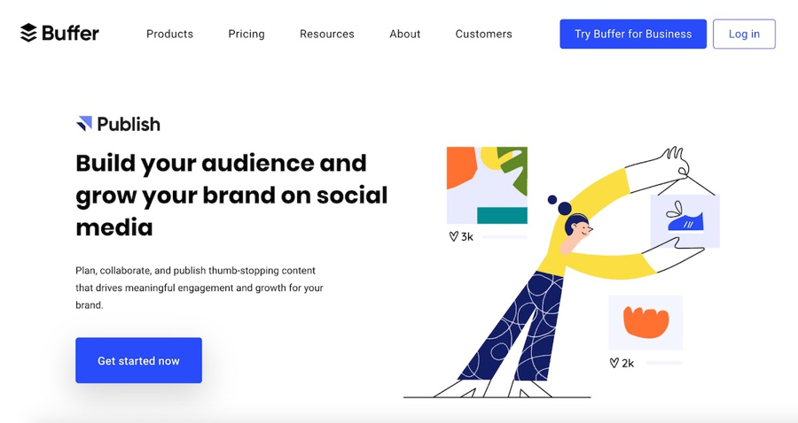
Source: Buffer
8. Better Branded Animations
GIFS, or silent repeating animations, are so widespread that you’re probably already using them within your content. GIFs are sometimes labelled ‘reaction GIFs’ when they’re used to convey an emotion that words cannot sum up.
Most commonly used on Twitter, GIFs have taken on a life of their own and companies are beginning to realize this. Why use a GIF from a TV show when you could create your own animation that is completely unique to you? And, what’s more, animations are leaving Twitter and popping up on landing pages and websites.
Branded animations give you the opportunity to add your logo and brand colors to the animation, which in turn helps with brand association. Plus, using a branded animation allows you to say exactly what you need to say in a visual context.
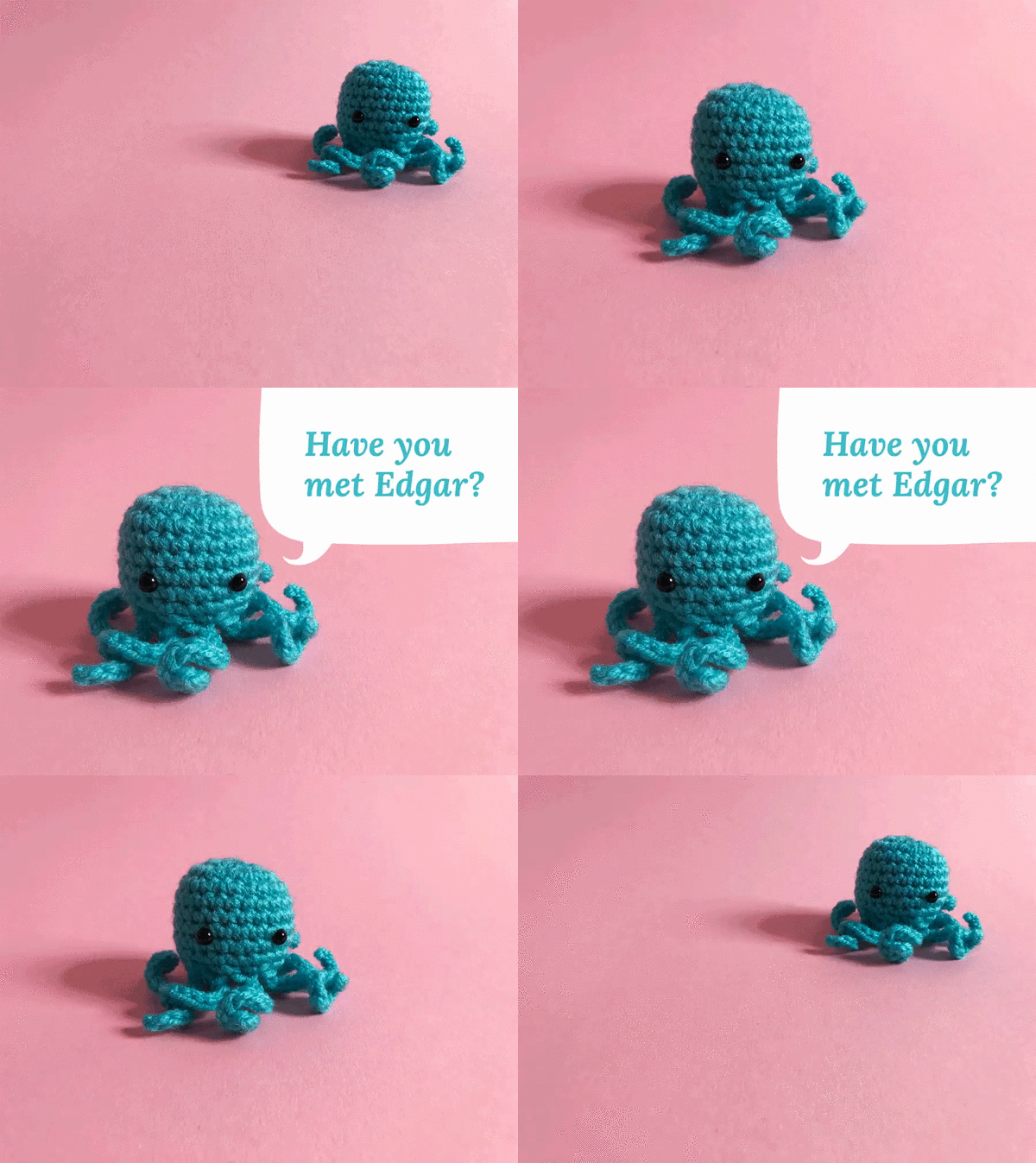
Source: MeetEdgar
In the example above, MeetEdgar created a custom stop motion GIF to help them launch a giveaway. Here, a branded animation works much more effectively because the context of the animation is very related to the brand.
Wrapping Up
Now, nobody expects you to pick up all 8 trends in 2020 - the key is to pick and choose what trend can integrate with your brand seamlessly. Concentrate on one or two trends that you can easily put into action within your existing guidelines, and you’ll have a fresh and on-trend 2020.


Leave a reply or comment below