


If you have an eCommerce website or are just getting started, you likely understand the value of your website. Since eCommerce is a branch of retail that is entirely online, your website is your digital storefront, your first impression with the customer. The physical state of your site will speak louder than any marketing trumpet can sound, so here are some great tips to keep things organized and efficient:
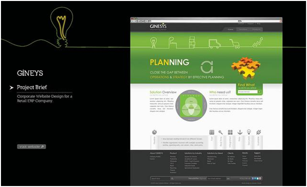
Photo courtesy of Flickr.com
- Less is More - Simplicity is your friend when plotting your layout. Too many images, words or products on display obscure the attention of your customer. Specific focus garners more sales than the shotgun approach due to the tactics that make niche marketing so successful. If you feel design is outside your particular skillset, you might consider building your store through a retail POS software, which has the added benefit of unifying both your physical and online stores.
- Order Amid Chaos - One of the measures of organization is how quickly you can find what you’re looking for. Counterintuitive categories may keep your inventory separate, but it fails on a practical level. Keep your best-sellers and most profitable items within reach as soon as a visitor arrives at your site. You may like the idea of them browsing through your catalogue, exposing themselves to all of your products while they look for the thing they want, but this has the converse effect of making it feel difficult to shop with you. Imagine if Best Buy just had a big box of “Electronics” that you had to sift through to find that printer you wanted to buy.
- Be Unique, but Clear - There is a standard layout that places the header, including the logo, categories, shopping cart, etc., at the top of the page and the search bar in the upper right corner. Feel free to ignore the standards if you like, but keep in mind that customers will expect to find things in a similar place and may have difficulty navigating your page if you have not clearly identified where you’ve placed things.
- Visually Pleasant - Poor usability can be a greater hindrance than content. Your eCommerce site needs to be practical in application and usage, and this includes your visual layout and color scheme. Some colors play well together while others do not. Read up on complementary, analogous and triad color schemes when planning your design. Note that some color combinations are great for a design, but terrible for text due to the low levels of contrast.
- Easy to Read - Readability is a subset of usability. Your font size, style and effects should reflect your brand without inhibiting the user experience. You may really like that old-fashioned, cursive font for its elegance, but are you certain that people can read it at a glance? People skim websites, and anything that slows them down is going to frustrate the shopper. Dip too far below what they have patience for and you may lose them altogether.
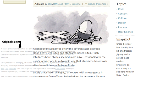
Photo courtesy of Flickr.com
At the end of the day, it seems like common sense that your site needs to be usable, legible and shoppable, but too many eCommerce sites seem to lack a specific fine-tuned approach. Maybe they just don’t know their customers as well as you do. The good news is that by going the extra mile to ensure your site is organized, you will easily stand out from the competition.


Leave a reply or comment below