

The design of your store says a lot about your business, being the face of your online brand to the entire internet. If it’s clunky and hard to navigate, users will take that first impression and run with it forever, becoming entirely uninterested in what you have to offer. But, if your online store is beautifully designed and easy-to-use, that will leave a lasting impression on users for a very long time. So, we decided to showcase some of our favorite 3dcart store designs to exemplify what we think is beautiful and effective.
With over 20,000 successful eCommerce stores built on 3dcart, choosing a handful of stores to highlight was no small task. There are too many beautiful 3dcart stores to list them all, but we chose to showcase the below sampling of well-designed merchants because, overall, they are doing eCommerce design right - great navigation, beautiful product photos, compelling calls-to-action and impressive design.
So, take a look & get inspired at these online stores built with our own templates, editors, modules and more. If you think we should showcase your store in the next design-roundup, let us know in the comments!
SturdyBuiltOnline.com
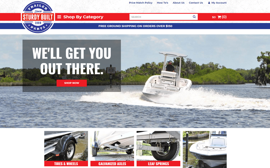
Designed to fully encapsulate the patriotic color scheme of their brand, Sturdy Built Trailer Parts’ online store is built to support a site packed with powerful products. Utilizing a wide hero banner and visual category list, this site is sure to make customers feel like they’re one click away from pulling their boat straight to the water.
UnicusDecor.com
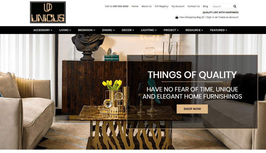
Unicus Decor lives on a site designed out of pure elegance, in a similar vein to their stylish and sophisticated products. Built with elements like a long black category bar, animated drop-down menus and a page-filling photo of high-class interior design, customers will feel transported to a refined home furnishing store in seconds.
OutfitterSatellite.com
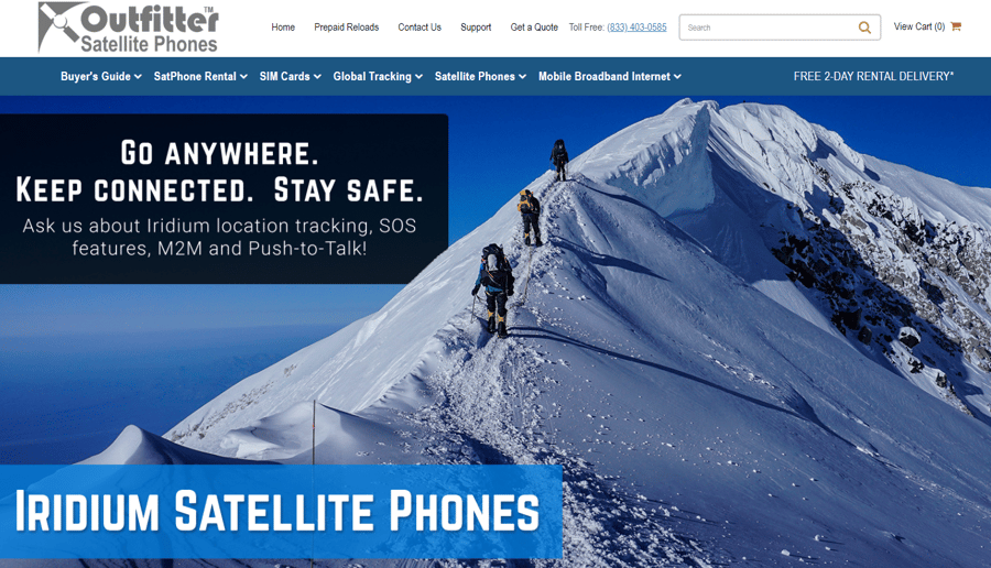
Outfitter Satellite Phones’ online store is a perfect example of knowing your customer and designing your site based on who they are. Their site is efficiently designed to lead customers to the products they’re looking for, enabling a prominent category bar with comprehensive drop-down menus, while also utilizing a large hero banner to exemplify their product’s typical use case.
Waterpologear.3dcartstores.com
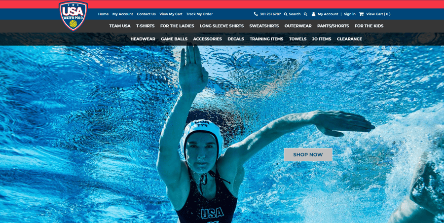
Designed with patriotism in mind, the USA Water Polo online store puts customers right into the action with stunning action shots that call users to start shopping now. Their photo-heavy design evokes an energy synonymous with the sport, pumping up customers to start wading through their product line-up. Navigation is straightforward, using two category bars to both enhance the site’s color diversity and get customers closer to their products.
PMFSuspension.com
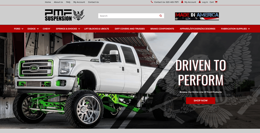
PMF Suspension’s online store is designed with intensity and high-performance in mind that seamlessly evokes the feeling customers will get when they use their suspension products. Built on a base of light grey with accents of black and red to draw attention to CTA’s, their site is easy to use and shows off a great example of suspension in action via an expansive hero banner.
BeverlyHillsOrchids.com
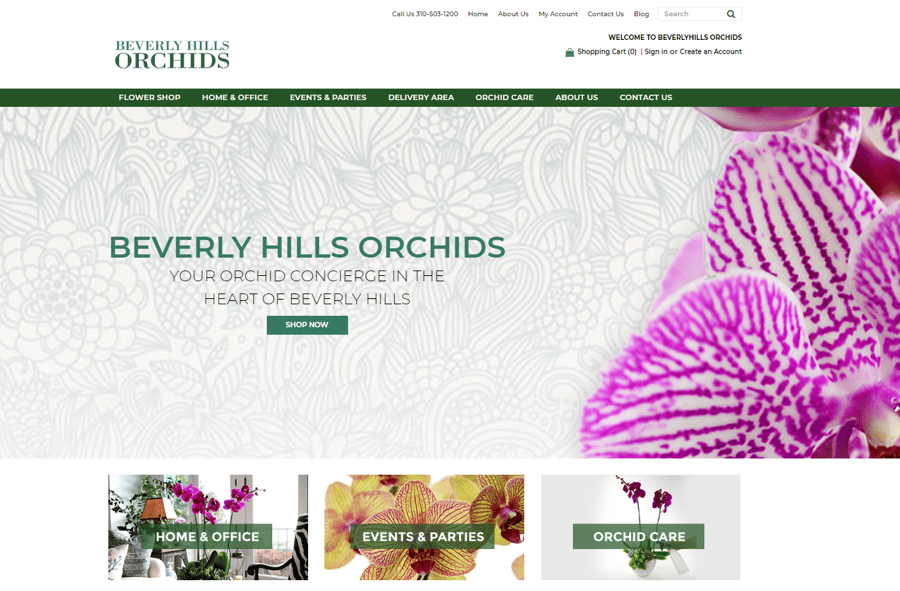
With an air of floral elegance, the Beverly Hills Orchids online store utilizes bright white and natural green to accent their beautiful orchid photography, which pops with a variety of colors. Orchid products are separated into categories, such as specific occasions that they’re meant for, in a visually appealing way underneath the large CTA banner.
FFStock.com
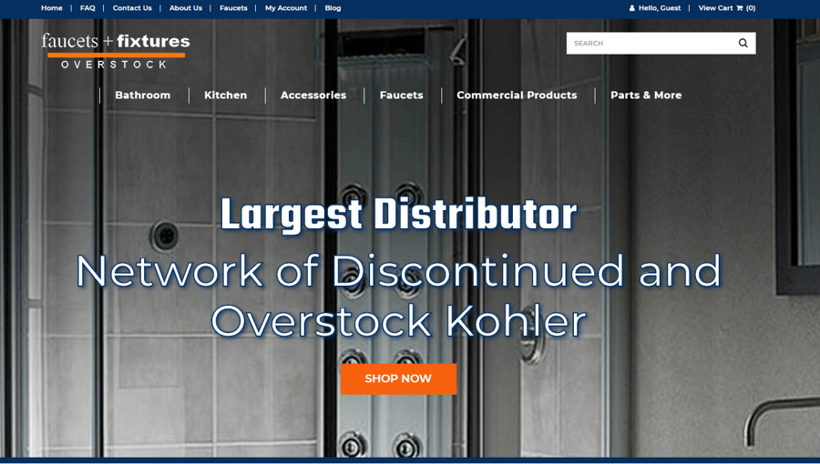
Just like their products, Faucets + Fixtures Overstock has a sleek and efficiently designed online store that immediately shows customers what they sell and why they’re the best option. Using bright orange and dark blue, their site feels clean and pops in combination with the steel grey in most of their product photos. Helpful categories are lined up in a minimalist way over-top the large screen-sized banner, making navigation easy.
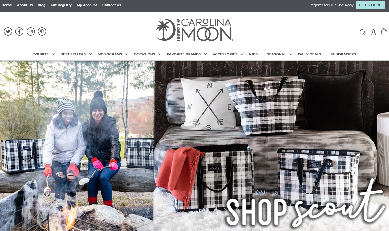
UnderTheCarolinaMoon.com

Using minimalist design with a southern charm, Under the Carolina Moon has an online store that knows its audience and caters to them in a fun way. Just like their products, their online boutique uses chic colors like cool greys and teals that feel like a modern take on classic southern motifs. Their store is all about their fashion and accessories, so they let their product photos and lifestyle shots do all the talking.
Wrapping Up
Design can sometimes look great on the outside but can end up interfering with user experience. A well-designed online store is able to balance functionality with aesthetic because, at the end of the day, you want to be able to convert users into customers.
Ultimately, a well-designed site is going to have a few fundamental things: a cohesive aesthetic that aligns with your branding, easy to use navigation, and products showcased front-and-center. If you can accomplish all of these things in a seamless fashion, then users will be sure to flock to your site and start buying.
Which site design is your favorite from this selection? Do you think that your store should be included on this list? Leave a comment below!


Leave a reply or comment below