In order for your online store to be successful, you need an awesome homepage. There’s no getting around it. You can’t have one without the other. The two are forever intertwined like Romeo and Juliet.
Not convinced? Consider this. Today’s online shopper spends approximately 25 seconds perusing a new ecommerce website before deciding to either make a purchase or move on to another store. And just about every one of those seconds is spent scrutinizing the homepage.
We’ll type it again in case you weren’t paying attention. You have 25 seconds to make the conversion. Don’t waste time.
When building a homepage, it isn’t logical to think that you can simply throw some text together, add a few pictures and let the good times roll.
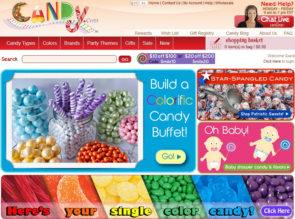
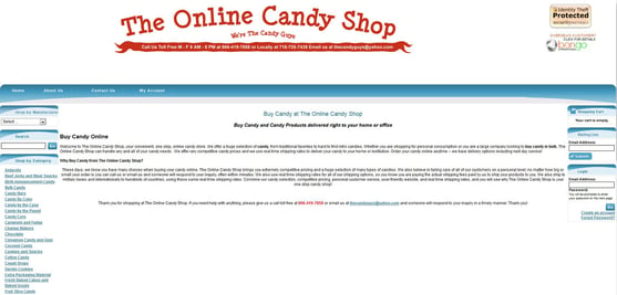
As a simple exercise to drive our point home, consider the following two homepage designs and ask yourself which store you’d rather shop in.
Candy.com
The Online Candy Shop
The choice should be clear. Candy.com has a far superior design than The Online Candy Shop. And it’s not just the look and feel of Candy.com's homepage that makes it the hands-down winner. There are several additional hooks that draw shoppers in and make them feel comfortable about spending their hard-earned dollars online.
If you’re looking to open an e-store, or maybe you already have one but want to redesign your homepage, the following six tips will help you get it right.
1.) Make it pretty
Looks can be deceiving, no doubt, but when it comes to ecommerce, the look and feel of your homepage can make our break your store.
Part of your job as an online merchant is to attract customers, and nothing captures attention more effectively than a beautifully constructed homepage. That's why it's important to pick a visually stunning template and fill it with crystal-clear product images. Low quality photographs won’t do you any favors, and that's why it's important to choose your images wisely.
2.) Keep it copy light
Given that you only have 25 seconds to make the conversion, nothing can hurt you more than filling your homepage with massive blocks of text. Online shoppers aren't coming to your website to read, so make sure they don’t have to do very much of it.
3.) State your business
When a customer enters your online store, there should be no question about who you are or what you’re selling. Therefore, clearly state your business up front. You can do this through pictures, videos, call to action buttons, etc... Failing to make your purpose known will only confuse customers.
4.) Establish trust
Adding payment, shipping and security badges can go a long way when it comes to converting new shoppers into happy customers.
We live in a modern world driven by brand names, and featuring badges from companies like USPS or PayPal will help customers feel comfortable about spending money in your store. Also, security badges like Google Trusted Store will reassure shoppers that your business is safe, secure and reliable.
5.) Call to action
Online shoppers tend to have short attention spans, and that’s why it's important to feature call to action buttons.
Try and keep in mind that if a call to action button doesn’t clearly stand out, then you’ll probably need to adjust its text, color and/or location.
The wording inside your call to action should be short. Things like “Get Yours Now” and “10% Off” sever as solid examples of the kind of text you want to feature. However, feel free to get creative with these. The better hook you come up with, the more likely it is that you’ll convert the shopper.
The size, color and location of your call to action buttons can also vary, but keep in mind that you want to grab a shopper’s attention. A button that is too small may go unnoticed, and a button that is too big can take away from other valuable content found on your homepage.
When it comes to color, stay consistent. In other words, if your online color scheme is red, white and blue, then your call to action buttons should reflect that.
Button location is all up to you. Some like to feature them above the fold while others elect to paste them to the bottom of product images. Our recommendation is to experiment with placement and use tracking URL’s to help determine which buttons draw the most clicks. When you find something that works, stick with it. No need to mess with a good thing.
6.) Organize your header tabs and categories
Header tabs and category lists help maximize your e-store’s functionality. They serve as navigation points to the rest of your website and need to be well organized.
A customer should be able to scroll over your header tabs and clearly understand where each one will take them. Same goes for category lists.
Part of your job as an online store owner is to make a customer’s shopping experience easy and enjoyable. Failing to provide them with a roadmap to your website will leave them wondering where to go and what to do next.
Conclusion
New customers come to your website because they’re interested in your products, but they will make a purchasing decision based on the look and feel of your homepage.
Remember, you have 25 seconds to make the conversion, and that’s why everything on your homepage should have a purpose. If your content doesn’t command attention, then it probably doesn’t belong.
The homepage of your ecommerce website acts as a window to your online store. A poorly constructed page will send people packing, but a beautiful, well-thought and streamlined design can quickly turn new customers into loyal shoppers.


Leave a reply or comment below