

Is your online store getting loads of traffic, but that traffic isn’t translating to paying customers? Your store may be suffering from a low conversion rate. This can feel disappointing to any online business owner, and for good reason. After all that work bringing traffic to your store, you now have nothing to show for it.
But don’t worry – there is a solution. In fact, there’s a multitude of solutions that may help your business.
Over the years, business owners and marketers have been looking for the best solutions to low conversion rates. Several have been tried, tested, and shown to be successful. Today, we’ll be guiding you through some of the most effective tips for improving your eCommerce conversion rate.
Top 10 Tips to Improve Your Online Store’s Conversion Rates
While there are many ways to improve your eCommerce website’s conversion rates, we’ve compiled ten of the most effective. Let’s go through each tip and show how it works in action.
1. Find and constantly measure your conversion rate.
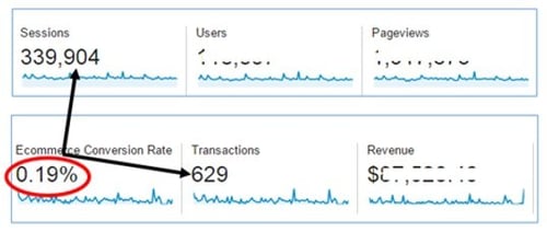
Before you can improve your conversion rate, you first need to know what your current rate is. You can find your website’s conversion rate by dividing total conversions by the number of visits to your websites. Then, multiply that number by 100% to get your conversion rate. A conversion can be any desired action that you’d like to track – this can include purchases, form submissions, email signups, and more.
According to Invesp, the average eCommerce website conversion rate is 2.63%. But, the average conversion rate across all online stores isn’t necessarily a rate that means success for your business. It’s important to at least meet that average and work towards a rate that best fits your business goals.
You can find your conversion rate within Google Analytics, so if you haven’t yet set that up for your store, now’s the time. Within analytics software, you can and should continue to track your conversion rate over time. As you make changes to your site and test out different approaches, keep track of how your conversion rate changes. These metrics are necessary to pinpoint the best strategy.
2. Simplify your checkout process.
One of the leading causes of checkout abandonment is a checkout process that takes too long. Your checkout process needs to be both easy to understand and convenient for all customers. Several elements in your checkout process can end up overcomplicating things for your customers. Ultimately, this gets in between them and the conversion.
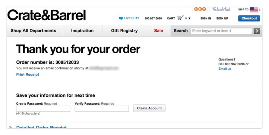
Not offering guest checkout is one such inconvenient checkout element. According to a study by Baymard Institute, 34% of shoppers abandoned their orders because they weren’t offered a guest checkout option. To keep those customers from abandoning your site, don’t force them to create an account before they’re able to check out. They may not have time to create an account, or they could simply just not want to take that extra step.
Whatever their reasoning, you should offer guest checkout as an option. However, if you’re worried about capturing fewer accounts, you can give customers the option to create one after they’ve made their purchase. At that point, they’ve already provided you with the information needed to create their account – all that’s left is a password.
Crate & Barrel accomplishes this on their post-checkout page:
Customers may also abandon checkout because your process is multi-page without any sign of how many steps are left. Rather than leave customers in the dark, provide a progress bar at the top of your checkout pages. This signals to customers that they only have a few more steps before they can finish checking out.
If you are using a multi-page checkout process, that may also be a contributing factor to your low conversion rate. The alternative would be a simplified single-page checkout process. However, one type is not always better than the other in all cases. Some stores have higher conversions with multi-page checkout, while others have lower rates. Test both types and see what works better for your business and audience.
Here’s an example of what a single-page checkout might look like:
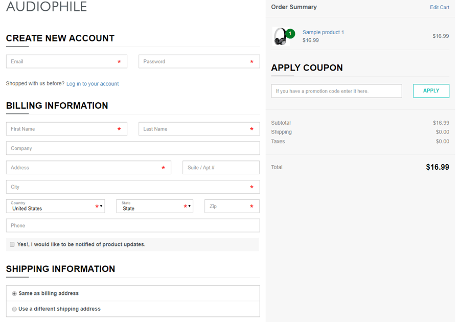
Whether you go for single-page or multi-page checkout, you want your checkout process to be as simple as possible. Aside from what we’ve covered, this also means reducing the number of form fields that customers need to fill in. You’ll also want to make it so customers don’t need to enter the same information multiple times. For example, you can have an option to make the shipping and billing addresses match.
3. Optimize your online store’s design.
It shouldn’t be hard for customers to find what they’re looking for on your online store. Products, and the ability to purchase them, should be front and center on your site as soon as customers land on it. Important elements like “add to cart” buttons and the shopping cart should be easy to locate across the board.
If your site is hard to use and customers can't find what they’re looking for, they’ll be more likely to bounce off without converting. Everything, from products to category filters, needs to be easy to locate.
However, website design is about more than just simplicity and ease of use. It’s also about credibility.
In fact, Kinesis found that 75% of shoppers admit to judging a company’s credibility based on their website design. Because the internet is vast, customers need to feel secure in the fact that your website is legitimate. If your eCommerce site looks outdated or unprofessional in any way, that may signal to customers that their business is to be had elsewhere.
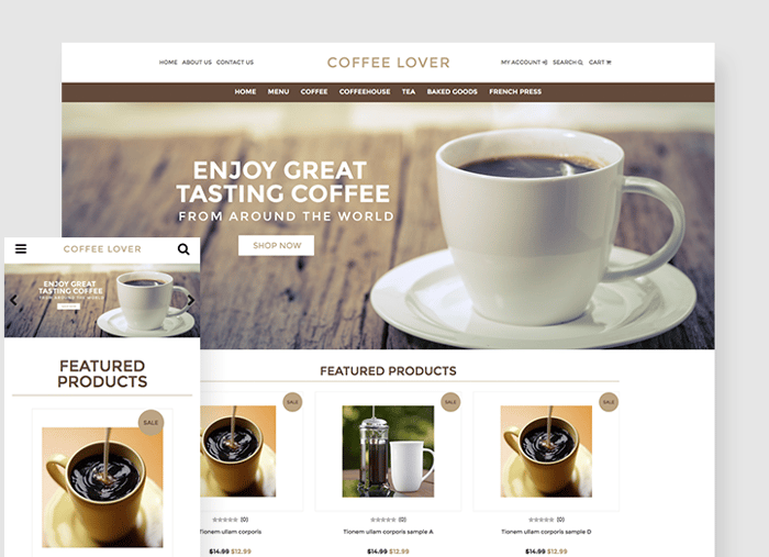
You should also be prioritizing responsive design. When a website is responsive, it changes dimension and design to fit screens of any size. If you don't optimize for mobile users, you may be turning away most of your audience and potential customers.
Here’s an example of a website template that’s simple, easy to navigate, and responsive:
4. Use social proof to gain user trust.
While the overall design of your site can be one massive trust signal, there are other ways that you can show trust to customers. Trust signals can come in all shapes and sizes, but one of the most effective is social proof. If customers see many other people buying your products, they’re more inclined to follow suit – that’s the idea behind social proof.
Social proof can be as simple as customer reviews on product pages. Not only do reviews show that real customers have purchased your products, but it also gives potential customers insight. With reviews, customers can feel like they’re making better decisions.
If it’s applicable to your business, you may also want to employ the use of customer testimonials. These can go directly on your home page, showcasing quotes from real customers that can vouch for your product or service. If those customers have any social standing or authority in your industry, they can serve as powerful trust signals to customers.
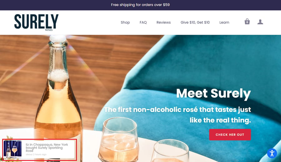
A unique way to show social proof on your site is through social proof tools like Fomo or Proof. These tools add a small notification to your website that pops up whenever a customer takes a desired action. This could be buying a product, downloading software, or signing up for a newsletter. It’ll often show the customer’s first name and initial, general location, and what they bought in real-time.
As customers browse your site, they’ll see these notifications pop up. They serve to show them that other customers are browsing your site and shopping at the same time.
Here’s how Surely Wines uses social proof on their online store. The notification is highlighted in red:
5. Implement cart abandonment solutions.
Cart abandonment is inevitable for any online store – in fact, 75.6% of shopping carts online are abandoned by website visitors. If you want to improve your store’s conversion rate, cart abandonment needs to be faced head-on.
A cart can be abandoned for a variety of reasons, many of which are preventable. You may feel like you’ve done everything you can to prevent cart abandonment from happening in the first place. But, when customers still leave your site without checking out, your next step is to bring them back.
You can catch a customer before they leave your site entirely, but as they’re on their way to leave, with exit-intent popups. Let’s take a look at an example from Optinly:
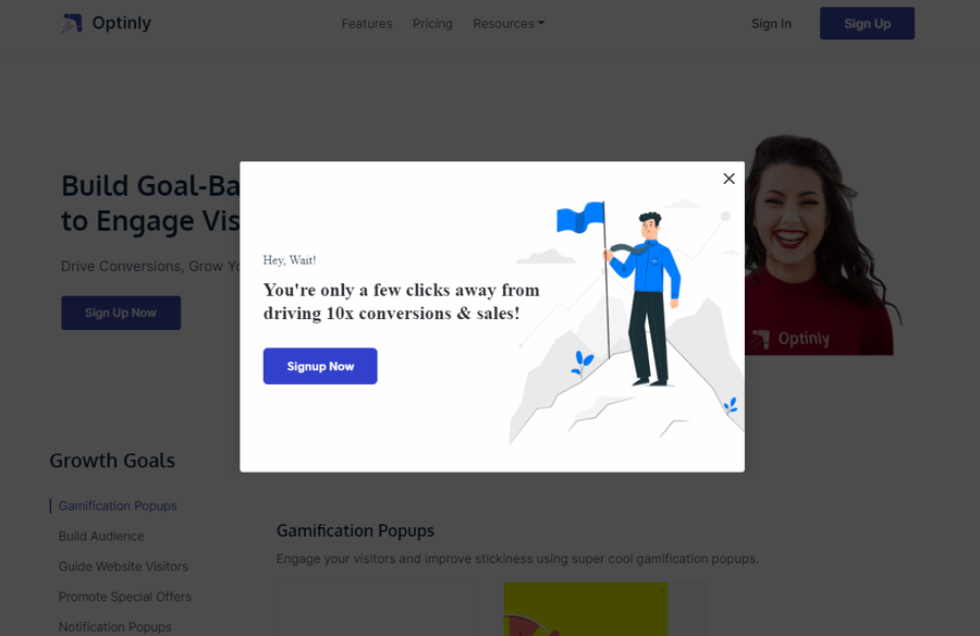
When a customer moves their mouse to change the tab or close their browser, an exit-intent popup will appear on top of your site. It doesn't appear in a separate window and it works to persuade the customer to stay.
An exit-intent popup can grab attention in many ways. Offer a discount code, ask for a newsletter sign up, or remind them that they haven’t checked out yet.
When an exit-intent popup doesn’t work, and the customer leaves your site and doesn’t look back, there are still ways that you can convert them.
If they provided you with their email address at any point, you can include them in an email campaign for abandoned carts. Using an abandoned cart saver, emails can be sent out automatically to shoppers that didn’t convert. The emails can include discount codes or a simple reminder that they didn’t check out.
6. Provide ways for customers to contact you.
Another valuable trust signal that’s vital to have on your site is contact information. Customers need to feel secure in the fact that they can contact your company directly in case they have any questions or concerns. They also want to get a sense of legitimacy from your business. Without any contact information, they may not find your website to be credible.
Adding something as simple as a phone number can make a difference in your conversion rate. In a test done by Neil Patel, a website’s home page with a phone number saw a 7.92% in signups compared to a version without the number. They also saw a conversion increase of 0.5%. While it may seem small, this percentage can go a long way in boosting your overall rate. It’s also not the only form of contact you can include.
Aside from basic information like a phone number or address, you may want to add live chat to your website. According to a survey conducted by Invesp, website visitors who used live chat tend to spend 60% more per purchase. They’re also 2.8 times more likely to end up converting into a paying customer.
There are several tools that you can use to add live chat to your store, including Olark and Pure Chat. If you don’t have a team large enough to dedicate employees to live chat, you can also employ the use of chatbots. You can program chatbots with scripts so that they always have the best answers for frequently asked questions.
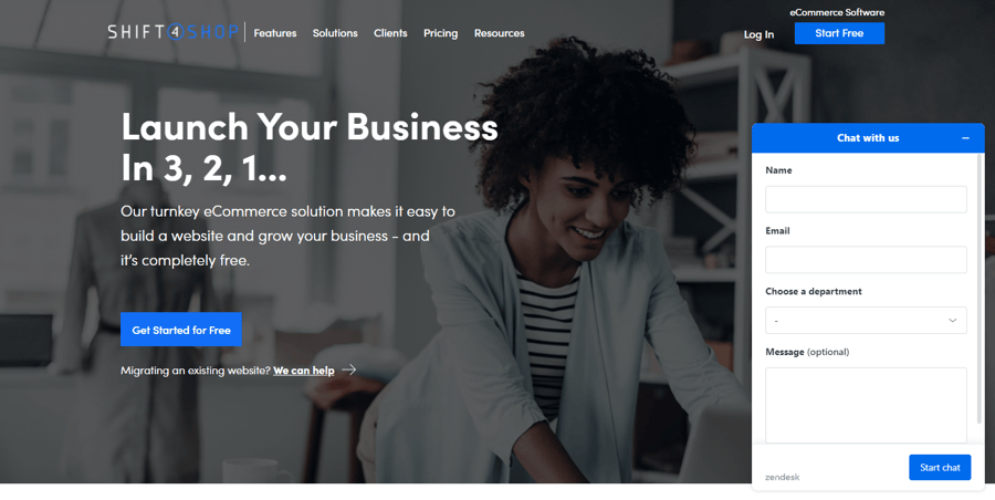
Shift4Shop’s website uses live chat to get customers in contact with live agents:
7. Create valuable and engaging content.
To keep customers converting, you need to prevent them from leaving your site prematurely. One of the best ways to accomplish this is through valuable, engaging content.
Ask yourself this: what do your customers want to see, and what have they come to your site for? You need to answer that question with content, whether that’s copy, images, or videos. Not only does that content need to be relevant to your customer’s interests and goals, but it also needs to provide value. This leads them to stay on your site longer.
However, your content needs to be more than engaging and valuable. You need to be able to persuade customers through your content to stay awhile and convert into paying customers.
Before you jump into content creation, start with answering questions and pain points. Think about the questions customers want to be answered before they make a purchase. Create content based on what they need to see or hear before they feel ready to buy from your store.
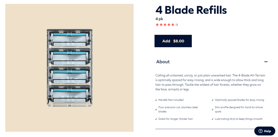
If your product requires instructions, you may want to write guides or film videos that explain how to use the product. If you sell clothing, you can write blog posts with photo galleries of the latest trends (and how your customers can find those trends on your store). All products should also have valuable product descriptions, which should feel the same as all other content on your site.
Here, you can see how Dollar Shave Club writes engaging product descriptions:
Throughout all your content, one thing needs to be consistent: your unique value proposition. Focus on what value your product or service brings to the customer that they can’t find anywhere else. Use persuasive and engaging content to promote that value and the result that customers can expect.
8. Personalize the customer’s shopping experience.
Research shows that website visitors converted at a rate of 3.4% when shown three personalized pages. That rate is double that of visitors who viewed two personalized pages, which was 1.7%. Statistics like these show that personalization can boost conversion rates in powerful ways. But, how exactly can pages be personalized for better conversions?
One way to personalize your online store is through customer segmentation. When you segment customers, you’re grouping them based on characteristics or behaviors. Customers can be segmented on how they found your products, whether they’re B2C customers or B2B customers, and other qualifiers.
For each segment you’re targeting, you can create personalized landing pages. For example, if a customer found your site through an Instagram post, you can take them to a landing page specific to what was in that post.
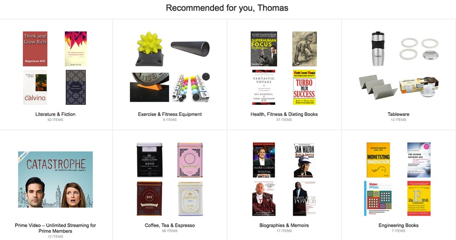
You can also personalize based on your customer’s browsing and shopping history. A common way to do this is by showing customers a selection of their recently viewed items on your store. You can take that a step further and curate a collection of products that match what they’ve been buying. It could also be based on their account information (such as shoe size or body measurements for clothes).
Amazon implements personalization every step of the way for its customers. Here’s an example of how their recommended products section may look:
9. Use urgency to convert customers quickly.
When a customer is given a time limit, whether it’s for a sale or for a product staying in stock, they’re more inclined to make a purchase. This is because of FOMO, which stands for “fear of missing out.” One 2018 study found that people were more likely to perform unimportant tasks that involved a sense of urgency than an important task that didn’t. Translate that to shopping online, and you can see the power of urgency.
By adding elements to your site that foster this sense of urgency, you can help to boost your conversion rate.
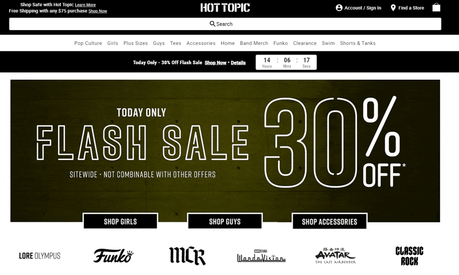
If you’re running a limited-time sale, you can encourage shoppers to engage with that sale as soon as they arrive on your site with a countdown timer. Show exactly how long they have to take part in the sale before they miss out, and add a CTA (call to action) that takes customers directly to the sale.
Here’s a great example of Hot Topic’s flash sale messaging and countdown timer:
You can add urgency to product pages as well. In fact, rather than just showing a simple stock level, you can put “almost out” messaging on a product page. This hides the exact number of products that you have left. Scarcity and uncertainty lead customers to worry that it will sell out at any second.
10. Run multiple tests on your site’s user experience.
While certain methods and strategies work for nearly every business, some may be more effective than others. This is where testing comes in. Whether you’re choosing a checkout style or adding an element to your home page, you should be testing the effectiveness of those changes. The most common type of test, in this case, is the A/B test.
An A/B test, or split test, shows two variants of the same page to different visitors simultaneously. Then, the two variants are compared to measure which was more effective in the desired metric – in this case, that would be conversions.
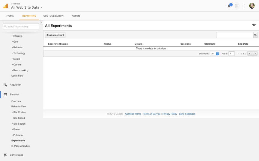
You can run a “content experiment” in Google Analytics to test your website in an A/B style. Once you’ve created two variations of the same page, you can find and create experiments in the “Behavior” section of Google Analytics. Here’s what that should look like:
Once you set up your experiment and let it run, keep track of the results and narrow down which approach works better for your site. Continue to measure your rate and test out different variations over time as well.
Conclusion
Every online store owner’s goal is to maximize conversions on their site. Whether they’re selling a product or service, they want as much traffic on their site to be from paying customers. With these strategies, you’ll be well on your way to achieving your goal conversion rate. Take what works for your business and leave the rest. Above all, consistently work on your site – what worked today may not work tomorrow, so stay ahead of the curve.


Leave a reply or comment below