
Have there been instances when you’ve had prospects arrive on a landing page and leave without taking the desired action? If only there was a way to make them stay, you wonder.
Enter exit-intent popups.
Exit-intent popups refer to a popup message that appears right before a visitor is about to leave the website.
They work on exit-intent technology which detects actions that indicate that the visitor is going to leave the website (eg. moving the cursor towards the ‘close’ button, trying to open another tab or any other action that takes the user away from the current window).
On detecting these actions, the exit-intent popup gets triggered and appears on the screen in an attempt to persuade the website visitor to stay on the page and convert.
8 Best Practices to Create High-Converting Exit-Intent Popups
So you clicked on an ad and arrived on a landing page only to be met with an intrusive and noisy popup. You didn’t have the intention to leave the website, but now you do.
Needless to say, such exit-intent popups are intrusive and annoying.
But what about those that provide a relevant offer that manages to capture your attention and incite action? That’s the kind of exit-intent popup you need to design.
A well-designed and executed popup has a conversion rate of around 4% - 5% which happens to be four times higher than the other call-to-actions.
Here’s how you can design an exit-intent popup that drives conversions without being annoying.
1. Develop a meaningful offer.
The single biggest factor that dictates conversions is the popup offer. If your offer isn’t valuable enough, there’s no way the exit-intent popup is going to be effective in generating conversions.
Create a relevant offer that meets your audience’s needs and solves a problem.
Start by understanding who your target audience is and what their challenges are. This will help you develop meaningful offers that they can derive value from.
Take a look at some popup offer ideas for your online store:
- Discounts and coupon codes
- Content upgrades in the form of checklists, eBooks, white papers and more
- Free trials or demos
- Remind them about the abandoned products in their shopping cart
- Provide information on value-added services such as free delivery, free shipping, etc.
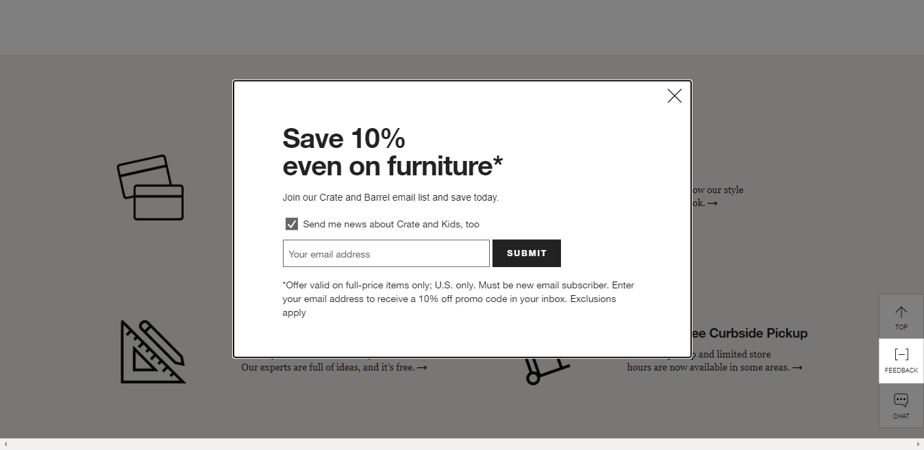
Take a look at this popup example by Crate & Barrel. They offer a 10% discount for joining their email list.
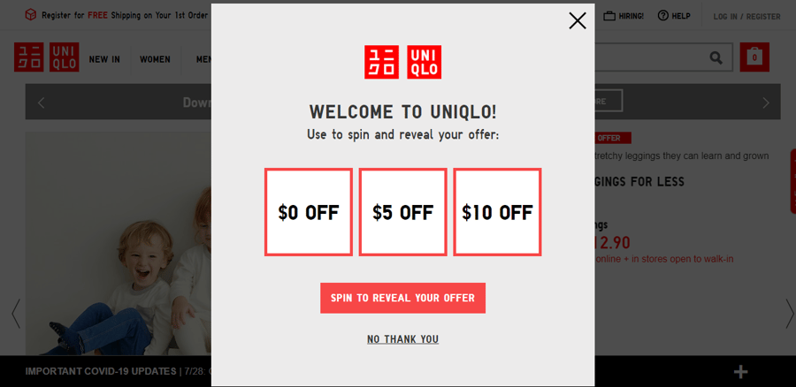
What’s more, you can also include interactive content such as calculators, quizzes, and spin-the-wheels in your exit-intent popup to encourage visitors to engage with it and boost lead generation.
Here’s an example of an interactive popup by UNIQLO which asks people to ‘spin to reveal’ the offer. It instantly catches your eye and gets you to participate.
2. Keep it contextual and relevant.
A valuable offer is great, but a contextual one is even better.
Let’s say you’re browsing women’s sportswear and the next thing you know, you are met with a popup message announcing a 30% discount on men’s outerwear.
Not only is this annoying, but it’s also irrelevant and does nothing to make you stay.
This is why it’s very important to serve a targeted and contextual exit-intent popup that is relevant to the user. You can target website visitors according to:
- Location
- Referral source
- Time spent on the website
- Website behavior
- The page they are viewing or engaging with
One good way to do this is by using Google Analytics to understand at what points visitors generally drop-off or which pages have high exit rates. You can use this data to strategically place exit-intent popups in those specific pages.
Long story short: communicate the right message to the right user at the right time.
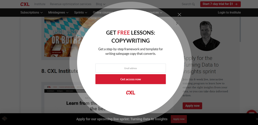
Here’s a good example of a contextual popup by CXL. It’s interesting to note how this offer on free copywriting lessons appears while reading one of their blog posts on writing copy.
3. Craft a bold headline.
An exit-intent popup doesn’t have much time to capture attention. In those few seconds, you need to ensure the popup gets people to pause and read what you have to offer.
One of the most important elements that can help your popup stand out is a bold and compelling headline. Apart from capturing attention, the headline needs to communicate the value offered and generate interest in website visitors.
Considering the limited space you have, it’s best to keep the headline brief. Say what you must in the simplest way you can.
Complement the headline with a two or three-line blurb that expands upon the headline and explains a little more about the offer.
Here are some tactics you can consider while crafting popup headlines:
- Directly communicate the offer (eg. Join our newsletter and get 10% off)
- Ask a question (eg. Want 20,000 Website Visitors Per Month?)
- Create a sense of urgency (eg. Only For Today: 30% Off On Your Order)
- Generate curiosity (eg. How to Hit 1 Million YouTube Subscribers in One Year)
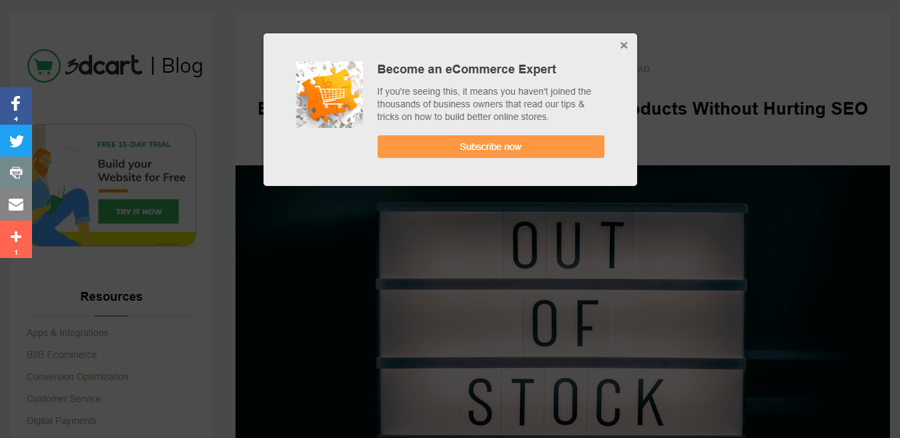
Take a look at this headline example by Shift4Shop. It’s simple, clear, and makes a promise, enticing people to click.
4. Implement a minimal design.
We can all agree that some exit-intent popups are plain eyesores.
Whether it’s the distracting visuals, poor choice of colors, or misaligned elements -- these popups just make you want to hit the ‘close’ button. Don’t make that mistake.
Firstly, the popup design needs to match your website’s design and branding elements such as brand logo, color scheme, imagery, fonts, and tone of voice. So, while it does need to stand out, make sure it doesn’t offer a disconnected user experience because that will make it appear spammy.
The best designs are simple, and the same logic holds while designing exit-intent popups. In the limited space you have, make sure the design is minimalistic and clean so that it reinforces the communication.
Use a contrasting color for the popup so that it stands out and instantly grabs attention. You might also want to put a visible border around the popup to make it more prominent.
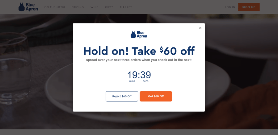
Here’s an example of a minimalistic popup design by Blue Apron. Notice how the design is aligned with the brand colors and fonts, yet manages to stand out and grab attention.
5. Include attention-grabbing visuals.
Speaking of grabbing attention, using visual content in your exit-intent popups helps you do just that. In addition to capturing attention, they also effectively communicate the message while keeping visitors engaged.
If you’re promoting a physical product, use high-resolution product photos or lifestyle imagery to generate interest.
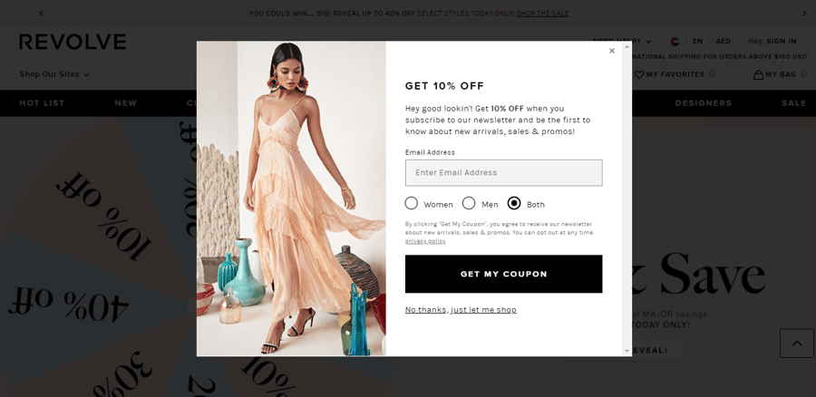
Here’s a good example by Revolve. They’ve used one lifestyle image to reinforce their message without overwhelming the reader.
On the other hand, if you’re a B2B brand that’s talking about an intangible product or service such as a discount code or eBook, use imagery that lets people visualize the product or the benefits they will derive from it.
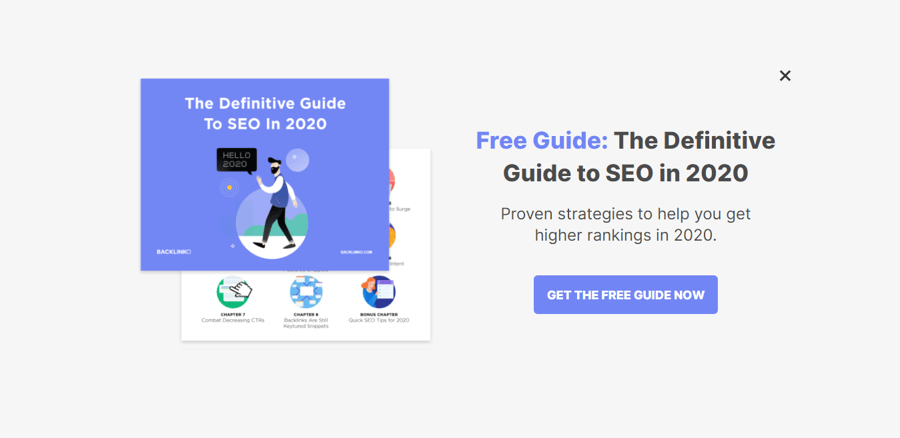
Take a look at this example by Backlinko. They’re offering a free guide and have used imagery to help people visualize it better.
Visuals also play a critical role in drawing attention to aspects that matter.
As the goal of every exit-intent popup is to encourage visitors to click on the call-to-action button, you can use visual cues in the form of arrows, directional cues, and contrasting colors to guide the viewer’s gaze towards the call-to-action.
6. Use social proof.
It’s not always enough to present a strong offer coupled with a powerful headline and call-to-action. Sometimes, it helps to go one step further and tell prospects how others have used or engaged with your product or service.
This persuasion tactic is known as social proof. It helps build trust and confidence while driving conversions in the process.
So, while designing exit-intent popups, think of how you can include some sort of proof that alleviates concerns and encourages people to follow suit.
Here are some examples of social proof you can include in your exit-intent popups:
- Customer testimonials, reviews, and ratings
- Number of subscribers or downloads
- Promote bestsellers
- Social media engagement metrics (eg. number of followers, number of shares, etc.)
- Showcase user-generated content
- Awards and accolades won
- Media mentions
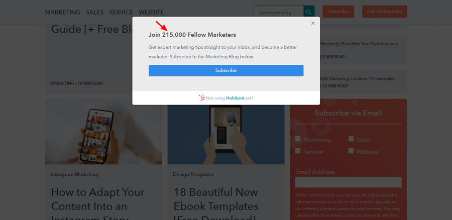
Here’s an example of using social proof in popups to drive conversions. HubSpot very smartly calls attention to the number of people who have subscribed to their blog, making you wonder if you should do the same.
7. Place a prominent call-to-action.
The call-to-action button has one purpose and that is to attract clicks. A lot depends on its copy, design, and placement.
You should use action-oriented power words that encourage action and tell the visitor exactly what’s expected of them. It’s a good idea to make it as specific and benefit-driven as possible.
For instance, if you’re offering a free trial, don’t use a generic copy such as “Get Started”. Instead, “Start My Free Trial” is a better and more specific option.
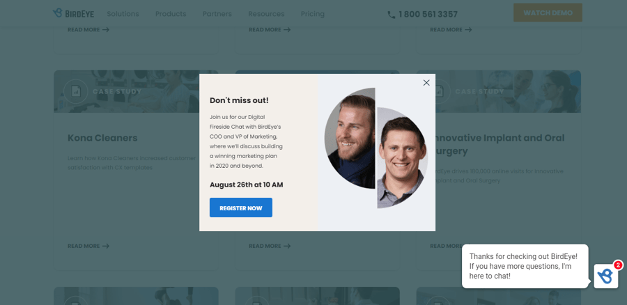
Take a look at this example by BirdEye. They’ve used one clear call-to-action that’s well-placed and prominent.
Another copywriting hack you can use is negative calls-to-action. They play upon the Fear Of Missing Out (FOMO) theory and are usually used to reinforce the main call-to-action.
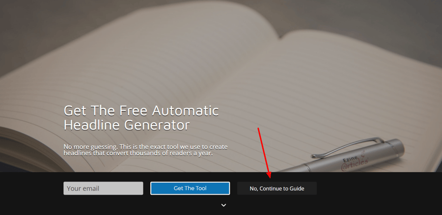
Here’s an example of a negative call-to-action by Sumo. It’s designed to be less prominent and uses copy that negates the actual goal (downloading the tool, in this case).
While designing the call-to-action button, make sure it contrasts with the background color and has enough white space surrounding it to make it stand out. It’s also important to size it well so that it’s prominent and in alignment with the other elements on the popup.
8. Give the option to leave the window.
Imagine being served a popup ad and struggling to find the ‘close’ button. Frustrating, isn’t it?
While you want the visitor to take note of your offer and click the call-to-action button, you can’t bully them into it. That just accounts for a poor website experience and leaves visitors annoyed.
Always place a ‘close’ button that’s evident or give people the option to not accept your offer. It’s a choice and they should be able to decide what they want to do.
The Takeaway
Nobody likes getting interrupted. But, if it comes in the form of an irresistible offer that’s relevant and well implemented, then why not?
So, consider these best practices to create exit-intent popups that not only capture attention but also pique interest and drive conversions. After all, they are your last chance of getting website visitors to stay and take the desired action – so, make them count.




Leave a reply or comment below