

A good user experience design is there to attract more clients, and to keep the ones you have. Of course, this much easier said than done.
The problem is, you need to stand out. There are so many website designers, programmers, and web experts, that the work, creativity, and resources needed to stand out are significant to say the least. This means you need to implement every tool in your arsenal, as well as get some new ones. This is where understanding the psychology behind UX design comes in.
Now, many are not thrilled at this notion. After all, designing something is an art, while psychology is a science. Going from something quite artistic to a rather academic notion may not be attractive to a regular designer. Furthermore, some may see it as something clinical, almost dead and cold. The problem with this line of thought lies in the fact that literally any design choice, anything people enjoy, is based on psychology.
We, of course, may not understand it completely, but that doesn’t influence the fact that there are some universal principles that can be applied to any design choice. In fact, our mind is the very reason we like certain things, why we are attracted to stuff in general. So, understanding the psychological framework behind all this stuff can be utilized to make your UX design much better, as GWM SEO and Web Design experts point out.
However, this entire concept isn’t just focused on figuring out what makes people like the things they like. It also helps you understand what frustrates people, what would make them ignore a website or an app, and what would keep them interested in one.
Going with a psychological approach behind your design is a lot like the difference between completely understanding a problem and its solution, and just memorizing the process and the solution to said problem.
Short attention spans matter
Another interesting psychological trait you can use is the fact that we all have limited attention spans. And we are not just talking about how people are used to nigh-instant gratification because of the internet and because of technology. No, this has been a part of human nature since caveman times.
A clearer way to look at this is by seeing the human mind as a computer. It only has so much processing power before it can’t handle any more information. And we acquire information constantly.
A cluttered UX design means there is a lot of information to process, and not much time to do so. Minimalism and fluidity are key here.
Keep the most important features and elements of your design at the forefront. Keep a clear hierarchical model by which a user can reach what he or she wants in as little as 4 clicks tops. A little thing like a cookie notice can draw attention away from the content you want to present. Essentially, the little things matter.
Understand gestalt principles
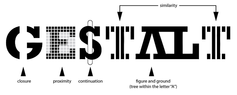
The first point focuses on the five gestalt principles (otherwise known as the principles of grouping). These are:
- proximity,
- similarity,
- closure,
- continuation,
- and figure/ground.
The actual principles are based on the notion that we make easier connections and associations with things that are closely grouped, or that are visually similar.
So, first, we have the notion of proximity. This is centered on actual physical proximity of relevant items we want people to focus on. Simply put, if we have two parallel lists of 10 items per list, we will automatically think that both of these groups of ten have, separately, something in common. This is great for facilitating a consistent pattern throughout your content.
The similarity is finding the visual similarities (colors or shapes for example) between two or more sets of objects. It’s an effective way to instantly notice that certain things are connected. Furthermore, it’s incredibly simple to create categories within categories. For example, having 4 lines of 20 objects, all in distinct colors, and then, within these lines, having certain items possess the same shapes.
The closure is all about having our minds “fill in the gaps,” so to speak. There are certain shapes that people pretty much universally recognized. Squares, circles, stars… The moment we see a partial segment of this shape, our minds will automatically fill it out. We will also, subconsciously, crave and want them to be finished. Closure can be pretty useful in setting up loading states and bars.
Continuation helps by guiding our eyes from one point of interest to another. This is seen in a simple drop-down menu, and a line of said menus showing clearly what a typical user will need. Another interesting and simple point are links. Our eyes will be drawn to the light-blue shade of the links and may increase the chances of us clicking on it.
Finally, we have a figure/ground. This gestalt principle uses our ability to separate visually different planes, and our ability to literally focus our eyes. It can be done through information hierarchy, layers, or contrasting. It can create illusions of depth and leaves room for interesting, eye-catching images. For example, an image of two faces looking at each other, while at the same time presenting a vase, is a good representation of figure/ground. You can utilize this element to make your design more unique.
Examples matter
![]()
The easiest way to get people to understand a concept is by showcasing it through an example.
We don’t handle abstractions as well as we do concrete real-world elements. So, let’s say you have a complicated and specific form on your website. The first option is, of course, to simplify it. If that is not possible, then we suggest you place an example, an image of an already filled out form below this one. When filling out anything on your website, keep an example in the bars. The example should represent the necessary format.
People have different sources of motivation
Some people need to be encouraged to do something, they need to know that others have already done it. People like this are drawn to “top rated” and “favorites” sections. Reviews also work wonders for this kind of personal style. On the other hand, some are motivated by completing tasks that are already partly done.
You can use this to your advantage by adding an “Almost done, you just need to…” option to your websites. Presenting a step by step process for certain features, and actually showing how many steps remain, works as a nice motivator as well.
And of course, you should target exactly who you want (after you figure out who your audience is). You can do this by using various tools and programs that you can find online. Certain analytical tools are already part of a social media platform you are using.
Humans are visual creatures

We not only process information consciously but subconsciously as well. A big part of this interpretation process rests on visual interpretations. If you can figure out how to trigger different subconscious processes, you will be able to facilitate a better connection with your users.
You should use colors and images tap into people’s emotions through their visual processing. A simple thing as the visual design of an eCommerce cart can boost your conversion rates. Now, there are essentially two ways you can do this.
First of all, have the images and the style of the page be somehow relevant to the actual content on the website. Understand what attracts attention to your page, and make it make sense. For example, running a website for a restaurant should have appetizing pictures of food as a background. Keep the colors nice and warm as well. If you run a platform that sells mountain gear, have some adrenaline-fueled background images. On the other hand, a spa should run a website that soothes the user the moment he or she sees it.
We should also mention emotions that come from colors. Namely, every color elicits a certain emotion within a user. For example,
- Red is all about passion and aggression. It’s associated with an increased heartbeat, higher blood circulation, it is tied to war and to love. It attracts attention, but it does not relax people.
- Yellow signifies happiness but can serve as a warning as well. Shades matter. So, lighter yellow is soothing and happy. Darker yellow is regal but also can serve as a warning sign.
- White gives one a sense of purity and calm, It represents virtue, and it is often a supporting color. It can emphasize any other color, white draws it out. Now, white can also be quite sterile, and sometimes evokes a feeling of one being in a hospital. We advise you mix it with some beige or ivory, to get soften up that sterile feeling.
- Black, on the other hand, is the strongest color. It can both allude to death, but it can also remind people of something elegant and sophisticated. Black gives a sense of mystery to things, but if you use it too much you will overpower the rest of your designs.
- Green reminds people of nature, and of health. However, be wary. Light green is energetic and fun, but darker shades can either give an earthy feel, or a feeling of sickness and poison.
Conclusion
Understanding how people think and react to certain design elements will help you much more than simply memorizing certain traits and ideas. Thinking about the five gestalt principles, taking color-emotion theory into account, and just remembering how limited our attention spans are — all this will help you get ahead, and make your work stand out.


Leave a reply or comment below