

Are your customers completing the checkout process? Or do they feel confused or let down at the final point in their buying journey?
If you get nothing else right with your online store (and hopefully that’s not the case) make sure you get your ecommerce cart design right.
Design it with one single purpose in mind: getting customers to pay for what they’ve selected. If not, they may head for the exits before completing their purchase.
And a lousy cart or checkout page destroys your conversion rate.
Baymard Institute estimates an average cart abandonment rate among ecommerce businesses of 69.89 percent (June 2018).
While some fall-away should be expected from people window shopping, comparing prices, or looking at gift options, abandonment can be reduced by making the website design more “frictionless” for the user.
Baymard studied cart abandonment in 2017 and discovered that 28 percent of US shoppers found the checkout process was too long. Many other respondents gave reasons that can be addressed by paying more attention to your checkout page.
Start by following these 12 ecommerce cart design best practices:
1. Keep your cart page sharp, uncluttered & snappy
Only include what’s necessary for a smooth checkout process. Anything else is unnecessary clutter that can confuse, slow down checkout, or cause people to abandon the cart page completely.
When your customer arrives at the checkout page they should see something clean and uncluttered like this:
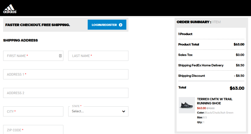
Note that there are no:
- Social media buttons
- ‘Continue shopping’ buttons
- Navigation buttons to other areas of the site
You only see what you need to complete the checkout process. Simple.
For a top user experience, test that page load speeds are snappy too. Otherwise, restless fingers may hit the BACK button.
2. Design your cart for mobile-first conversions
This is closely reacted to the first point but it’s so important that it deserves a mention of its own: design your cart for mobile conversions.
According to Statista estimates, mobile ecommerce will account for over 70 percent of total ecommerce by 2020 - up from 63.5 percent in 2018.
Pay attention to the following design elements:
- Easy-to-click buttons (using the thumb)
- Easy-to-fill forms
- Step-by-step checkout process
- ‘Save information for later’ feature
- A simple and uncluttered look
3. Make call-to-action buttons leap off the page
With cart design, your call-to-action buttons are probably the single most important element on the page.
They are directly linked with conversions as each time a user clicks them, they’re a step closer to the final purchase.
"Ensure the CTA is easy to understand and visually striking that compels the visitor to click the offer," says David Campbell, Marketing Strategist at Right Inbox.
These buttons deserve special attention. Help them stand out with:
- A unique color that ‘lifts’ the button from its surroundings (red or orange often works best for the key buttons)
- A clear, simple, unambiguous message focused on the user taking a single action
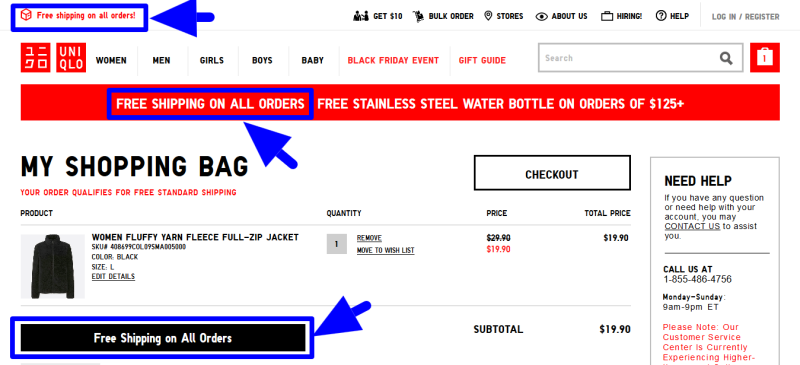
4. Be transparent about total costs
Customers want to know exactly how much they’re paying upfront.
Surprise additional costs (like extra shipping fees or unexpected taxes) are one of the top reasons for cart abandonment.
Be transparent and detail all costs early on. Uniqlo makes its shipping cost policy very clear on the cart checkout page:
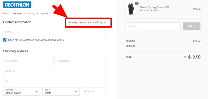
5. Allow the user to check out BEFORE creating an account
Users abandon their carts when asked to create an account too early in the process.
This has actually been known for a long time. Baymard Institute founder Christian Holst found in 2011 that 30% of users abandoned their cart when asked to register upfront.
It’s an unnecessary hurdle to make users cross; and it clearly has ‘nuisance’ value.
You can boost conversions simply by allowing the user to complete the checkout process as a guest - and then asking them afterwards to create an account.
ASOS famously cut checkout abandonments in half by removing the ‘create an account’ request from their cart page.
And Decathlon’s cart page allows you to complete the purchase without an account - but does allow users already with accounts to log in from the page.
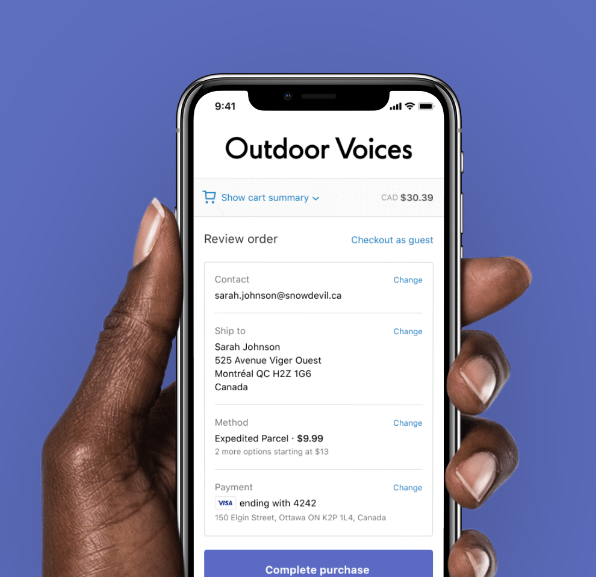
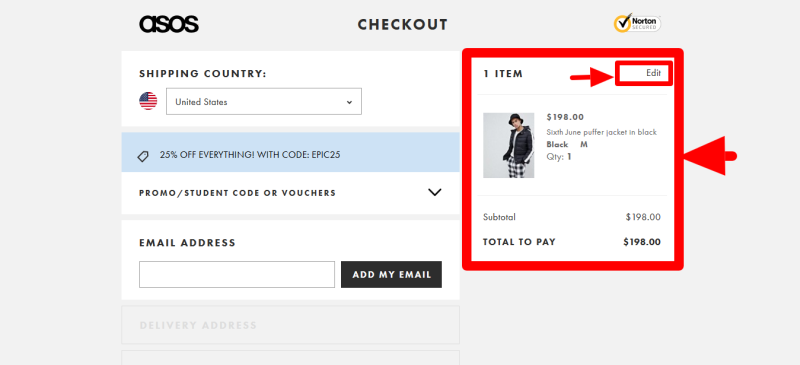
6. Include a product summary with high-quality thumbnails
Another important step for optimized ecommerce cart design is to effectively detail the products selected by the customer.
To do this, include the following key elements:
- The precise name of the product
- A brief summary of specifications (size, color, capacity, etc.)
- Quantity (this should be changeable by the customer)
- Large, high-quality thumbnails of each product
- Option to remove the product
- Order number
- Product price
- Total price
See how ASOS design their checkout page:
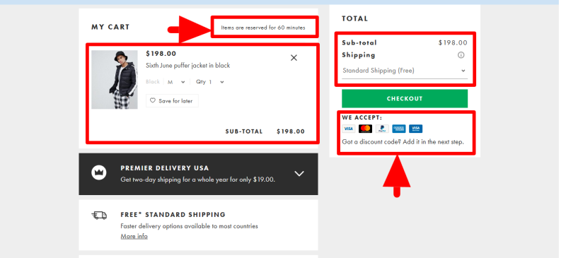
Also consider including details such as:
- Confirmation that items are in stock at that time
- Payment options
- Shipping details and approximate delivery times
- Indication of progress with the checkout process (progress bar or indication of steps)
- Data privacy and security elements
This is what you see when you click the EDIT button on the ASOS page. Note the confirmation of items in stock (and ‘held for 60 minutes’ is great for creating urgency):
Remember, users should be able to quickly review all the key information relating to their order on the cart page; and confirm checkout without being distracted by unnecessary information.
7. Use exit intent to prevent cart abandonment
Is your customer about to vanish before completing checkout?
If you could preempt their departure with a last-ditch effort to convince them to buy, how would that boost conversions?
Exit intent pop-ups help you do that. They are activated when the mouse cursor moves towards the back button or exit cross on the browser or tab.
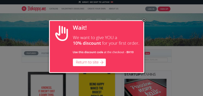
By interrupting the normal activity pattern of the user, you get them to make another decision rather than taking the easy option of hitting the ‘escape’ button.
Perhaps you can present an offer or a discount code that makes immediate checkout too good to miss.
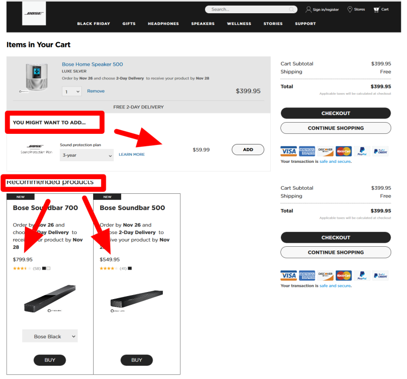
8. Upsell before you cross-sell
Upselling is the process of encouraging customers to buy a higher-end product than the one they’ve chosen
Cross-selling is the process of encouraging customers to buy complementary products (‘people who bought this item also bought…’)
With cart design, it’s best to focus on upselling as Econsultancy found that it is 20 times more effective than cross-selling.
However, the two strategies can work in tandem: show related products as long as it doesn’t create too much clutter on the page.
This is how Bose does it:
9. Give customers the option of live chat
Customers abandoning their carts due to confusion or not having their questions answered satisfactorily is inexcusable.
Include the option of chat on your cart page to prevent this. It will help you to build trust and remove any final reservations in the customer’s mind.
This is especially effective if your target audience is young.
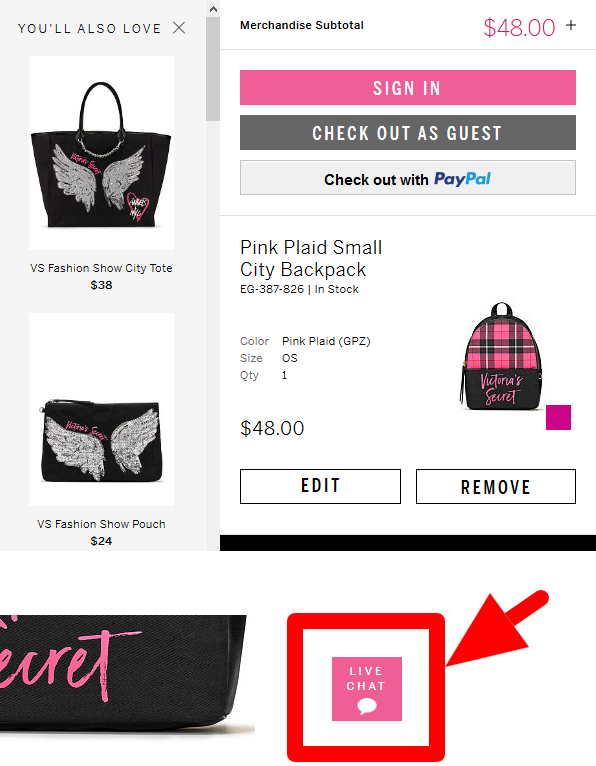
Not only does this improve conversions. It’s a great way of gathering (and acting on) customer feedback to improve the user experience: you have a written record of customer reservations via the chat logs.
10. Provide multiple payment options for customers
The Baymard Institute reported in their 2017 study that eight percent of users abandoned their carts because there weren’t enough payment options.
Including multiple payment options plays to the whims of your customers and helps reassure them that they can pay how they always pay.
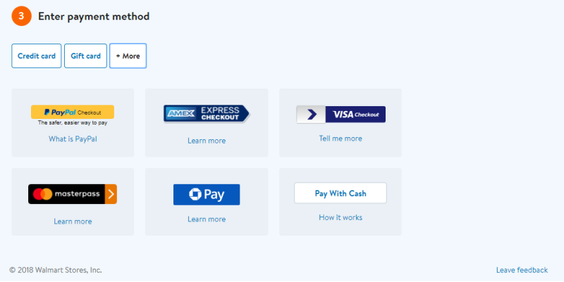
This is especially important if a large proportion of your customers are based around the world and are used to different payment methods.
Going with Visa and MasterCard only may damage your conversion rate.
11. Highlight your security credentials
Do people trust your cart design enough to input their credit card details? If not, they will leave without completing the purchase.
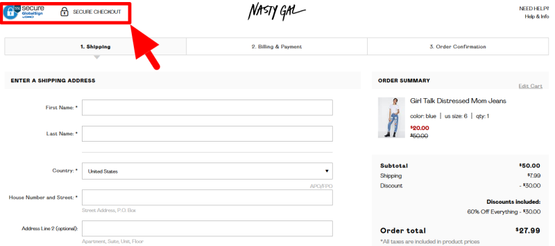
Trust is huge - one of the major factors that convinces customers to follow through with their purchase.
Include ‘trustmarks‘ wherever you can to leave customers with that warm, fuzzy feeling.
12. Allow customers to complete the checkout later
Do everything possible to convince customers to check out and pay. But you’ll never reach 100 percent conversion with that.
People have legitimate reasons for wanting to complete the process later and do intend to return. And they expect to find their cart the way they left it - whatever device they use:
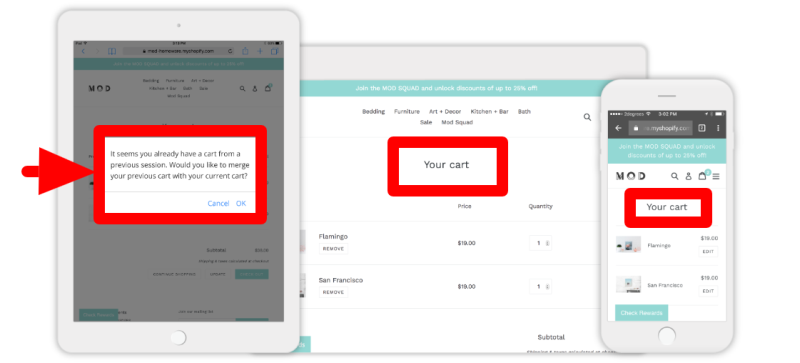
Incorporate “persistent cart” functionality into your cart design. This will allow customers the opportunity to pick up where they left off, if they don’t complete their transaction.
BONUS TIP: Use cart abandonment emails & remarketing
What do you do with customers who still don’t complete their purchases, despite your best efforts?
It’s no time to give up on them.
You can increase sales and revenues with:
- Cart abandonment email auto-responders to bring abandoned cart visitors back to your store where they left off. Try Klaviyo or MailChimp.
- Remarketing to visitors who’ve left without buying: offer discounts or promotions by email to entice them back or target them with ads on social media. More on using social media for ecommerce here.
Ready to increase conversions from your cart?
The 13 cart design page tips above will help you reduce cart abandonment and boost conversions.
There are many more potential tweaks you can make but the above are aimed at giving you some key quick wins.
As always - test what works and adjust as necessary.
Let us know how you go in the comments below.


Leave a reply or comment below