
Have you been thinking about taking your online store's design a bit further? Maybe you feel your site needs a little extra something to make it stand out and really wow your customers. The question is what kind of new feature would be best?
When making any design decision, it's important that you consider functionality and ease of use. Adding shiny new design elements just for looks can be a huge mistake if they end up making your site slower or harder to use. The best solution is to only implement design features that add value to your site and help your customers. Of course, there's nothing that says useful features can't look great— and they should!
One of those useful features is the menu, which customers can use to find different parts of your website. They're especially useful for categories and subcategories. To prevent the menu from taking up large amounts of space at all times, it's popular for menus to drop down when the mouse lands on them. Some menu items open additional fly out sub menus, such as to display subcategories.
Every online store with more than a few products can benefit from a dropdown menu, but it's important to do it right.
What Makes a Great Website Menu?
The menu is one of the most important parts of a website, especially a large online store with many products. The menu helps customers navigate to the items they're looking for, so it's crucial to have it organized properly. Customers need to be able to find their desired item within a maximum of three clicks, and menus are a huge help in this area.
Of course, a menu can be attractive as well as functional, and there's no reason any part of your website should be boring. In fact, your menu provides a unique design opportunity that can help your customers and make your brand more enticing.
This advanced menu is known as a Mega Menu.
What is a Mega Menu?
A Mega Menu is an example of a great design feature that is both attractive and functional. Think of a Mega Menu as an expanded, improved dropdown menu with extra navigational capabilities. If a dropdown menu is a list, a Mega Menu is more like a map, offering multiple, clearly labeled destinations.
With a Mega Menu, organized categories and subcategories make it easy for your customers to find exactly what they're looking for, and the simple truth is that when it comes to navigating an online store, sometimes a dropdown menu just isn't enough.
Mega Menus offer extra capabilities beyond a typical menu, such as increased space which eliminates the need for flyouts. Mega Menus can also use graphics to help your customers find what they're looking for even more easily.
Here are some examples of Mega Menus in action.
Rhodes Race Cars
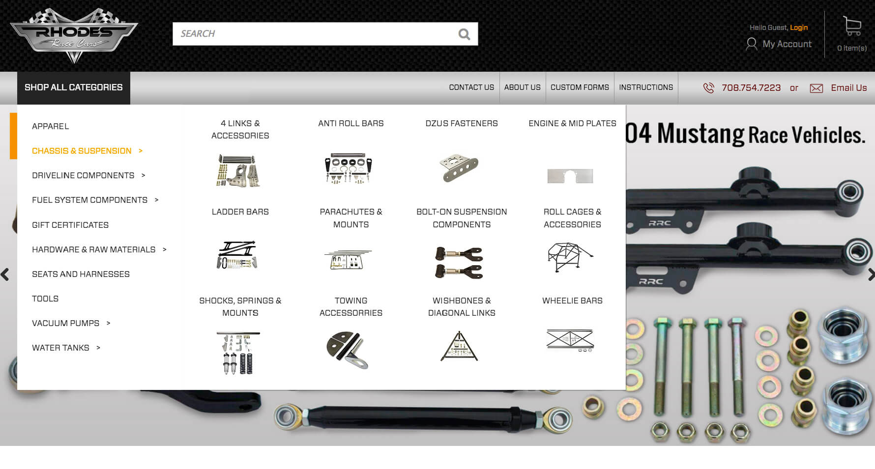
Rhodes Race Cars uses a Mega Menu complete with icons for every product category. These icons help customers understand at a glance what they can expect to find. This makes shopping quicker and easier.
Rhodes Race Cars' Mega Menu is designed as an innovative combination of dropdown and flyout menus, a compact design that frees up a lot of space when not in use.
Convention Exclusive
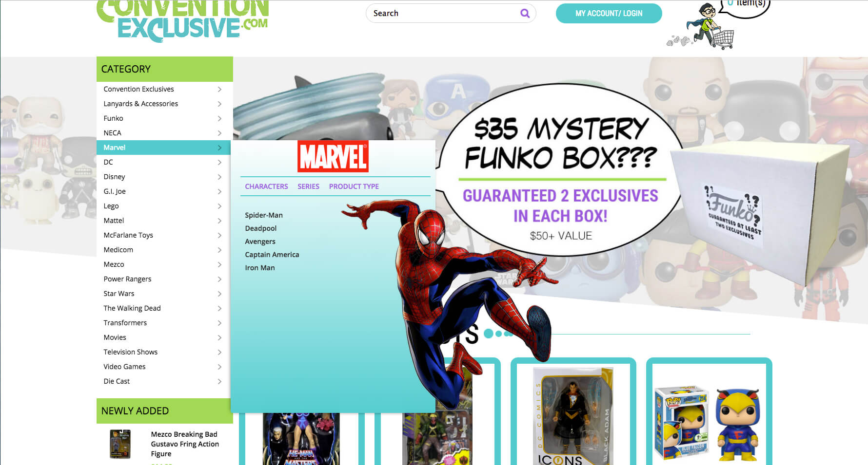
Convention Exclusive includes fun graphics as category examples in its Mega Menu. This fits the mood of the site quite well and appeals to the brand's target audience.
Convention Exclusive's category menu appears as a sidebar on the screen, so categories are always visible. The Mega Menu pops out when the individual categories are moused over. While this doesn't save as much space as Rhodes Race Cars, it carries the benefit of having the categories out in the open where they can catch a customer's eye instantly.
Sinful Shoes
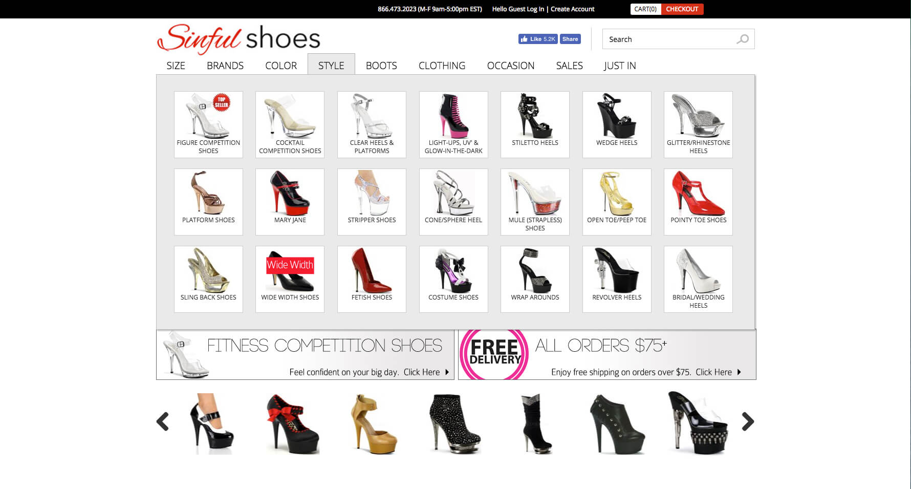
Sinful Shoes makes great use of icons in its Mega Menu to help customers know where to look for their favorite style. Other tabs in this Mega Menu are similarly designed to help customers shop by color, size, or other criteria.
This is an excellent setup for an online store with a large number of products that might be confusing to a newcomer. Even if you love shoes, you might not be able to guess at these Sinful Shoes categories without the icons to illustrate what they are. Images speak a lot louder than words.
Morgan Sports
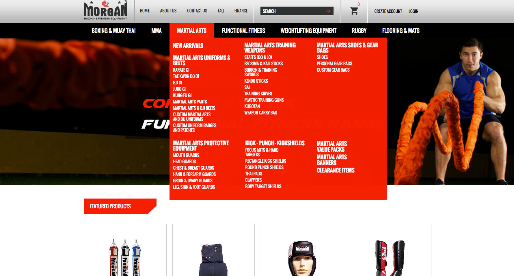
Even without graphics, Morgan Sports gets a lot of mileage out of its Mega Menu. As another online store with a large product selection, Morgan Sports relies strongly on its category structure to help customers find what they need. These categories come through perfectly in the menu design.
Rather than using flyout menus for subcategories, Morgan Sports' Mega Menu displays related categories in a sensible list format.
Direct Door Hardware
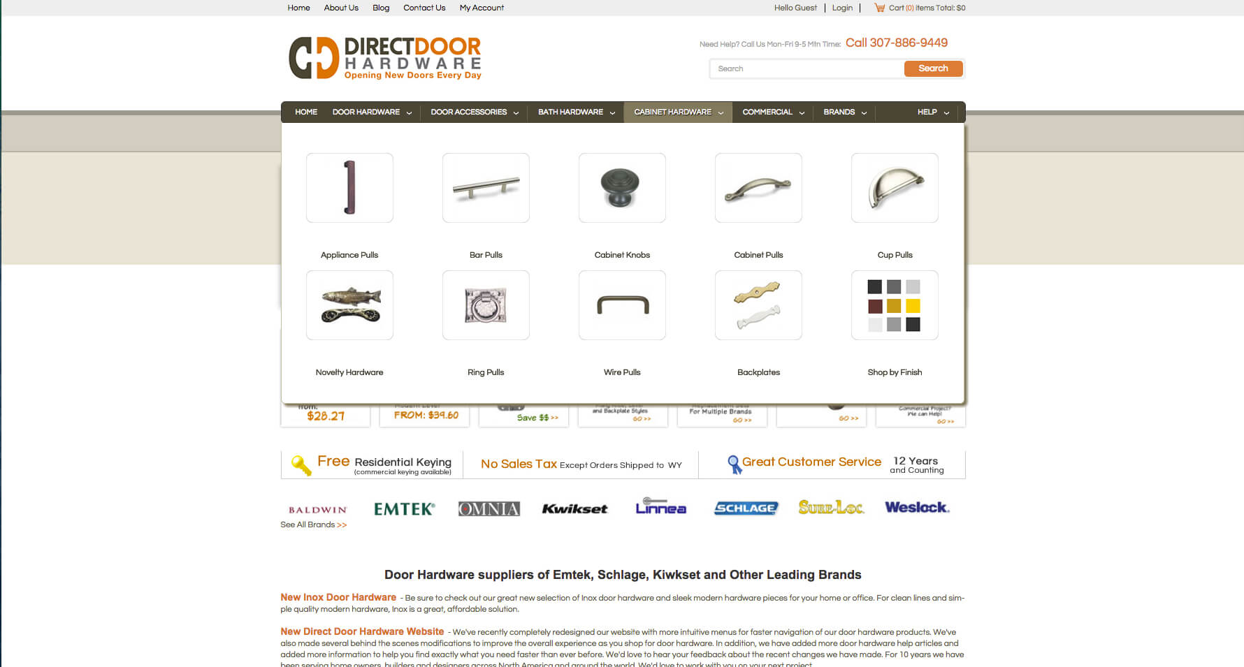
Direct Door Hardware utilizes its Mega Menu to give customers a general idea of each category. The Mega Menu uses icons for different products, finishes, and brands.
The benefits of this approach are similar to the Mega Menus on Rhodes Race Cars and Sinful Shoes. A large selection of specialized items is much clearer with images.
LogoUp
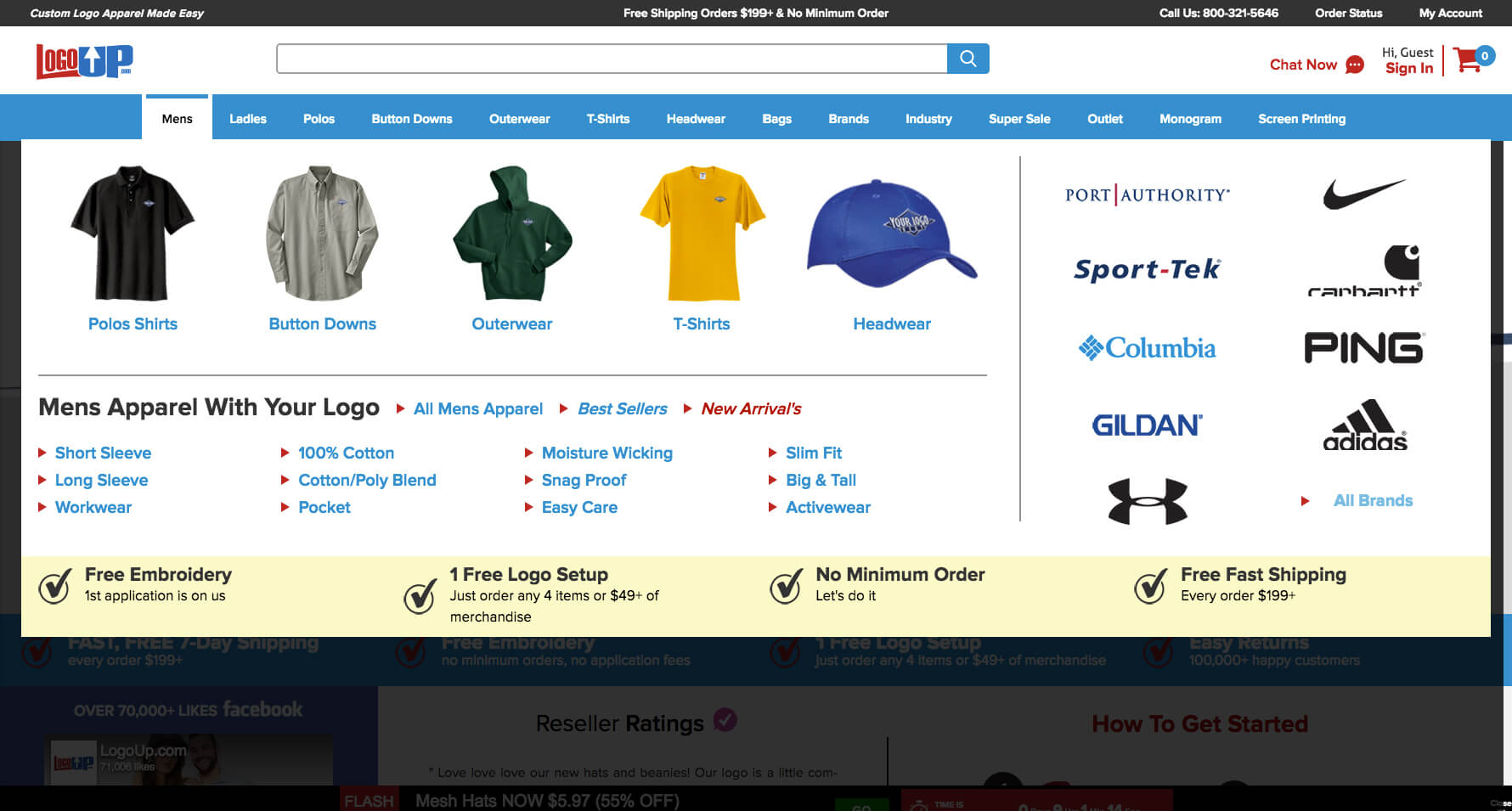
LogoUp utilizes a Mega Menu that relies heavily on images to help customers recognize their favorite styles and brands immediately. Product examples and brand logos are used in a similar way to the other sites above.
Since LogoUp's business is focused on personalization with company logos, it's important for their customers to know which brands and styles of clothing they can get personalized. Displaying them in this way informs customers and lends the website an air of prestige for working with major brands.
How and Why to Get a Mega Menu on Your Website
You've seen the difference Mega Menus can make, and their benefits can be summed up as follows:
- Structured navigation (menu items are grouped)
- No scrolling (all menu items are in view at the same time)
- Can include images, such as icons to aid in navigation
- Flexible layout (can be built for both vertical and horizontal orientations)
- Increases sales by providing information to customers to help find their desired items
- Fewer clicks to get to each product page
Of course, Mega Menus need to meet certain standards in order to retain their convenient qualities. It's very important that the menu's contents are organized meaningfully, and that it loads quickly and doesn't cover too much of the screen. The navigation should be clear but avoid too much extraneous detail; Mega Menus are meant to inform, not confuse. In fact, it's best to have a Mega Menu designed by an ecommerce web design expert.


Leave a reply or comment below