As an eCommerce shop owner, you understand the importance of ensuring your user experience is frictionless. Unattractive or understated elements can turn away or even confuse users. When shopping or performing any action on your site, your customers may desire some kind of direction and guidance on what to do next. This is a fundamentally important aspect of good UX — creating effective CTA buttons can accomplish that.
What Are CTA Buttons?
Call-to-action buttons are clickable elements that direct your customer to the logical next step of their website browsing experience. These buttons can lead customers to buy products, read more about a topic, or even sign up for promotions and newsletters.
As an eCommerce shop owner, you want your customers to have a clear path on what to do next. In other words, they should not be spending time wandering about your website and possibly getting distracted. Or, even worse, your customer may simply become frustrated and abandon their cart.
With this in mind, remember that the quality of your CTAs can make a huge difference in your customer’s purchasing experience — and your bottom line. If your button is poorly designed, it can be misconstrued or ignored entirely.
Unfortunately, many people put less effort into their CTA button design and copy than the rest of their page. As implied before, this can be a costly mistake. After all, more than 90% of visitors who read your headline also read your CTA.
To assist you in getting up to speed on making your buttons better, here are some well-known tips on making eye-catching, direct, quality CTAs for any situation.
How to Create Call-to-Action Buttons That Compel Customers
1. Choose Color Wisely

Color can be a significant factor in ensuring that an element on your page draws the eye and encourages action. In other words, avoid plain white and black buttons. If you want some universal go-to's, the highest converting colors tend to be red, green, orange, and blue. From there, you may want to choose based on what works well for your site. For instance, reds may seem too aggressive on some websites, whereas a calmer green or blue may integrate more naturally.
When choosing colors for your CTA buttons, you should also consider your company’s branding. Think about the images/background surrounding your actual button as well.
Additionally, when deciding on a color for your buttons, keep accessibility in mind. Make sure you choose a color that will stand out even in cases of color blindness, which can cause certain shades to blend in or look like a different part of your page.
2. Design Buttons With Contrast That Pop

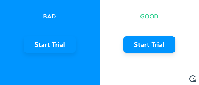
Contrast in art and design is typically used to make one element stand out by displaying it against a contrasting color or value. This is, essentially, the entire purpose of carefully selecting your color.
Remember, while you want to catch your reader’s eye, avoiding loud, bright contrasting colors that make your design confusing and headache-inducing is essential. One common way to determine if specific colors go well together is to view your page in grayscale to see how the values work. If it looks appealing and adequately balanced without color, it’s more likely to work in color as well.
One trap that some designers fall into when crafting their CTAs is making the “no” option obscured and difficult to find by not introducing enough contracts. Don’t do this. Your users will notice and will be actively dissuaded from using your website.
3. Use Verbs and Active Language

Source: hubspot.com
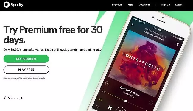
Of course, your button’s basic design isn’t the only thing you will want to consider. Your copy will play an instrumental role in grabbing conversions. Because of that, you want to avoid terms that can be easily forgotten and ignored, such as “Buy Now.” Use direct, active language that evokes the image of what you're selling.
For instance, Spotify has the simple and direct “play free” button displayed as an option for their free streaming option. This has a straightforward, easy-to-understand connotation that evokes action. Other “action words” and phrases such as “get,” “now,” “play,” and “click now to…” are all ways to properly direct your visitor to the next phase of their website browsing experience.
4. Give Your CTAs Room to Breathe

Source: theworkshop.com
When making a design element stand out, you must provide it with the appropriate amount of space from other similar components (in this case, other CTA buttons). No reader wants to be bombarded with several different buttons on the same page. Spamming them with a variety of buttons will only serve to make them frustrated with their user experience.
You should also give your button enough “breathing room” from the rest of the content on your page. This simply means you want to provide a buffer of white space to help it stand out and ensure that your page doesn’t appear too crowded. A cluttered page can cause your reader to get lost and prevent them from quickly finding your CTA.
5. Use Proven Placement

When deciding the actual placement of your CTA buttons, it helps to remember some tried and true rules based on natural user flow and behavior. This means placing a CTA after a user has read the content on a page. If your website is targeting English speakers, remember that they read from left to right — which also impacts the logistical flow of the UI experience. This means that the best place for CTA buttons is typically at the bottom right of the page for an English-language website.
You can avoid bad CTA placement by keeping away from:
- Popups that shove the CTA in the users' faces before they read the content
- Putting the “negative” CTA option before the “positive” one (e.g., putting “No thanks” before “Click here”)
- Placing your CTA on a sticky menu that follows the user as they scroll
6. Place CTAs in Your Copy
Source: alltechappliance.com
Most people think of CTAs as buttons. However, that doesn’t always have to be the case. Calls to action can be put anywhere, including within a hyperlink in your page copy. Doing this can prevent the flow of your content and webpage from being broken up where you may not want it to be.
Of course, if you take this approach, you will need to ensure that you integrate the CTA seamlessly and that it doesn’t distract too much from the context.
7. Make Your CTAs Easy to Read

Any user should be able to comprehend a UI element without much effort. This is especially important for CTAs, which are bite-sized directions that tell your user exactly what they’re doing and where they are going.
Keep the actual language of your CTAs brief, direct, and to the point. Fortunately, the compact nature of these buttons means that you will always have to be economical with your words. However, you still need to ensure that your words won’t be misunderstood. That means keeping words and phrases in CTAs as short as possible.
While you can have a short, snappy string of words, it is not recommended to let your CTA go over four words — keep it at two if possible. Don’t try to be excessively clever with long, overdrawn sentences.
8. Encourage a Sense of Urgency

Source: getsitecontrol.com
A compelling call-to-action button induces a sense of urgency within your reader. One way to do this is to utilize those verbs and active language we mentioned earlier. By using words such as “now,” “fast,” “hurry,” “get,” and “approaching,” you are evoking a sense of immediacy in the user.
That said, it is still important not to make your audience feel “pressured” into anything. Strike a balance between encouraging your customer to buy now without seeming aggressive or desperate. This is where clear, short, direct wording comes in. The more direct and logical your messaging is, the less it will seem like a marketing ploy.
9. Cater to Your Audience's Needs
Source: getsitecontrol.com
An essential part of any marketing campaign will be customizing your messaging to suit your audience’s needs. That means using your call-to-action buttons to give your audience what they want. Make it clear that your CTA button will be the solution to their needs. Demonstrating that they can sign up for your newsletter, download an eBook, or start a free trial is addressing their pain points quickly and effectively.
10. Always Test Your CTA Buttons
Source: gosquared.com
Regardless of what you’re selling, testing your call-to-action buttons at every opportunity will be essential to your success. No matter what you change — copy, color, size, contrast, placement, etc. — you want to compare it to other versions. One way to do this is by sending out separate versions of the same email to different audiences and A/B testing their success rate. Observe how they compare when it comes to clicks, conversions, and more.
When testing your buttons, don’t compare your current button to the results you would have with no button. Be sure to compare your call-to-action button’s performance to something already live and demonstrating specific metrics.
Conclusion
Regardless of what you’re selling or providing to your users, creating an effective CTA button requires a bit more thought and effort than you may assume at first glance. With that being said, a few primary considerations and steps will help ensure that you avoid the common mistakes designers make that turn away customers, conversions, and leads.
It’s also important to understand that not every change will give immediate results. Keep on testing, stay patient, and you will get what you need out of your calls to action.


Leave a reply or comment below