


Checkout pages are often seen as an afterthought, since most of the purchase decisions have already been made prior to reaching this step. But it’s here that the customer actually commits to the purchase, and will either follow through – or head for the door.
For most people, the checkout is the least fun part of shopping, and not because it's the bit where you hand over your hard-earned cash. Too many questions, confusing options, and pages that time out can really put a damper on the whole experience.
According to the latest eCommerce statistics, these are the most common reasons people abandon their cart:
- 37% – needed to create an account
- 28% – the checkout process was too completed
- 23% – couldn’t see up-front costs / total order
- 20% – website crashed
- 19% – didn’t trust the site with their credit card
Luckily, there are easy ways to fix these problems. And, given the growing trend and adoption of cloud software in the accounting world to further streamline the process, optimizing your checkout is a lot easier than it was. Let’s take a closer look at some of the biggest turn-offs and how to solve them.
1. No clear Call-to Action (CTA)
Think of your CTAs as being like little digital signposts. When new visitors land on your website, they need to know exactly what needs to happen next and how to do it – and well-crafted CTAs will help them complete their transaction.
Be sure to guide them with clear statements, like “Add to Cart” or “Enter Your Card Details Here” to ensure users can easily spot which parts of the page they need to use. This isn’t just helpful for the average user; it also improves the experience for users who use screen readers, which are programs that read out loud content of webpages. Because of this, designing CTA’s to be more accessible also helps to make your website ADA compliant.
When anchor text (the button you click to go to a different page) is unspecific, like "Click Here," users using screen readers can get lost because they won’t be able to see the cursor.
Instead, say exactly what you mean. Making sure your anchor text isn’t generic is the best way to help screen readers jump to the relevant content. For example, saying "How to create a strong password" or “Enter your card details” is more descriptive and will help blind and visually impaired people find the information they're looking for.
Placement is important, too: your CTA should be easy for customers to find. If it's tucked away, surrounded by design clutter, or hidden behind too many steps, then you're going to lose out on a lot of conversions. In fact, recent CRO trends and conversion statistics show that call-to-actions that are surrounded by more negative space and less clutter had an increase in conversion rate of 232%. So keep it simple and clean.
2. Overly complex forms
We’ve all felt a pang of irritation when faced with pages and pages of form fields during checkout. So why do businesses still insist on asking customers question after question?
Our advice? Don't ask for any unnecessary information. No matter how great a “and tell us about you” might sound, there's really no reason you need to know who this person is, what the name of their first pet was, and what they think about your brand’s color scheme. At least, not at this stage in the journey…
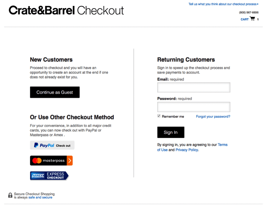
Keep your checkout forms nice and short by removing all unnecessary questions and only include the absolutely essential ones – such as name/address/payment details etc. If you want to find out more about them, consider sending out a survey after checkout. And if possible, offer a guest checkout option, so they’re not forced to make an account unless they absolutely need to.
 Source: UserZoom
Remember: prioritize your customer’s experience, not your need to harvest data and email. The nicer your website is to use, the happier your customers will be. And happy customers have a tendency to become repeat customers.
3. Annoying username and password fields
Lots of different websites have different rules when it comes to choosing login information. Some sites require numbers or symbols in your account name, while others only accept letters and capitals.
Some systems let users pick anything they like, but most force usernames to be 6-12 characters long with both and alphabetic characters mixed in. Forcing users to create overly complex passwords is annoying and slows the customer down in their shopping journey. If you’re worried about security, then consider adding a link, or a few lines that give tips on how to choose a safe password – and leave the rest to them.
4. Unclear shipping and payment options
When it comes to checkout processes, there's a lot to take into consideration: you need to make sure your customers know precisely where they are in the process and what will happen next – this will help them quickly complete their transaction with minimum fuss.
The key is to be short and simple with your instructions. We spoke about the importance of clear CTAs, like “Add to Bag” or “Proceed to Checkout” instead of long-winded or ambiguous statements. But clarity should be a part of your design, too. Make it clear which checkbox is for delivery and which one is for billing details so customers aren't left wondering – and get a UX expert to properly design your site so each step feels natural and intuitive.
5. A cluttered page
Website design can be a tricky business, and there are several aspects that need to be taken into consideration when it comes to checkout pages, which should be treated a little differently to the other pages on your site.
No matter how flamboyant your actual site is, when it comes to this important page, avoid getting too creative or focusing too much on aesthetics because this could ultimately harm the customer experience and hurt conversion rates in the long run. You might have the most playful homepage, but when card details are being handed over, play it safe: this isn’t the time for changing cursors or flashy video content.
Checkout pages should be aesthetically pleasing to appeal to your target market, but primarily, they should be functional. They must display relevant information, call-to-action buttons and potential buying opportunities. Keep things clean, simple, and obvious in terms of what’s going on.
6. Using social media buttons on the checkout page
Using social media links at checkout can be distracting. The last thing you want is for your customers to feel overwhelmed when trying to buy from your website. They should instead feel informed, confident and ready to complete the transaction. Not only that, but the idea that it's even possible to share a page where card details are entered? No thanks.
7. No confirmation/thank-you page
So you've entered your card details and clicked pay. Then...silence. You’re not even shown a message saying "Success." Not only can this be frustrating, but it also makes you wonder whether the transaction really went through. Do you click back? Refresh? Wait? Put the order in again? Cue panic.
Not having a confirmation message isn’t just unnerving from the customer’s perspective – it's also a missed opportunity for thanking the customer and building up a bit of rapport. Add this vital content page and your customers will thank you.
To really take things up a notch, consider sending out a thank-you email or an automated SMS to the customer right after purchase (use automation software to streamline this). Not only is it extra reassurance – it’s a great way to answer any FAQs they may have, as well as give them information they need about their new purchase. This has the added benefit of taking the strain off your customer service department: if the answers are there, the customer won’t need to ring/email in.
8. Not having a payment security
Digital security is vital to eCommerce success. So when a customer is inputting their card details, they're going to want some reassurance that the site they're using is secure. They will have been prompted with a message saying your site uses industry standard SSL encryption when it does, but if there has been no prompt or even an indication of what 'SSL' means, you can bet this will put them off from buying from you – and might make them go elsewhere.
Showing customers that their details are safe with PayPal or whatever method you use could be all that stands between a successful sale and a lost one.
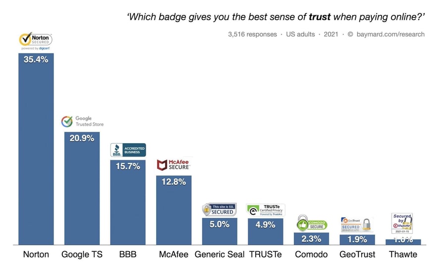
Source: Baymard
So how do we begin to solve this? Making sure your SSL system is up to date and clearly positioned on the page, as well as linking it with PayPal or similar will help you build visitors' trust. You could also consider implementing a third party payment service that automatically displays the security logo of your choice, so customers know they are in good hands.
9. Having too many payment options
Choice is good, right? Well…not always. Research has shown that including more payment options than necessary had a negative impact on the customer’s perception of the trustworthiness of the website. It can also lead to analysis paralysis – which is where you struggle to choose because there are too many options. But on the other side of the coin, having too few options and not meeting customer expectations can also result in a loss of trust, which means that they are less likely to continue with their purchase. So what are you to do?
If you’re stuck choosing, play it safe with the big names: all the card options, plus Apple Pay and PayPal. In fact, PayPal transactions have 70% higher checkout rates than non-Paypal transactions – so it’s definitely worth your time.
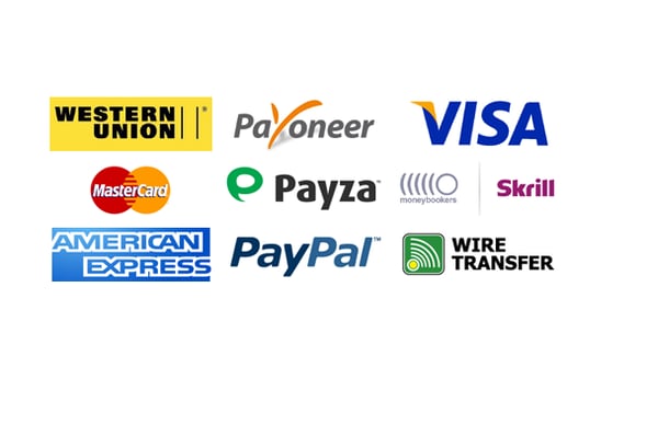 Choose three or four, max. Image Source: startupguys.net
Final thoughts
An optimized checkout process is about making sure customers can easily find everything they need to complete their payment without getting confused or frustrated in the process, which means it's down to you, the store owner to make sure that this happens.
If your website is slow or difficult to navigate then this could be what's putting them off shopping with you, so make sure that it is up-to-date and user friendly by referring to industry guidelines on design trends. It might also help if you offer additional services such as live chat, email enquiry tracking or social media options – all of these will encourage shoppers to return.
Online eCommerce platforms can also be a huge help in streamlining the process for you, and your customers. With the right software, you can easily set up a range of options for your customers to choose from and make sure they're satisfied with their choices. This way, potential customers won't be put off by any confusing aspects of the payment process and you'll encourage them to complete the checkout process without hesitation.


Leave a reply or comment below