


Over the years, there has been continued rapid growth in e-commerce; and it’s all thanks to technology and the internet. It’s easier and more fun to order things from our mobile phones while relaxing on a couch. But, this growth isn’t entirely positive for everyone. With this growing trend, the competition is also increasing at a great pace. And, some sites are lacking big time.
What if you wanted to buy something you like that’s also on a good discount? But alas! The site is too complicated to finish the purchase. You’ll probably want to avoid all the hassle and visit another site with better navigation.
An average consumer wants a convenient shopping experience. Web design is more than just using pretty pictures; interactive design trends indicate that all the visual elements should be able to work together to give an amazing user experience. Your online store’s design goal should be more conversions, more sales and increased repeat customers.
Factors that affect conversions are related to how your e-commerce site is designed. If it is easy to find the information you need, or if the website communicates a trustworthy brand image, it all depends on the design. You cannot ignore any part of the user journey. Every step that the user takes on your website, from the initial landing page through checkout, should be carefully designed with the final purchase in mind.
Today, we will be discussing the best practices in e-commerce web design which you can use to up your game and reach your business goals.
1) Let Your CTA Science Prevail
Want to convert a visitor in the least amount of time? It’s essential that you have a clear call-to-action (CTA). They can be made to stand out by using contrasting colors in comparison to your store’s theme and other design elements to grab visitor’s attention.
Then, you can also play around with the wording of the CTA to target different types of demographics. You can even influence customers to take action quickly by bringing in a sense of urgency to it. Choose words and phrases like “a few left,” “buy now,” “free shipping” etc. for the CTA to make it seem urgent. Human psychology plays a critical role here. According to Espresso Digital, about 70% of small scale businesses lack any calls to action.

As in these buttons above, there is not much difference in the text; but, the red button can get you more conversions than the green. CTA is more of a science than an art. The science behind CTA’s is best described by Hinge Marketing.
2) One-Click Checkout Can Save Customers Time
Amazon has this amazing one-click checkout feature on their products pages. This way, you can avoid the “Add to cart” step and make the process of checking out even faster.
Suppose you’ve something in your cart that you wanted to save for the near future but don’t want to delete it; here comes a one-click CTA to the rescue.
Amazon took advantage of this, and they were able to increase conversions tenfold. Although they have lost the patent, now anybody can use this element on their online store in any way they desire.
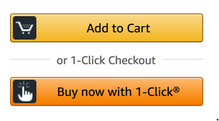
Research found that a customer was able to place an order and checkout in 10% of the time of a conventional checkout process, which is a major factor in the case of abandoned carts – when a visitor abandons the checkout process simply because it is too complicated.
3) Easy Checkouts
A lot of the time, people fill their carts but end up abandoning it. Have you ever wondered why? Usually, it’s because checkout was too complicated! Be sure to use the following tactics to keep your checkouts quick, easy and convenient:
- Always remember to put in various payment options and make it user-friendly.
- Never ask too many questions while checking out; this could be a big turnoff.
- Always keep navigation easy. Never complicate it by putting in too many CTA’s while the payment is being made.
4) Keep in Touch
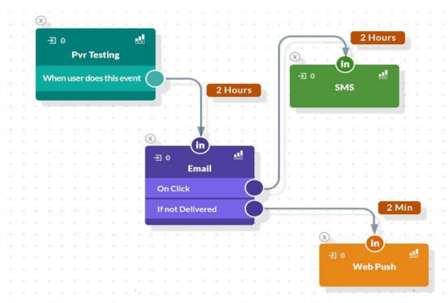
Always keep your visitors updated. Triggered notifications are quite similar to the notifications that you receive regularly from your Facebook and Instagram; the only difference is that the companies send this to their visitors whenever they are online.
There are various types of tools which can keep your customer updated:
Push Notifications
These are the notifications which contain a message sent on your subscribers’ device by the website or web app. It is not necessary for the customer to be on the website; you can send push notifications anyway. These turn out to be great converters.
Emails and SMS
You should also send customers emails and text messages regularly so that they don’t miss out on any updates. Let them know that you care for them. They will surely notice that you miss them and will visit you again. Design your website so that it’s easy for customers to sign up for email and text notifications, but make sure to not shove it down their throats.
Web/Mobile Banners
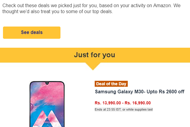
Design your banners beautifully with interesting fonts and pops of color. Let your customers know that your product is on sale or that you’re shipping it for free!
Customers love discounted products. Banners are one of the best ways to attract the customer's eye.
When your customer visits the page, you receive an alert so that you can keep them updated by sending them emails, text messages and push notifications to encourage a repeat visit (and possible conversion). There’s a lot of Marketing Automation Software in the market to lead you in the game.
5) Lead the Game with SEO
The most amount of web traffic comes from the search engines. According to The Conversion Guru, only a 10% of web searchers make it through to the second page of search results.
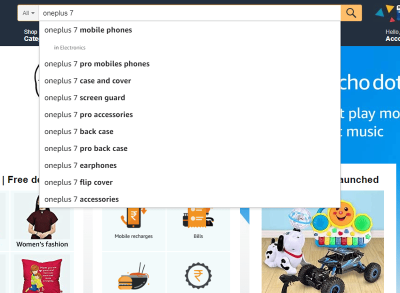
But, SEO isn't just for search engines like Google or Bing. For most visitors, your on-site search tool is the beginning of their purchasing path, so it is imperative that they are able to easily locate it on the website. Customers are more likely to make a purchase if they find exactly what they are looking for.
This makes it easier for the customer just to click on the desired results and not to type the whole thing. Once a customer does a search, they should be able to easily filter the results based on various metrics. There should be a filtering functionality so that customer is able to easily sort through numerous search results. This is a sure-fire way of improving conversions.
Google Search Console and Ahrefs are some of the best tools to make your site SEO friendly.
6) Ignoring Mobile is a Big Mistake
More than half of the world’s population uses mobile phones, as they are very convenient. More than 50% of e-commerce purchases happen over mobile phones.
People will often want to skip you if your site isn’t mobile optimized. There are several sites that you can use to let you know whether or not your site is on the right path to mobile. A simple Google Tool test can let you know.
Here’s some tips on how to keep your online store’s design mobile optimized:
- Never put in big banners and pop-ups that cover up the whole screen.
- The CTA’s should be clear enough to read on a small screen.
- The images of the products should be displayed in proper order and preferences.
- Always show best sellers on the top, so that customers don’t need to scroll to find the desired product.
Consider how your store’s desktop layout will translate onto small screens, how the most important elements are highlighted on a page and how navigation works on mobile. Do this so that a visitor can find what they need quickly and easily.
7) Encourage & Show Off Customer Reviews
Social proof is a thing that many people live by. Typically, shoppers avoid buying products that don’t have any reviews. Keeping this in mind, many sites are now using customer reviews to up their sales. Amazon is the biggest example of this; it has reviews for each and every product and allows anyone review or share snapshots about the product and their experience.
No one wants to risk their money, but customers will be more comfortable trusting the product that has a thumbs up from the masses.
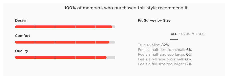
Also, there’s a variety of new ways for people to rate and review products, making ratings more helpful by including different aspects. For example, many clothing retailers categorize the ratings into design, quality, comfort, and fit.
Credibility increases if you write “verified purchase” near the review to show that this reviewer actually purchased the product. You can help customers find the most helpful reviews by creating a review snapshot, as seen below.
8) Enable Easy Email Signups
Always make sure your website makes it easy for customers to subscribe to you so that you can keep them updated. If you’ve got a lot of subscribers, you'll want to to shower them with love. Send them emails with special discounts and coupon codes. Email marketing is considered one of the most effective ways to boost conversions for your online store.
You can make it simple for customers to sign up for marketing emails or newsletters by adding a module at the bottom of your website. Customers can easily type in their email address to get exclusive sales and updates in their inbox. Another way of doing this is by adding an email subscription checkbox option in CTA's; you can even incentivize email signup with a discount code.
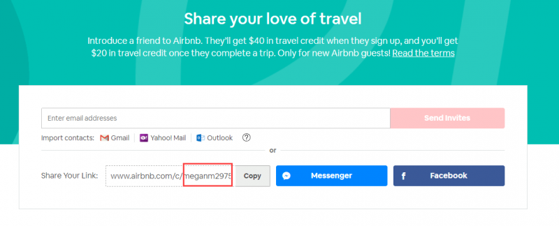
9) Add a Referral Option
People trust their people. Often, you'll find that many people tend to change their mind about any product when it is referred by their family or friends. Many referrals also come with discount coupons, giving a two-way benefit to you and the referral; they get a discount while you gain a customer.
Every e-commerce site should consider using referrals to boost their sales. You can easily add in a referral code CTA into your online store's design that triggers after any purchase. Make the feature simple and include both an email address box and a link that anyone can easily copy for simple sharing. This one small design feature will prove to be incredibly useful on your site.
10) Keep an Eye on Customer Needs
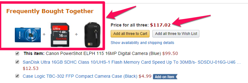
Suppose that a customer is on your site to buy a camera. So, don’t just let your customer leave only with that; suggest they add on a memory card and a camera case along with it. Upselling products is a great tool, and can be effectively implemented into the design of your site’s product pages.
Supplementary products are definitely a great up seller, because when will suggest people buy the items that complement their original intended purchase on a discounted price, they tend to buy it. After all, what good will a camera be without a memory card?
11) Make Customers Feel Protected
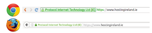
Trust is a major factor when it comes to conversions. Secure Socket Layer, or SSL, is a protocol that ensures a site’s security. It displays as a green bar in the URL section of a webpage. If customers don’t see the green URL bar, they usually avoid doing the payment.
Make your visitors feel protected. This green bar means that the website encrypts the user’s personal and banking information and makes it nearly impossible for hackers and scam artists to steal it. Nobody wants to risk purchasing from an unsafe website. Displaying your site’s SSL has the capability to reduce the bounce rate of your site by a significant number.
Google also prefers these green-certified websites. They rank these websites better to their counterparts. Google gives you a 5% better ranking if you have this green bar.
You can additionally integrate trust badges into your website’s design, typically displaying at checkout to reassure your customer that their transaction will be protected in a way that’s approved by authorized parties.
12) Write Relevant Content
The design of your website isn’t just about the visuals; you also have to think about your copy. Play with your words and write good content on your site so that people get hooked and find what they need. Here's a few tips on how you can improve your site's copy:
- Don’t use too much jargon or buzzwords; just write to make your products stand out. Impressive and relevant words might get you more conversions.
- Research shows that people tend to skip on reading long and paragraphs, instead preferring detailed, yet short, content.
- Keep the heading short, unique and good enough to know about the content that lies ahead.
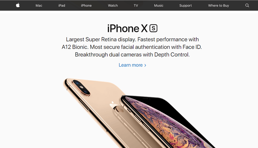
Apple’s homepage gives us the best example of effective and well-designed copy, as they have written enough to inform users about the product. For the people who need to know a detailed description about the product, they can visit the ‘learn more’ link.
Conclusion
Creating an e-commerce site doesn’t need to require a big budget, but keeping pace with the industry requires good practice.
Keep exploring things. Always keep a close eye on the status of your progress. Take surveys; use them to know from your audience what is working for them and what is not.
Conversions are not smooth sailing; remember that you need to work hard and be patient to see returns and results.


Leave a reply or comment below