Whether you’re advertising your ecommerce business on another site or trying to direct your own traffic to a particular product, banners serve both purposes. Done right, they are visually appealing and can entice shoppers to buy more from your ecommerce store.

Amazon’s scrolling banner ads are a great example.
Even if you’re using other forms of advertising or marketing, banners can be a great addition to the mix. Why? Banner ads can help with brand recognition. When a shopper keeps seeing your brand all over the internet — first in a banner ad, then on social media, then in search results — it sticks with her. It can also alert people to a particular product or promotion, driving specific sales where you want them.
In this post, we’re going to dive into why you should consider banner ads, where and how to use them, and best practice tips for designing them.
What Banners are Good For
Your first thought might be of banners designed for online ads, and that’s a great place to start. While pay-per-click ads through Google and other search engines can be helpful in driving search traffic to your site, you should also capitalize on introducing other potential customers to your brand directly on sites your audience frequents.
There are two ways to do this, and both require well-designed banner ads. The first is to work directly with a website or blog and purchase advertising from them. Let’s say you sell baby clothes, so you reach out to a few parenting blogs that accept advertising. Your reach will be smaller than it might be with search advertising, but the audience is exactly in line with who you’re trying to reach, and it’s likely more affordable.
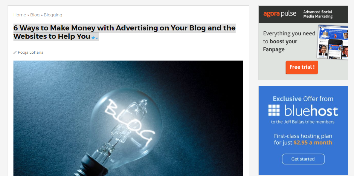
Example of a sidebar banner ad on JeffBullas.com
The other option is to work with an ad network that distributes your banner ad across targeted sites for you. Sites like AdRoll will place your ad on websites, social media channels, and emails based on the demographic targets you establish, and AirPush does the same, but on mobile sites and apps.
Additionally, you can use banner ads for retargeting. When a shopper visits your site, a cookie tracks her around the internet and displays your ad on sites within the ad network you participate in. She may even see a specific product she was browsing on your site. Seeing it over and over increases the likelihood that she’ll click the ad and buy the product.
After searching for AdRoll, this ad followed me around on Entrepreneur.
And finally: you can use your ecommerce banners on your own social media channels to attract more eyeballs and clicks, or on your website to promote a specific product or sale.
Types of Banner Ads
While banner ads come in every shape and size, let’s start by understanding the two types of banner ads.
A static ad includes a photo or graphic with text that viewers can click to go to a specific page. They’re useful when you’re communicating a simple message with a simple image (maybe just of the product), and are effective when your audience is already familiar with your brand.
An animated ad may include video, interactive activities, or rotating images. These are great for boosting brand awareness and engaging with your audience.
Sizewise, your banner ad should fit the space it’s intended for. If you’re planning to place it on a sidebar, a half banner or skyscraper ad is appropriate. If you want to direct attention to a particular product at the end of an article on your blog, try a leaderboard or large rectangle.
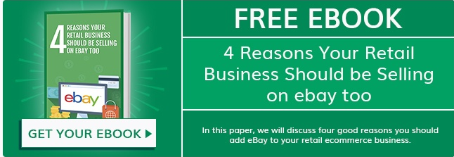
A rectangle banner found at the end of a 3dcart blog post.
Hire Help or DIY?
While hiring a graphic designer will ensure that your banner is visually appealing and built to convert, it’s not necessary to hire a professional if you don’t have the budget. There are DIY tools like AdKreator and PicMonkey that offer customizable templates you can modify to fit your needs.
Just realize that working with a professional designer will get you the benefit of his knowledge and experience in knowing what works to create appeal in ads. Even if it’s a bit of a stretch for your budget, the investment may be worth it in the long run if his banners help you attract more sales. The increase in revenue will more than cover the cost for the design.
Tips for Successful Banners
Now that you understand why banners are beneficial and what your options are, let’s look at proven strategies to follow, whether you design your own banners or give a graphic designer guidance on what you want.
1. Know Your Audience. If you know your customer demographic, you can better choose a product to highlight and a promotion to offer. If, for example, you know that your average customer is female, aged 40-50, who spends a lot of time looking for the best deal, you know that you better offer a pretty enticing promotion in your banner.
Where do you get this information? Your customer relationship management software. If you’re tracking customer data like purchase details and demographics, you can use that information to help with marketing and sales.
So before you design your banner, consider:
- Would my audience respond better to a discount on a specific product or blanket sale?
- Which products are moving slowly that I could boost sales with a promotion?
- What does my audience want in terms of discount amount?
Over time, you can test different offers to get more data that you can then use to tweak future banners and offers.
2. Use Top-Quality Photos. Stellar product photos are essential, not just for your banner but also for your product pages. If you’re going to DIY the photos, make sure you have the right equipment, backdrop, and lighting. Don’t skimp here! The difference between a shoddy photo you take and a professional one can make or break your company.

Using models in your photos can attract interest, like this one on Wal-Mart.
Choose the best photo of the bunch for your banner so people see, front and center, what you have on offer. Leave room for copy next to the image.
3. Include a Call to Action. One big mistake some ecommerce retailers make is not including a call to action on the banner. This is the “thing” that spurs visitors to take action. Create a sense of urgency with words like “act now” or “for a limited time only.”
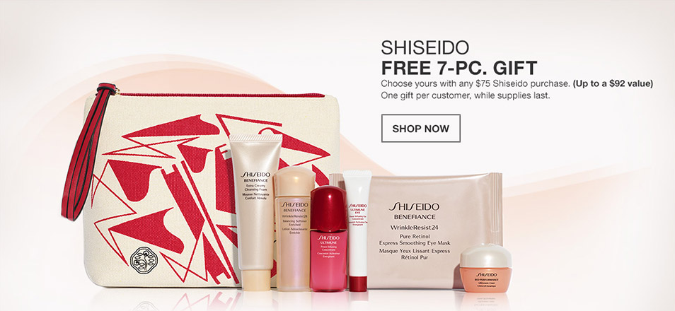
Macy’s includes a call to action and a sense of urgency with this banner.
And while we’re talking words on your banner, make sure you focus on the benefits of your product, not the features. What’s the difference?
Features are things like:
- Bigger! Better! Brighter!
- More power!
Benefits tell your audience what’s in it for them:
- More room for you to store what matters to you
- More power means you get more out of your day
Keep in mind that the color of the call to action words, as well as their placement, can also impact results, so consider designing a few ads and running an A/B test to see which gets better conversion.
4. Keep it Simple. The biggest mistake you can make in designing a banner, particularly if it’s for an ad on another site, is to overclutter it with images and words. You’re not writing a novel; focus on just a handful of words that get the point across:
- What’s the offer?
- What’s the product?
- What’s the call to action?
The idea is that if people want to learn more, they will click the banner, and then they’ll have your product description to consume.
Other Considerations
Here are a few more suggestions that ensure that once people click on your banner, they find your ecommerce site as a whole to be user-friendly and easy to navigate.
Make sure you accept credit cards. In this day and age, it’s bad form to not accept credit cards on an ecommerce site. Accepting them makes you more credible with consumers and builds trust. Also, the more forms of payment you accept, the more money you will make!
Ensure that your site is easy to buy from. Do an audit of your checkout process. How many screens does a shopper have to click through and fill out before the purchase is complete? The fact that 28% of shoppers say they don’t complete a transaction because the checkout process is too long tells you that streamlining the process can bump up sales, so take the time to whittle down the steps if possible.
Keep your site updated. Regular visitors to your site will get bored if nothing on the site changes. Updating your banners on the homepage is a great way to foster interest in new products and promotions, and by rotating them out, you can also test to determine which designs — as well as offers — get the highest conversion rate.
Also make sure you’re adding new products and blog content to your site to keep the attention of visitors as well as search engines. People like seeing what’s new on your site, so give them plenty to explore on a regular basis.
Banners can help you boost revenue, if you take the time to carefully think out your promotion and design. Whether you do it yourself or work with a designer, make sure you create and place banner ads with intention, targeting your audience with offers they want.





Leave a reply or comment below