

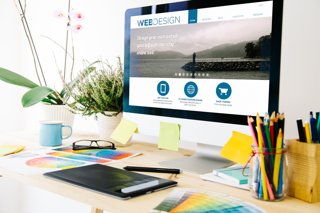
Your homepage is the face of your website. Not only is it how most of your visitors will get to your website (nearly half stop here first), but your homepage is your business’s chance to make that crucial first impression. In order to do its job, a homepage needs to look stunning and function even better. If your homepage is lacking, whether in aesthetics, design, or functionality, it will fail to convert your customers. That means, not giving your homepage the attention it deserves is leaving money on the table — and your competition is ready to pick it up.
Designing your homepage should be an ongoing process – a business experiment that is constantly providing data so that you can respond to. Even the best performing homepages have room for improvement and, if your website is currently suffering from a high bounce rate, then there’s even more reason to reevaluate your homepage design.
On the surface, homepage design is fairly simple: invest in professional designs, highlight what makes you different, feature your products or services, and make it easy for people to pay for your products. However, as anyone who has ever tried to actually design an effective homepage knows, it’s never really that simple.
From making a good first impression, to selling products, to capturing leads, there’s a lot that needs to be done the right way in order for your homepage to maximize its potential. Below is a checklist for you to visit (and revisit) to make sure that your website’s homepage is performing well and getting your business the results you want.
8 Step Checklist for Designing a Homepage that Converts
1. Understand what the main goal of your homepage is.
There is no “perfect template” when it comes to designing a smart homepage. Every business is unique, which means the way homepages look and function is unique too. It’s critical that you understand your homepage’s purpose so that you can design a website according to these specific needs. Are you wanting homepage visitors to ultimately make a purchase? Or is your goal more to build a strong list?
If it’s difficult for your visitor to understand what they should do next (or where to go next), then your homepage needs to be reimagined. Remember, the longer it takes for your visitor to get where you want them to go, the less likely they’ll actually end up there. But, at the same time, if your homepage only tells your visitor about where you want them to go, instead of answering their questions, then it’s just as likely that you’ll lose that conversion in the end.
Tip: Adding a simple search bar tool to the top of your homepage can help visitors who know what they want to find get there as quickly as possible.
2. Follow the “navigational flow” of your homepage.
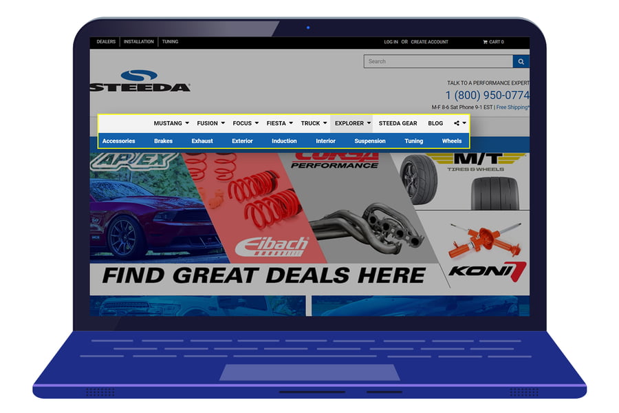
At most, your homepage visitors will likely spend only twenty seconds there before they click somewhere else. That means that your homepage navigation needs to be incredibly refined so that they can quickly see where to go or what to do next. If your navigation features too many choices, then it’s likely that the only choice your visitor will make is to leave. Part of optimizing your homepage is looking at the choices you’re giving your visitor and making sure that all of those choices matter. And, if one choice is better (for your business or your visitor) than another, highlighting that choice is critical.
3. Pay attention to everything happening “above the fold.”
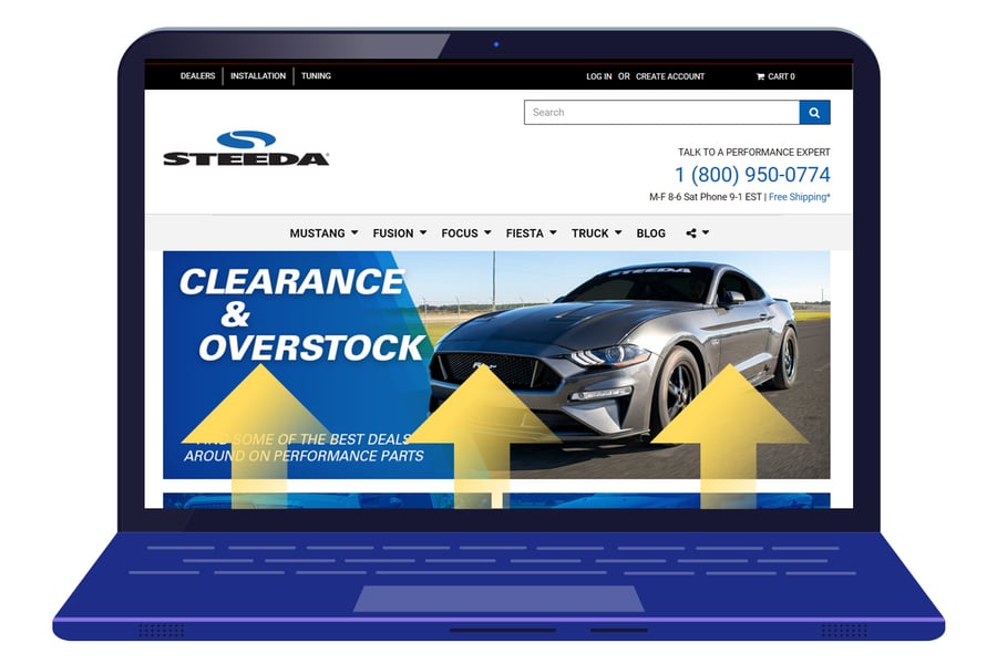
The part of your homepage that is visible before scrolling is also known as “above the fold” content. This is arguably the most important section of your homepage because it is not only what your visitor sees first, but it also has the potential to dictate initial actions.
If the most important information or call-to-action isn’t located here in the above-the-fold area, then you need to redesign your homepage so that it does. Part of this redesign should include a professionally crafted headline and a visual that differentiates you from the crowd. Making sure that your branding is also featured above-the-fold is key in letting your visitors know where they are in the digital world.
4. Simplify everything you can.
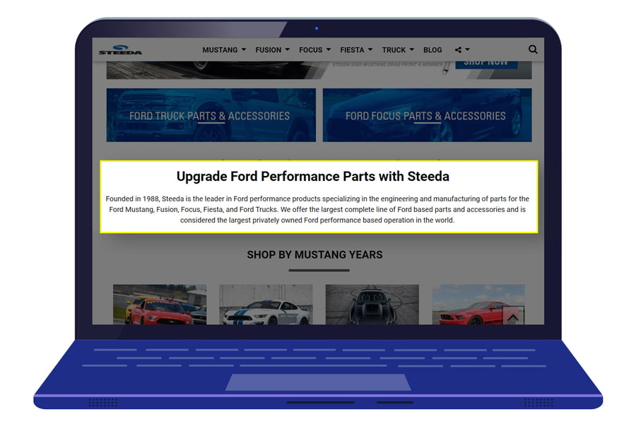
It’s easy to info-dump on the homepage of your website, especially if you are designing it yourself. As the owner of your business, you’ll have a lot to say — and all of it will seem important. And, as your business grows and changes, the easiest most obvious place for new content and information to land is on the homepage, making most homepages feel more like bad garage conversions than a professional landing page.
Remember, your visitor is in a hurry, which means they need to find the gems without having to dig. When possible, limit the number of navigation links on your homepage to ten at the very most, and order them from left to right in order of importance. When you find information that you just can’t cut, be sure to chunk it instead, which means breaking up big pieces of content into smaller, bite-size portions that are easier for your visitor to consume. In some cases, videos are a great way to simplify a website’s homepage that has a lot to say. Rather than trying to write it all out, a video is a more engaging way to say what needs to be said (and it’s a great way to make a personal connection with your visitors, too).
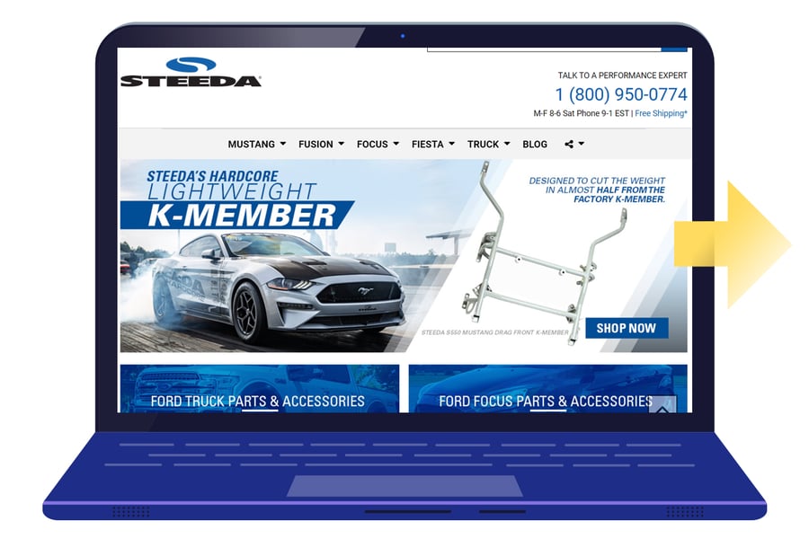
5. Don’t settle for “okay” images.
When designing your homepage, it’s easy to just want to see it go live as quickly as possible, which often means settling for generic stock photos — or, still problematic, images that have been taken by someone other than a professional (i.e. you). Every chance you get, opt to use a professional photo of the real deal (your products, yourself, your city, etc.). And, when you are looking to find ways to make “okay” a whole lot better, then consider a few tricks of the trade for making the images on your homepage stand out. You can make any image feel more custom by adding text and filters. Integrating your copy and calls-to-action can transform so-so stock into something that really is unique.
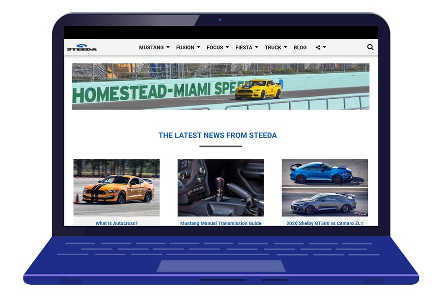
6. Harness the power of slideshows.
If your store features a lot of different products or services, then integrating a slideshow, or carousel, into your homepage can be a smart way to quickly grab your visitor’s attention. Again, the images on this homepage carousel need to be high quality in order for it to really be effective. And, although you might be tempted to put as many slides into your show as possible, it’s a good idea to limit yourself to just three. Your visitors aren’t likely to stay still long enough to see more than three slides, which means putting any additional information in your slideshow will just go to waste.
7. Design specific calls-to-action.
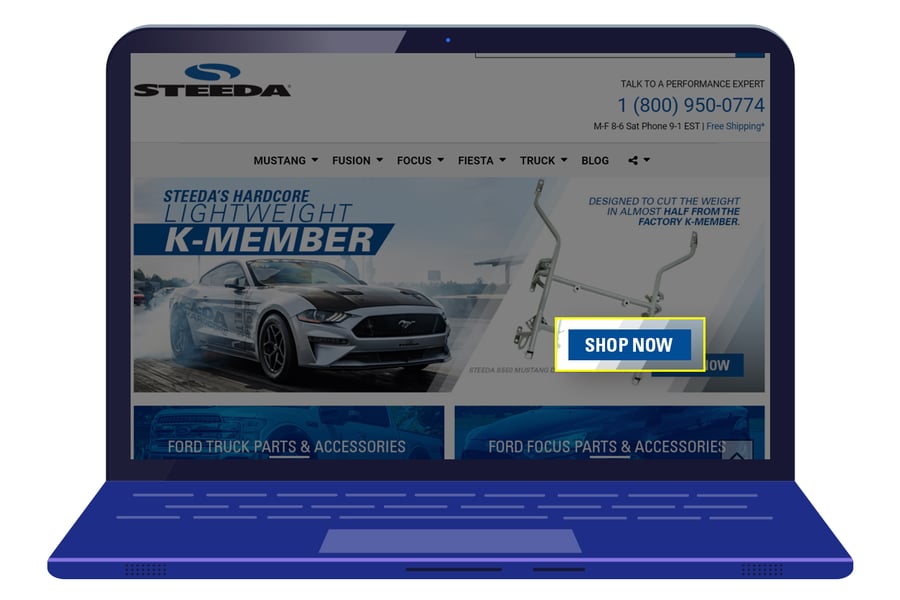
Your homepage needs to have a call-to-action (or CTA) in order for it to be effective. Whether straight to the point and simple (“Click Here”) or a little bit craftier (“Let’s Make It Inbox Official”), CTAs ensure that your visitors know exactly what to do next. Depending on what your homepage’s main goal is, your CTAs will vary. What shouldn’t vary, however, is the clarity of the call-to-action. Not only should the wording be clear, but the button or link should stand out on your homepage. Remember, if it’s hard to determine what to do next, then your visitor won’t do anything (besides leave).
8. Make your shopping cart visible and accessible.
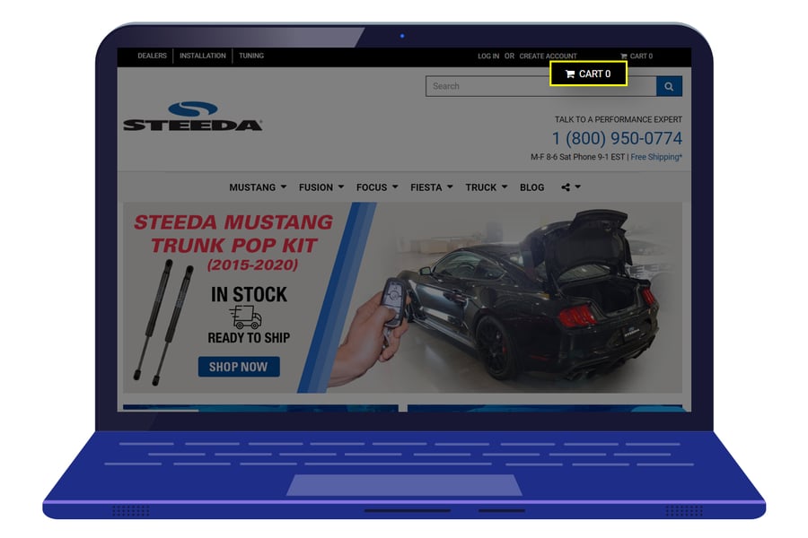
Not all websites will have shopping carts, but those that do need to ensure that it’s easily visible and accessible from every page of the website – including the homepage. Customers need to know when they’ve added items to their cart and have an easy way to review their items too. Today, most online shoppers are savvy enough to know to look for the shopping cart icon in the upper-right corner (which is fairly standard in the eCommerce world).
If your website features something different, then it’s critical to make sure that customers can see it and recognize what it is on every page of your site. One of the best shopping cart features, and an essential one to making your visitors happy, is having an item count. This feature clearly displays to customers that they are putting items in their cart and allows them to monitor their actions on your site.
Conclusion
Creating an intelligent homepage for your website is one of the best ways to ensure you’re maximizing your conversion rates. While a lot of designers focus on above-the-fold content, it’s important to remember that every aspect of your homepage is essential in making a good first impression — and letting your visitors know what they should do next. Revisiting the design of your homepage regularly is a great way to make sure it’s continuing to deliver the best results possible, and keeping up with current online expectations and trends as well.


Leave a reply or comment below