


Here's an alarming statistic: a staggering 88 percent of online shoppers claim they won't revisit a website after a bad user experience, according to Amazon Web Services. However, there's this common misconception that providing visitors with a good user experience equates to having a visually appealing website.
If you are like most people, you most likely assumed having an aesthetically pleasing website would suffice. So, how come you're still not generating as many leads, and your site's bounce rates remain high? In most cases, it is because you rarely put much thought into user experience (UX).
UX statistics indicate that this common mistake will not only turn your online visitors away, but it can also cost your business a substantial amount of revenue. When it comes to user experience, you have to remember that a beautiful site won't mean much if it is frustrating to use.
Just like on-page SEO, the importance of providing your visitors with an exceptional user experience cannot be overstated. If done right, UX design is barely noticeable. In other words, it allows your site visitors to move between elements seamlessly. UX design gives your website the intuitiveness and clarity needed to encourage conversions.
User Experience in a Nutshell
As technologies and methodologies continue to evolve, websites and web applications have also become increasingly complex. What was once a one-way, static medium has now developed into a rich and highly interactive experience.
However, regardless of how much change has taken place, a considerable part of your website's success hinges on one key thing: how users perceive it. Does your site give them value? Is it easy and pleasant to use?
In essence, UX design enhances the satisfaction of users by improving the usability, accessibility, and efficiency of user interactions on your website. It is crucial to keep in mind that visitors can make split-second decisions based on various design elements.
Your website is the hub of your online and marketing sales efforts. That said, it is of primary importance that all the critical design elements fit together to provide a rewarding and valuable user experience.
When John Kosner, head of digital media at ESPN.com, incorporated user suggestions into their website, the company saw a 35 percent increase in revenue from the improved user experience.
Top Ways to Enhance Website User Experience
Just like SEO for mobile, designing a website that provides a rewarding and valuable user experience can seem like a tall feat. The good news? There's no shortage of ways you can enhance the user experience. Below are some of the top tips that should rank high in your priority list.
Embrace the use of white space.
For many, white space is considered one of the most critical elements of great website design. Creating a margin (also referred to as negative space) around your content can help make images and text blocks stand out.
Padding titles and texts with white space can also increase user attention by as much as 20 percent. Spacing can also give users the impression your website is open and ready to use.
The "breathing room" can go a long way towards enhancing your content's readability and attractiveness. However, you also need to make sure that you balance the need for usefulness against white space.
The primary idea is to determine what you consider is most important and give it good website real estate while ensuring you are not creating page clutter.
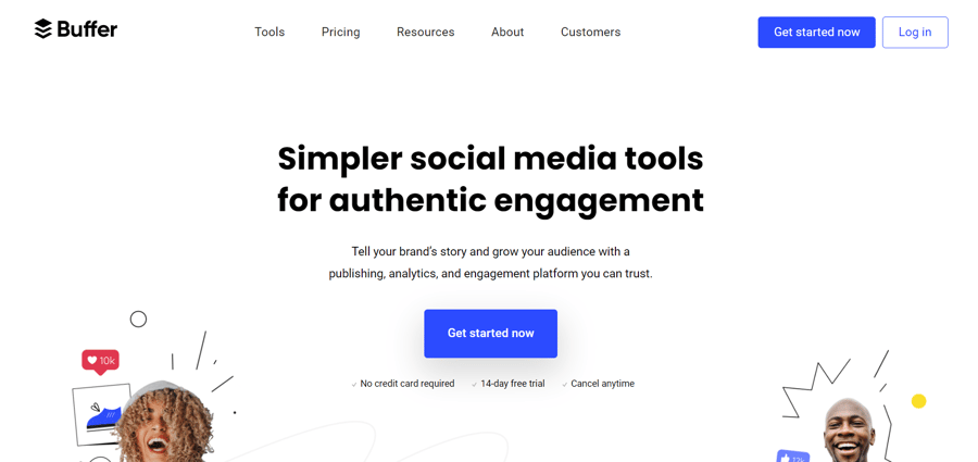
For instance, Buffer's home screen is mostly white space with an explanatory sub-header, value proposition, and a call to action. The openness and clarity encourage visitors to explore your website more.
Use appealing calls to action.
Visitors navigate your site through the visual cues that move them from one piece of content to another. Calls to action (CTA) use bold buttons and active words to help users navigate your website. CTAs are also used to encourage them to take the next step.
When creating your CTA buttons, take into account the impact of colors on user psychology. Color psychology involves using different hues to evoke various feelings and results from your site visitors.
While seemingly trivial, the color of your CTAs can result in an uptick in conversions or a disjointed user experience. Case in point: Sitepoint saw a 35 percent increase in their conversion when they switched from a green to a red CTA button.
The words you use on your CTA buttons should also be given just as much attention. As a general rule of thumb, use active verbs that drive them to take action and illustrate the benefits they will enjoy when they convert.
The more time-sensitive, emotive, and actionable your CTA is, the greater your conversions.
Improve your page speed.
When they visit your site, visitors want and expect a speedy and seamless online experience. Pages that load in 1 to 2 seconds have higher conversion rates than those that take long to load.
According to Econsultancy, at least 40 percent of visitors leave a site that takes more than 3 seconds to load. With mobile usage now becoming more prevalent, people expect sites to load faster.
Understandably, since a slow loading site can prevent an otherwise fluid browsing, expect more people to leave your site before they even get the chance to explore your site or discover the product or services you are offering.
So, what can you do? Use the free services Google provides to assess your mobile and website speed. You can also find countless ways to improve page load time for mobile and desktop online.
Create targeted headlines.
Your headlines should be congruent with what your target audience is looking for. In line with this, it is ideal that you use keywords you are targeting in your titles. This strategy can help you facilitate browsing, attract the right audience, and encourage further content consumption.
Aside from improving user experience significantly, using the correct headlines can dramatically impact your search engine optimization (SEO) efforts. Keep in mind that Google gives headings more weight compared to regular content. That said, targeting the right keywords will not only improve site experience, but your searchability as well.
Use original images.
Visual content is vital to many people. According to MDG Advertising, at least 67 percent of consumers consider high-quality images crucial in their online purchase decision — even higher than reviews and ratings.
That said, it is recommended that you avoid using generic or stock photography. A study conducted by conversion optimization platform VWO revealed that replacing stock photos with authentic images of products or services has increased the conversion rate by 45 percent.
Undeniably, using authentic images can help provide the satisfying and unique web experience your site visitors are looking for.
Segment essential information using bullet points.
Using bullets can make it very easy for your online visitors to find the solutions, benefits, and key features of your products and services. If you present your propositions in bullet form, it becomes more appealing and easier for visitors to remember.
If you are feeling creative, you can also bypass the circles and instead use icons that represent the text, adding image recognition and value to those who visit your site. You will not only be reinforcing your messaging with a visual aid, but your visitors will also definitely appreciate the variety.
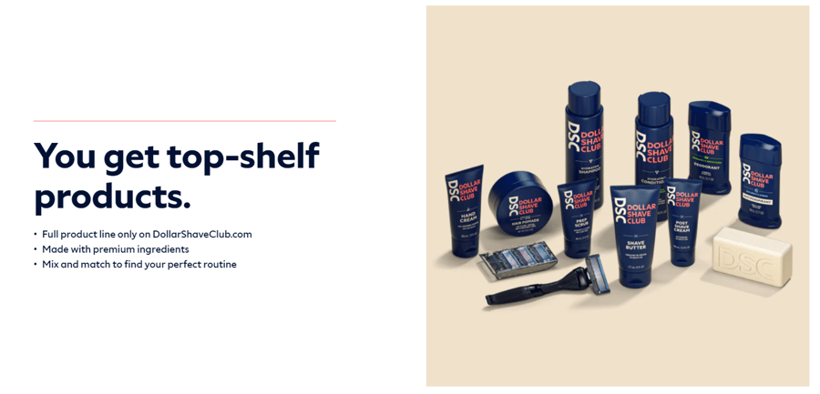
Case in point: Dollar Shave Club made website browsing fast and easy (not to mention fun) by using product images and bullet points. This simple yet creative design tactic also allows you to highlight essential information while improving your site's readability at the same time.
Use hyperlink differentiation.
When adding a link to any page, you're encouraging the visitor to click on that link. In line with this, it would be best to ensure your links are easily identifiable through visual cues. Differently colored and underlined texts can also effectively draw attention to the link you want visitors to click.
A study done by Karyn Grave indicated that many regular web users recognize blue and underlined texts as links and click on them. Exploiting what users already know and their expectations can be a massive contributor to your success online.
You don't necessarily have to invent the wheel when it comes to hyperlink differentiation. Sticking to convention would be a better option. Also, when hyperlinking, take into consideration the length of your hyperlink. Basically, the longer the text link titles, the easier they are to identify.
Keep your site pages consistent.
Consistency requires that everything is congruent. From your font choices, button styles, design elements, heading sizes, photo choices, down to your illustration styles, everything should match. In other words, you need to ensure everything is themed to ensure the design is coherent across all of your pages.
Drastic design changes can make visitors feel confused and lost. They might also see your site as unprofessional and untrustworthy. Massive design inconsistencies can also prompt them to leave your site and not return.
Be mindful of your 404s.
While you don't get penalized by search engines for soft 404 or page not found errors, your site visitors are not as forgiving. When a visitor clicks on an image or link, they expect to be directed to the next place they should go.
If anything, a 404 error page will not only frustrate your visitors, but it might also annoy them. Worse, it might make them rethink spending time on your website when they can always go elsewhere to find out what they are looking for faster.
Second to slow page load time, encountering 404s can completely disrupt the user's journey as they work their way through your site. To check for 404s, set up Google Webmaster tools on your site and check for crawl errors. You can also use free 404 checkers you can find online.
Ensure your site has a clear and concise navigation.
Your website's navigation is your visitors' guide to your top-visited pages and products. With that in mind, you need to ensure you use easily understandable language for your headings. This is especially helpful for new visitors to your site.
It is also recommended that you don't provide too many options as you might overwhelm your visitors. While there is no set number you can use, it is considered ideal to keep it within the three to seven range.
Ask for minimal information.
If you want visitors to sign up for your email list, ensure you ask for the least amount of information possible. Many sites now only ask for the first name and the email address. This is perfectly acceptable for many.
Once you start asking for more information, visitors' chances of filling out the form can go down dramatically. Keep in mind that we live in a fast-paced world, and most online visitors don't have the time to fill out lengthy forms. As a general rule of thumb, ask only for the information you need.
Conclusion
Your site visitors want (and expect) a fast, rewarding, and seamless user experience each time they visit. That said, you should design your site to ensure they know where to go and they can find what they are looking for and complete transactions without a hitch. Look at your website through your visitors' eyes and make sure it's designed with their satisfaction, convenience, and best experience in mind.


Leave a reply or comment below