


A great website is important for your business, and the homepage of your site is critical. Your homepage will be the first thing visitors see, so it needs to make your business attractive in every way possible. Appealing design, a user-friendly layout, and other factors all need to come together and present visitors with an outstanding impression of your business.
One of the quickest ways to discover what makes a great homepage is to learn by example. That's why we've collected some of the best home pages. These homepages each have something special about them that will help you understand what makes a successful homepage, and therefore a successful introduction to your website and business overall.
First, let's go over the purpose of a homepage and the different aspects that can make or break its success.
What Makes a Great Homepage?
The main thing all great homepages have in common is that they present a fantastic first impression. Whether a website belongs to a local business, an international enterprise, a free or paid software service, or anything else, that first impression is vital.
Here's how great homepages make that all-important first impression:
1. Clarity of Information
A great homepage immediately tells the visitor what they want to know about the business. Who does this website belong to and what does this company do? Visitors should know immediately which of their problems your business can solve. If a visitor has to click around your website to discover what services or products you offer, you risk losing them.
2. Unique Value Proposition
A business's unique value proposition (UVP), also called a unique selling proposition, is a strong and enticing outline of what makes the business special. A UVP can be nearly anything, but it's the main way a business stands out from the competition. Your UVP should be a central part of your business operations, marketing, and of course your homepage.
3. Attractive and Functional Design
If you've earned visitors who are interested in the products or services you offer, you don't want them to turn away. Great homepages are pleasing to look at, without obscuring any information or sacrificing convenience. Performance is also crucial — internet users are notoriously impatient, so your homepage needs to load within 3 seconds or they'll bounce.
4. Clear Calls to Action
A homepage can be clear, beautiful, and compelling, and still fail if it lacks a call to action. Why? A call to action (CTA) answers the most important question for an interested visitor: What do I do next? People need hints as to how to proceed, whether by signing up for your newsletter, adding a product to their cart, or creating an account. The clearest calls to action are buttons labeled with the visitor's next step.
5. Appropriate Voice for the Target Audience
Voice is the characteristic that brings a business's personality through in writing, and to a lesser extent, graphics. Wise businesses use a voice that communicates with their target customers on their own level and in their own style of language. Businesses with a very specific customer base — such as stay-at-home moms between 30-45 years of age, video game enthusiasts in their 20s, or men over 6 feet in height — will have a strongly defined voice. Generally, business targeting a wider audience use a more universal voice that feels less personalized, but still has some uniqueness.
6. Mobile-Friendliness
The trends don't lie: according to 3dcart, mobile internet usage is growing, with 60% of all website traffic coming from mobile devices. This means businesses who don't design a mobile-friendly website are instantly alienating over half their potential customers. A mobile-friendly homepage works equally well on smartphones and tablets as it does on desktop computers. The ideal way of achieving mobile-friendliness in 2018 is through responsive design, in which a website's layout alters to fit the screen.
List of Great Home Pages to Use as Inspiration
All the website homepages we've collected for this article share these qualities, so keep them in mind while you browse our favorites below. You'll be able to understand how each homepage accomplishes its goals, which will help you learn how to apply these principles to the homepage on your own website.
Dropbox Business
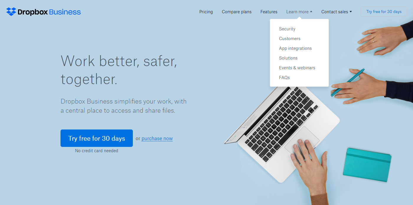
Dropbox Business lets you know its benefits right away: you and your team can securely share and collaborate on documents. You're presented with a simple design that explains the service and provides the most demanded information as soon as you scroll down. The pricing, FAQs, and feature lists are all included on the homepage, saving you the trouble of clicking. Of course, if you do want more information, links to those pages are visible in a clear menu.
Dropbox Business also includes CTAs for trying a free 30 day account or upgrading an existing account. These CTAs are strategically placed at the top and bottom of the homepage, so if your journey to the bottom convinces you to give it a try, you can get your free trial without having to scroll back to the top.
The Hop Yard
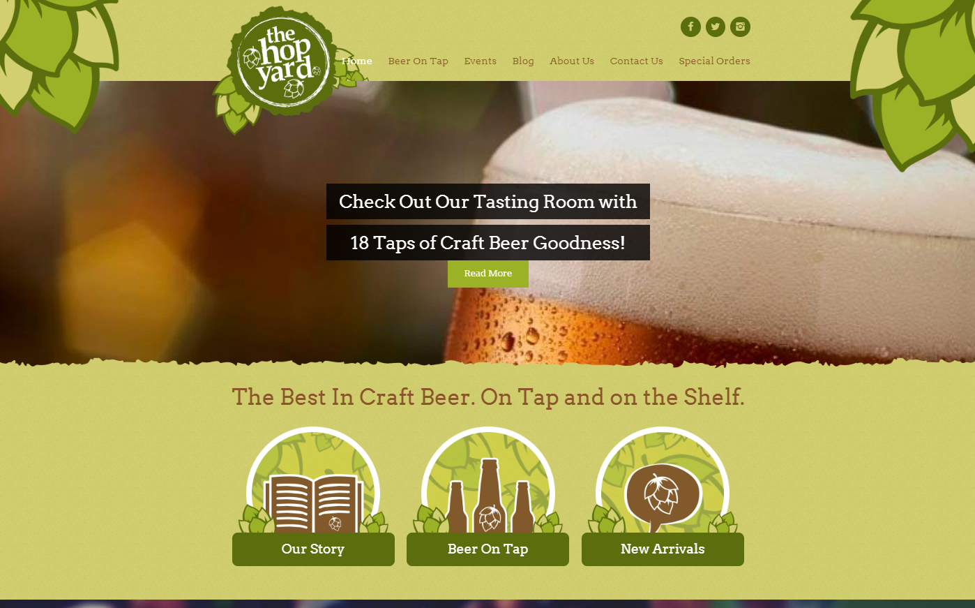
The Hop Yard immediately catches the attention of its audience — craft beer enthusiasts — with a combination of photography and simple yet effective graphics. The site banner is a close up of a cold, foamy beer glass that shows off the color of the brew, sure to get connoisseurs speculating on the flavor. Simple designs of hops frame the page and all the important information is right in front of you, only a click away at most. The fonts and colors are also very well chosen.
The Hop Yard's homepage is successful in its appeal to craft beer lovers, and its confident statement "The Best In Craft Beer" almost challenges the visitor to dig deeper into their website and find proof of that claim. Overall, the design is cohesive and appealing, with even the social media icons fitting into the green color scheme.
Evernote
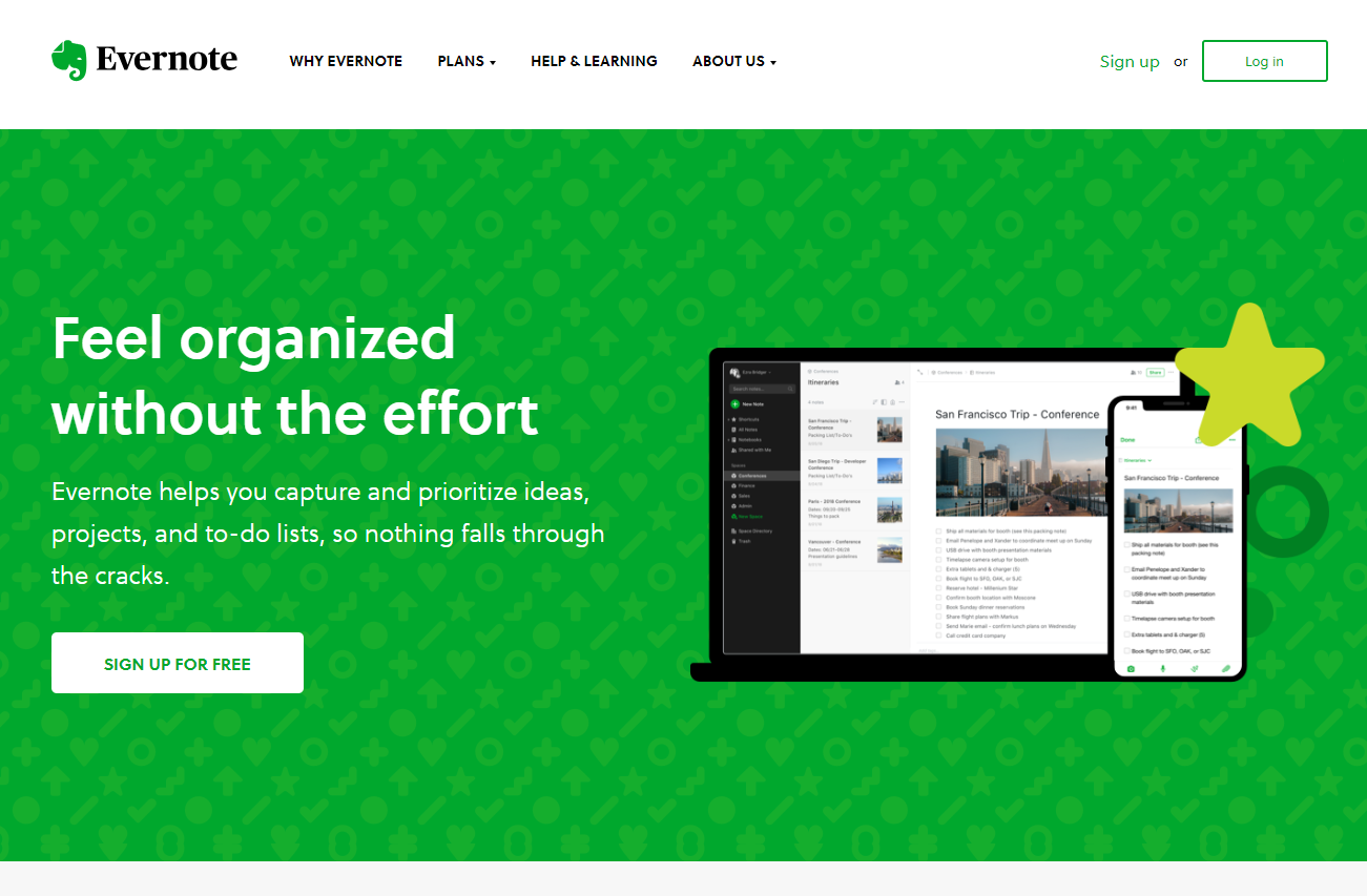
Similar to Dropbox Business, Evernote immediately presents the viewer with its main benefits in a very minimalistic fashion. Evernote describes its product in a concise way that can make you decide instantly that it's the solution you need. The fact that you can sign up or login with your existing Google account, with the click of a prominent button, works to make Evernote feel even more appealing to a busy person looking for a quick way to get organized — before they get distracted.
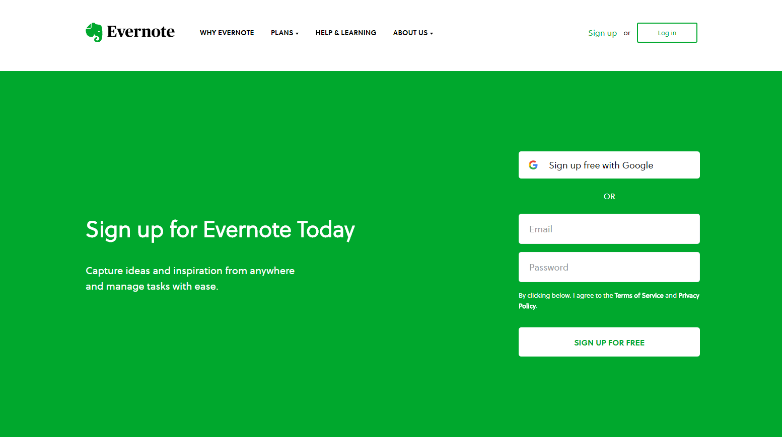
Speaking of distractions, there simply aren't any on Evernote's homepage. There's tons of whitespace, which is appropriate for a digital notepad waiting to be filled by the user. Scrolling down reveals stylish graphics, each of which illustrates another benefit of Evernote. Keep going down and you'll have another convenient signup box and quick links to blog posts that will help you make the most of the tool. Evernote makes it clear that this is about you, and there's no need for them to show off.
charity: water
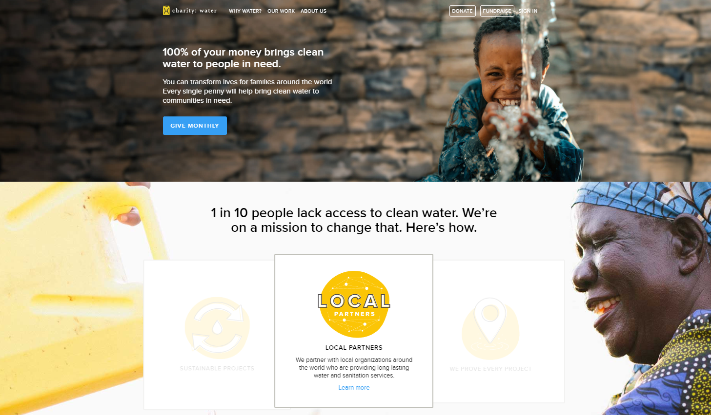
This nonprofit website takes a different approach than many others. Instead of showing people in need, charity: water goes straight to showing you the direct results you can accomplish with donations. This is very appealing emotionally, as the viewer immediately sees happy people gaining access to clean water in their communities. The nonprofit's mission is clearly stated along with an immediate assurance that 100% of donations go toward that purpose. This removes all potential doubt a viewer might have as to whether or not their donation would be worth it.
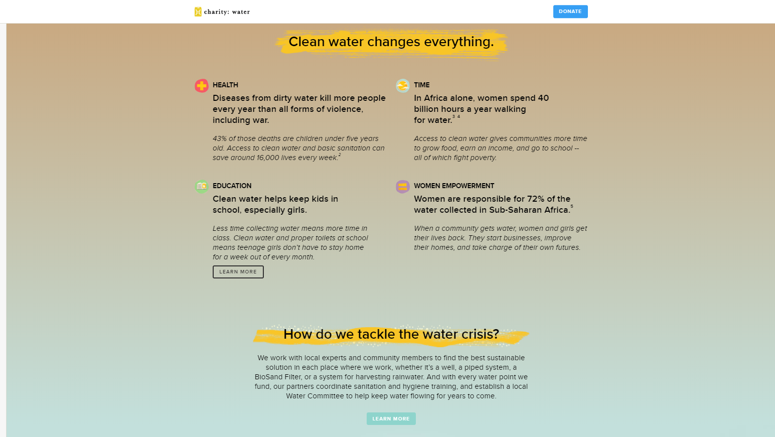
After opening with this powerful appeal and honest transparency, scrolling down reveals more specific information about the problem that charity: water aims to solve. Continue and you'll see the past results of their water projects and the numbers backing up their success. By bringing the viewer straight to the emotional reward, this homepage gets people excited about donating and being part of an already successful program. This optimistic approach is much stronger than the guilt-based donation drives often used by other charities.
Nike
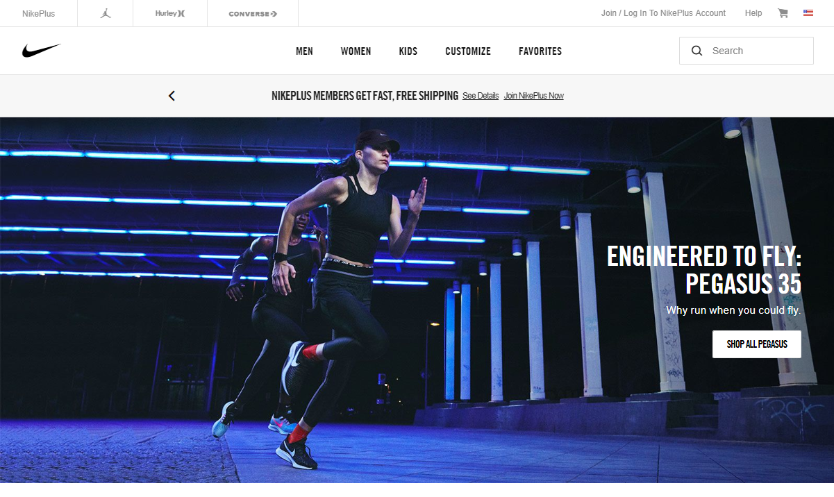
The sports giant Nike draws attention on its homepage with huge graphics, in a design that's constantly changing to reflect current events and industry trends. The large banners catch interest immediately and each is also hyperlinked directly to the product or category featured. Scrolling down reveals numerous images showing adults and kids of all ages, wearing Nike products in different situations. This variety of images effectively makes the point that Nike sneakers and sportswear can be enjoyed by everyone, whether you're playing an intense basketball game or just relaxing with friends.
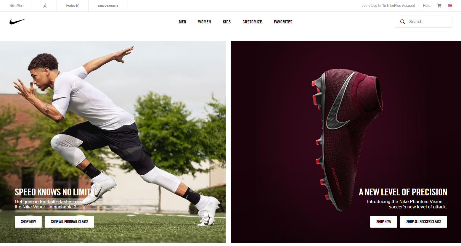
While you explore Nike's homepage, the main menu scrolls with you so it "sticks" at the top of the screen. This is very useful since the main appeal of the homepage involves large images with product links that would otherwise feel disorganized. The constant accessibility of the menu counters this nicely.
Chipotle
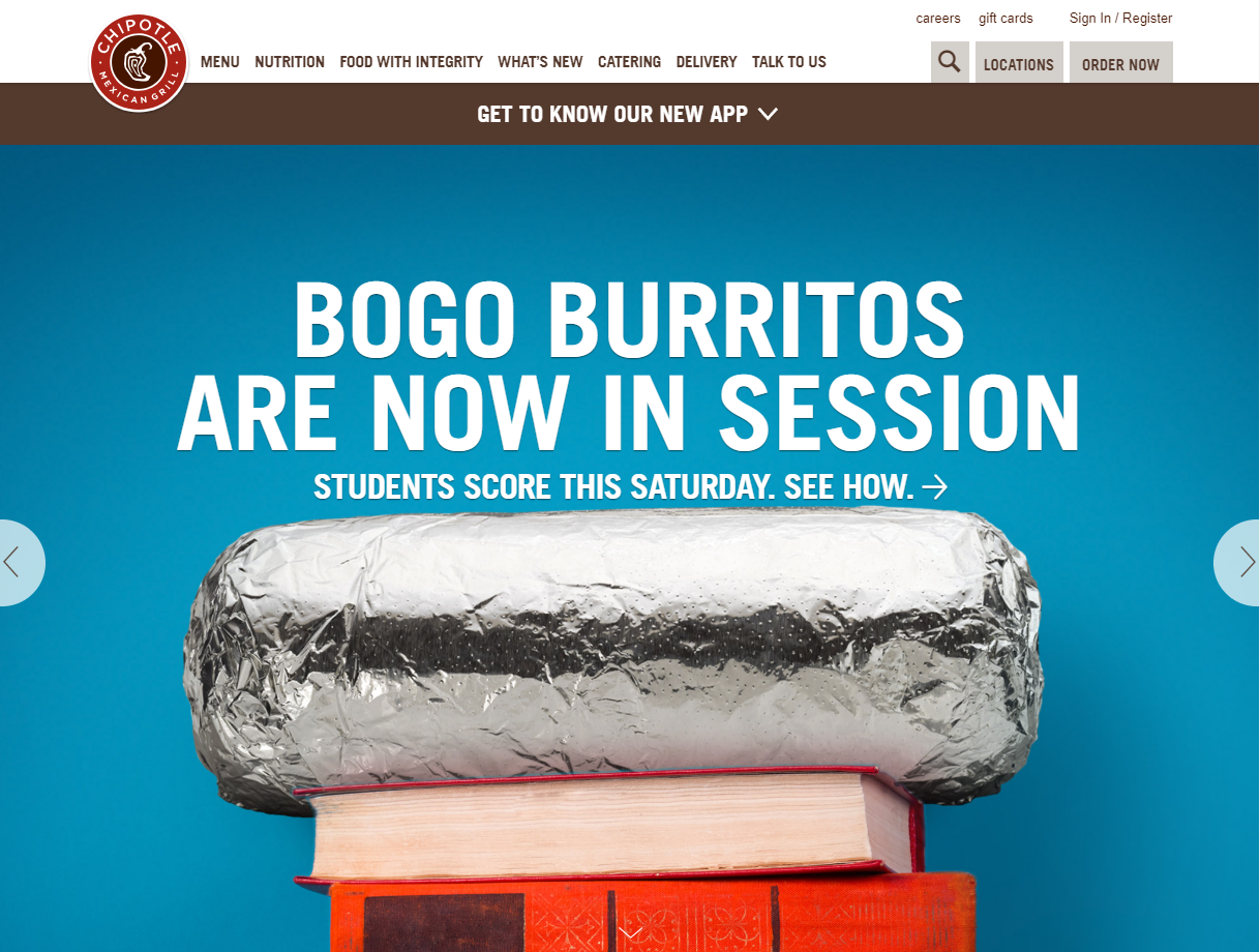
Chipotle Mexican Grill is in the food business, so their homepage's goal is to make you hungry. They accomplish this with giant banners showing off their entrees, sides, and other meals, changed frequently to match current promotions. If you find your appetite stimulated, there are at least two ways to find a Chipotle near you right from the homepage. You can search for locations by entering your ZIP code, with the results displayable in list form or on a map. You can also click to order from the website. This is a valuable web design principle in action: smoothing the user's journey to their purchase.
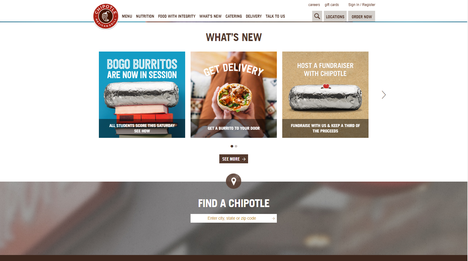
The rest of the homepage contains a helpful menu that makes it easy to find nutrition facts, information about Chipotle's supply chain (such as their food safety standards and initiatives to work with local growers), catering and delivery details, and of course the full menu offered in the restaurant. You can even look for a job at Chipotle right from the homepage. They really thought of everything!
Chewy
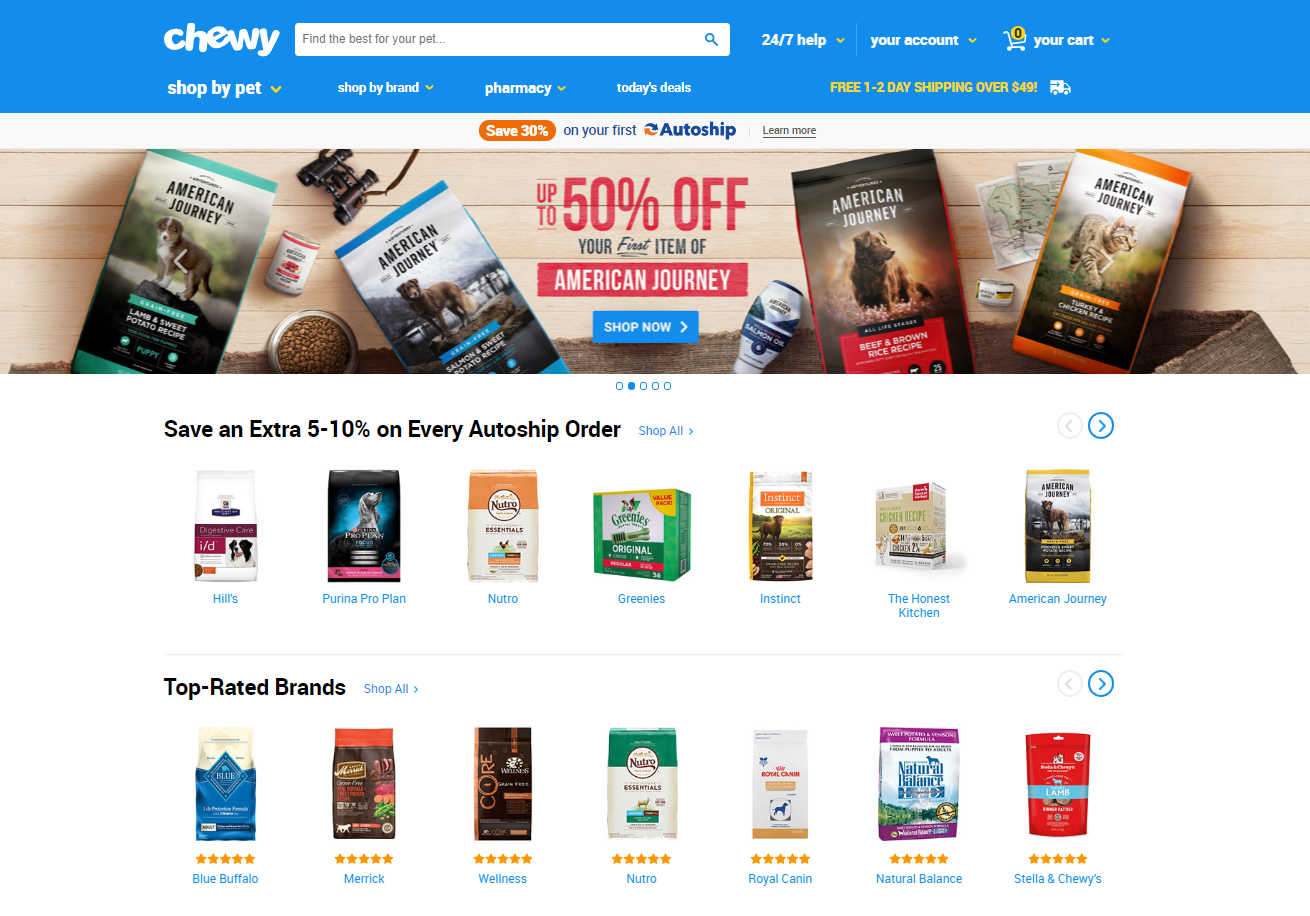
Chewy.com is a great example of an well designed home page for an ecommerce website. Featuring their current promotions in multiple banners within their home page carousel., they're able to send the visitors to specific categories within their website. Chewy.com uses its homepage very efficiently to present to visitors their featured products and the fact that they offer Autoship recurring deliveries.
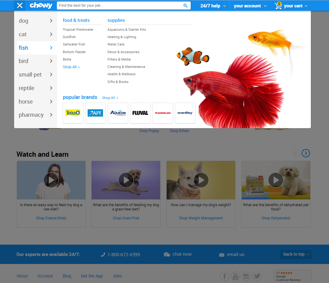
As you scroll down on the page, the take advantage of a sticky menu navigation combined with a great-looking mega-menu. The navigation is classified on the type of pet, showcasing the most common products and popular brands for each category. They're very successful at providing great navigation tools for the best shopping experience.
What We Can Learn from These Homepages
All the homepages we've included in this list are great examples of how to use this medium successfully.
They introduce the business well enough to entice the visitor without forcing them to explore further into the site. They catch interest, provide information, and answer customer questions immediately: What is this company? Who are they? What are they offering? What problems do they solve? How can this business help me? Visitors who find these answers quickly are more likely to stick around, explore the rest of the website, and become customers.
These homepages are great examples of what can be done to effectively grab the visitor's attention within a single page. If you need inspiration for building your own website, they're a great source of inspiration.


Leave a reply or comment below