


What’s one of the first things that come to mind when you think of an iconic brand, like Pepsi or T-Mobile? More than likely, your mind is immediately filled with the color blue or pink. Iconic brands have mastered the use of color in their branding down to a science for success. If you’re building an online store, then the most important application of your color palette is in your website’s design.
Your eCommerce website’s color palette and overall branding needs to stick in your customers’ minds long after they leave your site. In the world of online shopping, you’ve got a lot of competition – something as simple as color choice can make or break a conversion. So, let’s go through what it takes to put together website's color schemes that not only converts, but that also establishes your brand in your industry for a long time.
How Does Color Affect Customers?
Color is a lot more powerful than simple aesthetics – the colors that you choose for your business’s brand and your online store can actually go as far as influence the behavior of your customer and whether or not they want to shop with you at all. Let’s break this effect down into three main components: emotional responses, shopping behavior, and demographics.
Emotional Responses
Different colors have been found to trigger certain emotional responses when observed by humans. This is the science of color psychology, which is the study of how colors affect the way we think and feel. Something as simple as color can directly affect how we like a person we’ve just met, how we feel in a certain location, and, of course, how we shop. While this can vary depending on many factors, certain colors typically associate themselves with emotions, such as:
- Red, for excitement, love, passion, energy and anger.
- Orange, for friendliness, enthusiasm, creativity and youth.
- Yellow, for youthfulness, optimism, cheerfulness, and spontaneity.
- Green, for wealth, health, tranquility, nature and stability.
- Blue, for trust, security, stability, peace and calmness.
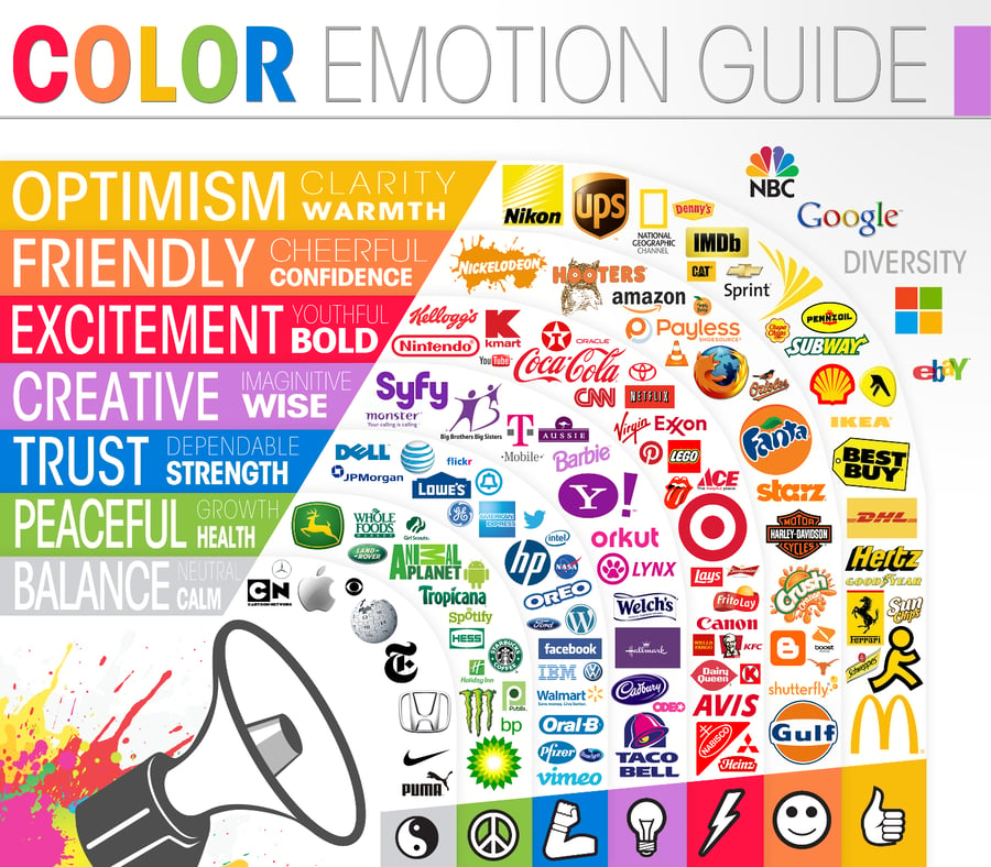
Source: The Logo Company
Shopping Behavior
Branching off of emotion is behavior, or more specifically in this case, shopping behavior. Just like different colors can influence a certain emotion, that emotion can then influence a desired behavior and attract certain types of shoppers.
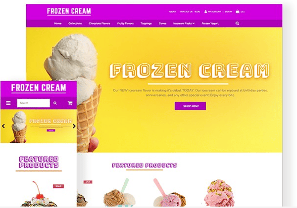
For example, highly saturated colors like red, orange, and black typically attract impulse shoppers and may even stimulate appetites – think fast food and clearance sales. You’ll see these colors in companies like Coca-Cola, McDonalds, and Netflix, which build off of stimulating energy, drawing attention, and attract impulse buying.
On the other end of the spectrum are less abrasive colors like white, yellow and blue, which tend to attract shoppers on a budget – banks and large department stores come to mind. Best Buy uses both yellow and blue in their marketing, as their business is often associated with saving money on big ticket items. Blue is everywhere in social media branding, including Facebook, Twitter, and LinkedIn – all of which are free services (for the most part).
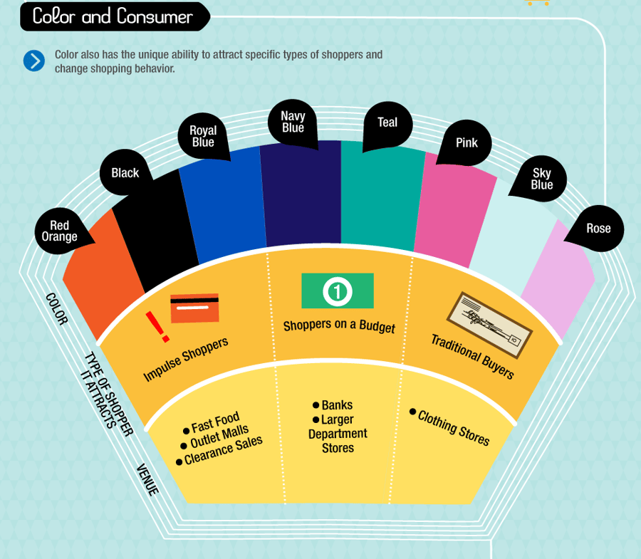
Source: KISSmetrics
Demographics
Another major factor in how colors affect customers is the customer themselves; specifically, their demographics. Certain demographics, from gender to physical location, tend to respond better to specific colors. For example, it’s been shown that there is a gender divide between color – men tend to prefer brighter, more saturated colors, while women tend to prefer softer, less saturated colors.
Beyond gender is the customer’s country and culture; colors can have wildly different meanings from country to country. If you’re doing business in a country that has a predominant culture that you’re not familiar with, it’s important to do research into what colors mean in that culture. For example, while red is a positive color in countries like China and India, it’s the color of mourning in South Africa. Furthermore, purple may represent wealth and power in most Eastern and Western countries, but certain countries in Europe like the UK and Italy associate it with death and grieving.
How to Choose a Website Color Scheme
Now that you understand the basic psychology of color, you can start picking and choosing the colors you want to use on your business’s website. But this isn’t as simple as choosing red because you want your brand to represent energy; a palette is made up of several types of colors that all have meaning both psychologically and in business.
1. Analyze Your Industry
Before you even pick a color, you need to first look at your industry as a whole and your competitors. Take the time to do market research into what types of color palettes are most common, and successful, within the industry you do business in. But you also want to avoid using colors that your competition already uses, as to not cause brand confusion or be at risk of copying your competitor. You want to differentiate your brand, but also not appear so different that you confuse shoppers who shop within your industry.
Rather than copying competition, instead gain inspiration from other businesses that are successful with the color palettes that they’ve chosen. You can even build off of those colors to influence how customers think of your business. For example, if your point of differentiation against your competition is that they’re outdated compared to your business, and they use a desaturated blue color, then consider using a brighter blue color to show that you’re fresh.
2. Start with Your Logo & Base Color
Now that you understand the playing field, you need to start with your most important color: your base color. If you already have an established logo, then your base color will be the main color used in the logo in order to maintain brand cohesiveness. However, if you don’t yet have a logo, then your first step is choosing a main color that will be used in all of your branding so you can then create your company logo.
Using what we’ve discussed, you probably already understand that it’s not as simple as choosing your favorite color. First, think about the emotion or behavior that you want to evoke in customers when they visit your website. An easy way to do this is by writing out the words you want to be associated with your business. For example, if you’re website is representing your yoga studio, you may write down “tranquility, serene, calm, balance.” Match these words up with the colors that represent them and pick a color that makes sense for your business.
Next, think about your target audience. What are your target demographics? Use the information on your customer’s gender, age, country, and more to inform your color choice. However, it may be wise to not play into stereotypes (such as girls always liking pink) to avoid clichés and stand out from other businesses.
Finally, reflect on the industry that you’re in and the behaviors and emotions associated with it. If your business is based on budget clothing, then look into colors that attract budget buyers. Or, if your business deals in more luxury fashion, decide on a color that’s associated with high-end shoppers.
After choosing your basic main color, you’ll need to determine the exact shade or tint you want that color to be. Just because you’ve chosen yellow as your color, for example, doesn’t mean that a neon yellow may be best for your business; a pastel yellow may make more sense in your field. Different shades of a color can effect emotions as well, such as lighter blue feeling more fun than a serious dark blue. Go back to your target audience, desired behaviors, and emotions to determine the shade that makes the most sense.
3. Create an Engaging Color Palette
With your base color chosen, you can now pick accent colors that mesh well and enhance your brand’s image. Putting together a palette that works is based on color theory, which encapsulates all of the concepts behind how colors combine together and work side-by-side. Typically, this is based on the color wheel, which visualizes how colors relate to each other in various ways. Today, we’re going to discuss the two main ways that colors can relate to each other that you should know about: analogous colors and complementary colors.
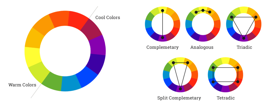
Source: Web Ascender
Analogous colors are groups of three colors that sit next to each other on the color wheel. For example, blue, blue violet and violet are all analogous colors. A palette that uses analogous colors typically creates a rich, monochromatic, simplistic look that is based around one type of color with variations in shade and tint.
Complementary colors are any two colors that sit directly opposite each other on the color wheel. Common examples of this are red and green, yellow and purple, or blue and orange. As the name suggests, complementary colors tend to complement each other, and are almost always guaranteed to look good when used together. Most dynamic website color palettes tend to use complementary colors to add contrast and pop, as well as to avoid all of the colors blending together.
Most color palettes will use a mixture of both analogous and complementary colors, but some site designs can use solely one type for that desired effect. Keep in mind that you want to avoid using too many colors, or else you may risk designing a site that’s too busy and overwhelming to customers. You want to design a palette that is easy on a customer’s eyes and doesn’t drive them away to a less distracting site.
However, at the same time, you don’t want to use too little colors; this may come off as bland and unoriginal. It’s important to strike the perfect balance of color variation that’s right for your business and goals.
4. Distribute Your Main & Accent Colors
While color choice itself is a crucial aspect of web design, it all comes together in your color distribution. Now it’s time to apply your chosen colors to the design elements of your website.
Your base color should be used in the places of your site that you want users to pay attention to most. This typically includes your logo, menu tabs, titles or headlines, and other major buttons.
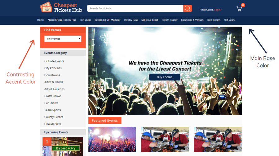
Your accent colors should then be used in high contrast areas to make certain elements stand out. These will include current menu tabs, subtitles, CTA buttons, and for highlighting secondary information. Keep in mind that the color choice of your CTA buttons is crucial on its own; they should use colors that entice users to click and pop out the most in your chosen color palette. For example, if you’re using a palette with blue and orange, and your base color is blue, then your CTA should be orange.
Best Website Color Scheme Generators
While you can take the time to study color theory and choose every color in your palette one by one, an easier and faster way to build a color palette that works is by using a color scheme generator. We’ve selected five of our favorite generators that can help you on your color journey.
Adobe Color CC
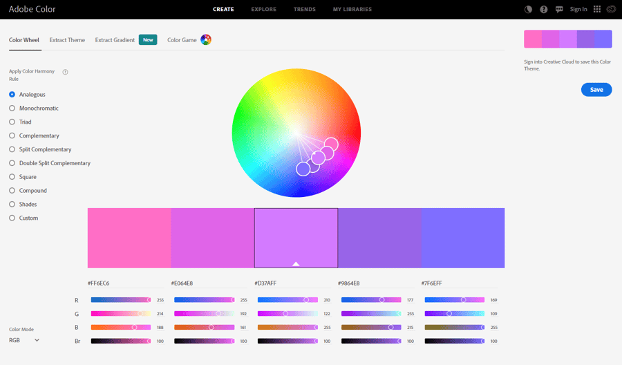
Created by Adobe, the design software company, Adobe Color CC is a color scheme generator that integrates directly with all Adobe products. The site is free to use without making an account; however, if you’d like to save any of the palettes you’ve generated, you’ll need to create a Creative Cloud account (which you may already have if you use programs like Photoshop).
Adobe Color CC lets you create a color palette using a color wheel, extract a palette from an image that you can upload, and explore popular color palettes that are created by other users. One of the best aspects of this site is the Trends section, which shows you what types of color palettes are currently trending in a specific industry, like fashion, architecture, or game design.
Colormind.io
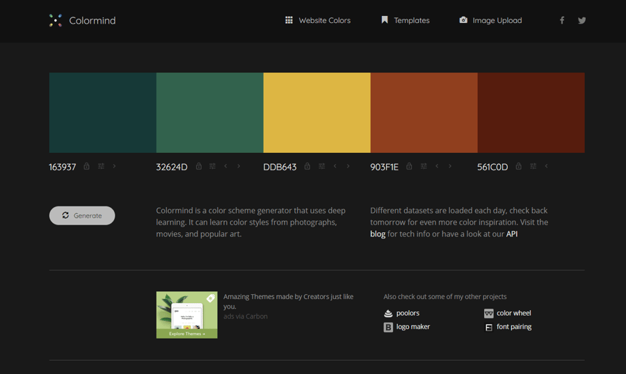
Colormind is a free website color scheme generator, with no account needed to use, that allows you to generate random color palettes for use on a website. The simple interface also lets you apply a color palette to an example bootstrap website, apply a palette to an example dashboard, or extract a palette from an image.
To use Colormind, simply generate a new color palette, choose a scheme that has one or a few colors that you really like, and lock those colors to keep them in the palette. Then, you can generate new colors that match your locked colors until you find all of the colors that you’re happy with.
Coolors.co
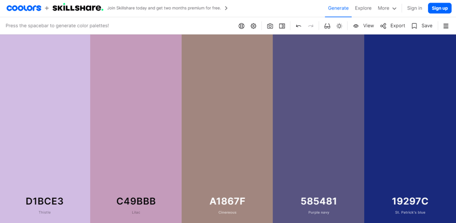
Coolors is a free website color palette generator with no account necessary to use; however, you can make an account to save your favorite colors and palettes for future use or reference. Coolors gives you the ability to generate colors, explore trending palettes, pick a palette from a photo, create a collage using a palette, make a gradient/gradient palette, check for contrast, and much more.
To generate a palette, navigate to their generator, which will create a random palette that you can change by pressing the space bar. Like Colormind, you can lock a color to keep it in the palette and generate new colors to match it. One useful feature of Coolors is the color blindness tool, which allows you to see how your palette will appear to individuals with different forms of color blindness – this is especially useful for making your site accessible.
Coloring for Colorblindness
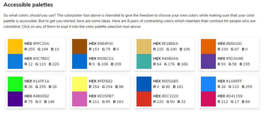
Diving even further into accessible design is Coloring for Colorblindness, which is a free website created by David Nichols, a math PhD alumnus of the University of Connecticut. Color for Colorblindness automatically generates a color palette and shows examples side-by-side of how that palette will look to individuals with different types of color blindness.
The site goes even further to help you design with accessibility in mind by giving you examples of eight pairs of contrasting colors that maintain their contrast for people who are color blind. You can click on any of these pairs to load them into the color palette section tool and use them to create your own palette.
Material Palette
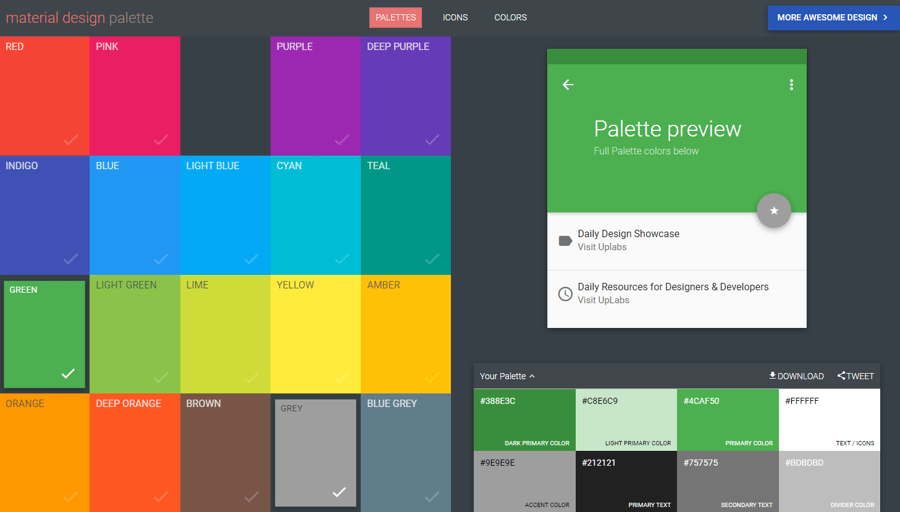
Based on Google’s “material design” color palette, Material Palette helps users to generate simplistic color schemes for use in minimalistic websites and apps. The site is free to use and has no way to make an account; to save your palette, you have the choice to tweet it out or download it in various file formats.
Using Material Palette, you can select from two of the 19 colors on the homepage that you like. Then, the site will generate a palette using those two colors and a demonstration of how the palette looks in action on an app interface.
One of the most useful aspects of this generator is its suggestion on how to use the colors in the palette. For example, you’ll be given a palette with designations for primary color, primary text color, secondary text color, icon color, divider color and more.
Wrapping Up
Just like every other business decision you make, the color palette that you choose for your website is crucial for fostering success. This is because your online store’s color palette is something that should last as long as your business and will be used across all forms of marketing in addition to your website’s design. Branding is not an easy process, so it’s important to put some thought into how you’re crafting your business’s identity. If the process seems daunting, a professional graphic designer can help you create the perfect look for your website as well.


Leave a reply or comment below