

A website used to be a fun novelty for a business, but those days are long over. Today, a website is as essential as a business card. With the continual growth of eCommerce, businesses worldwide have discovered new ways to connect with customers far beyond the possibilities of traditional brick-and-mortar commerce. In turn, customers have grown to love the convenience of shopping online and using the internet to learn more about their favorite brands. Websites are what put the e in eCommerce.
However, not all websites are created equal. Some are inconvenient to use and survive solely on the reputation their brand has built in the offline world. Others are fast and seamless, but lack the features customers want. And of course, there are those websites that do everything right: they're easy for customers, and profitable for businesses. This is the type of website you want to have.
Before you jump into the highly-competitive eCommerce world, you need to understand the goals your website must reach in order to put it into that coveted third category — and you need to get it right the first time. Every minute your business spends with an inferior website will hurt your reputation among customers. That isn't to say you should just give up if your website currently isn't up to standards, but it does mean you need to start overhauling it as soon as possible.
If you're just starting out, you do have an advantage. You can build the best possible website for your business straight from the outset, and not have to recover from having made a bad impression with an old site. It's better if you collect website feedback at this point.
Either way, it's time to learn what goes into successful web design so you can build the perfect online store.
The Three-Part Checklist
Every eCommerce website has to perfect three different things: aesthetics, function, and user experience. Many websites are only strong in one of these areas. Some handle two of them pretty well. The very best websites, that have customers coming back again and again, have mastered all three of these essentials.
This article will go over them one by one in detail, covering important factors and features that influence each.
Aesthetics
Aesthetics refers to the appreciation and understanding of beauty and good taste. In web design, this translates to the need to create a website that has as universal an appeal as possible, instead of building a site according to the designer's personal preferences. In short, you have to think about what your customers like, what they want, and how they want to use your website — not what you personally like.
It can be challenging to figure out how much your personal taste might be influencing you when you decide on the best look for your website, especially if you're building a more unique eCommerce store. Is your favorite color really the best color for your website's background? Fortunately, there's tons of data available today about what works in web design and what doesn't. The best colors (including saturation and contrast), fonts, layouts, images, and everything else can all be backed up with real numbers that show which design choices customers prefer. Customers will always spend more time and energy on a website they like, and this includes all types of engagement from reading to buying, so it's worthwhile to follow these guidelines.
• Proper Color Scheme
Color scheme is one of the more subjective aspects of web design because the best colors partially depend on your brand identity. The trick is to create a visually-pleasing website that uses color properly — doesn't distract visitors or fatigue their eyes, or draw their attention to the wrong place, or obscure your important information, etc. — while still matching your brand.
If you're still not fully committed to how your brand will look, keep color in mind while designing the logo and other elements. This will make it easier to create an appealing, effective web design that fully matches your brand identity.
To understand proper color schemes for websites, first you must understand color. Color theory is a set of principles that defines which colors go together and why, not because designers say they do, but because of the science of how colors work and how our eyes perceive them. You can use color theory to identify which colors look good side-by-side for different purposes, and which clash and should never be placed together. The easiest reference for color theory is a color wheel, which shows primary, secondary, and tertiary colors.
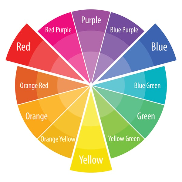 Red, yellow, and blue are primary colors. Purple, orange, and green are secondary colors, resulting from the mixture of primary colors. Tertiary colors are mixtures of primary and secondary colors.
The color wheel is a quick reference that can tell you which colors are related. There are two types of related colors:
- Analogous colors are close together on the color wheel, like yellow and yellow-green.
- Complementary colors are exact opposites on the color wheel, like yellow and purple.
Both analogous and complementary colors can be used to achieve harmony in a design. Analogous colors are often used together in a gradient, to give a bit of life to a page background or bestow a slight 3D effect on buttons. Complementary colors are great for smaller elements where you want to split up space or draw some attention, but their usage takes a little more care to ensure they look good. Colors without a close relationship (neither analogous nor complementary) often don't look good together at all.
Value and saturation are also important. Value is the lightness or darkness of a color, and saturation is the intensity. These two factors also influence how well two different colors work together and how easy they are on the eyes. If you tweak the value and saturation, you can create color harmony even while using colors that would normally clash if they were at their usual brightness or intensity. Lower saturation is more relaxing to the viewer, while highly saturated colors "fight" with each other more on the page and can fatigue the eyes quickly.
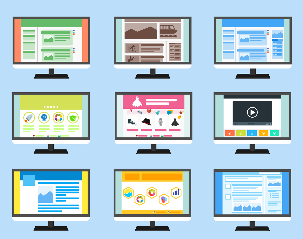
Let's look at some eCommerce website templates that use color theory principles to create harmonious designs in different ways:
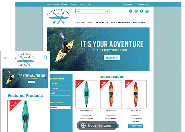
Kayaks uses a range of blues along with small touches of yellow to bring out important highlights. The saturation levels help these colors work together pleasantly. The red Sale tags are likewise somewhat desaturated to prevent them from clashing.
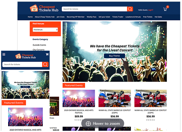
Tickets Hub uses complementary orange and blue, with similar value and saturation, along with plenty of white to create a theme that's exciting without being visually overpowering. The menu subtly stands out by using a slightly darker value of blue.
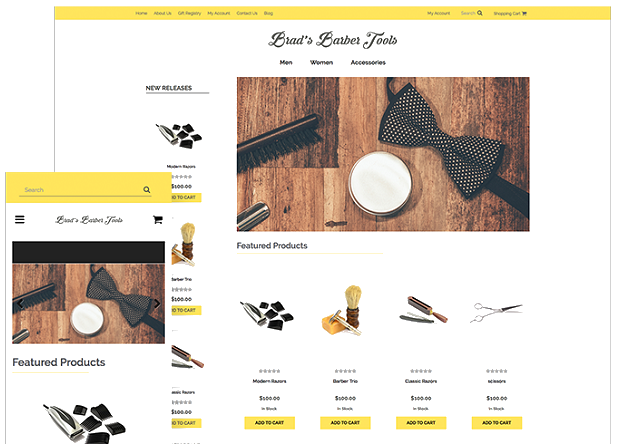
Brad's Barber uses only yellow for its highlights. Since the yellow doesn't have to compete with other colors, it can be a bit brighter (more saturated). The text is deep grey rather than pure black, to help prevent too much contrast with the yellow.
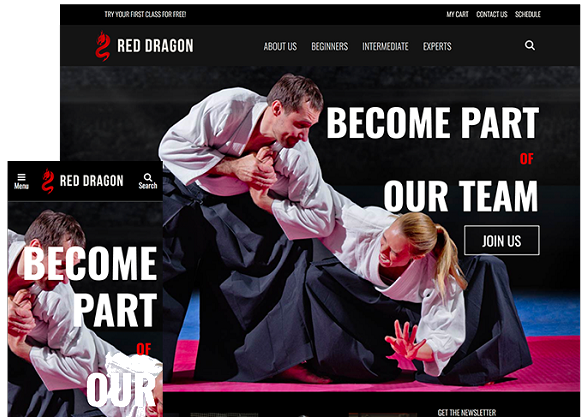
Red Dragon uses red for its highlights, which is slightly lower in value than "pure red" to prevent it from being too bright against the black and grey background areas.
Understanding how color works will help you make better choices about the colors you use, which is important because you need to be selective when it comes to color. Too few colors can look lifeless and boring, while too many colors exhausts the human brain and triggers a subconscious desire to leave the website. If you're familiar with analogous and complementary colors, and the concepts of saturation and value, you'll be able to use color to its best effect.
• Layout
When a person views any type of content, whether it's a book, a magazine, a poster, or a webpage, they expect to be able to move their eyes across it in a natural fashion. There are some minor cultural differences involved here, relating to the written direction of the viewer's native language, but every person is going to naturally want to start at the top of a page and move their eyes in the direction they're used to reading — even if the page is mostly images and little text, like an online store category page.
As the viewer looks at the page, they'll need some quick moments to pause and let their eyes (and brain) rest as they absorb the information they just took in. if you don't provide them with these moments of rest, they'll get overwhelmed and turn away from your website. Your site's layout is critical for giving your visitors a comfortable environment to absorb the information you're presenting to them.
This is why the best eCommerce website layouts are based on a grid, with sufficient whitespace between products and other elements. The grid layout doesn't force the visitor's eyes to jump around, and the whitespace allows them to rest.
That's not to say grid layouts have to be boring. Check out this eCommerce website theme, Hat Gang:
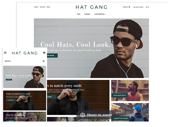
The front page's several banner images are laid out in a neat grid divided up by whitespace. The different banner sizes mix up the layout just enough to make it more interesting, but the viewer's eyes never have trouble figuring out where to go next.
Now let's look at one of the most notoriously bad layouts on the internet, Arngren.net:
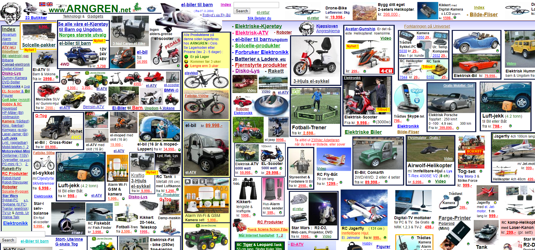
There's a reason this website is found on almost every list of "worst websites" you can find today. Everything is jumbled together so chaotically that your eyes flick around constantly on the page, and there's nowhere to rest them because everything is so close together. To make it even worse, this site is completely nonresponsive to the size of your screen, and even on desktop, you'll probably have to scroll horizontally to see it all.
We could go on about everything wrong with Arngren's layout, but we don't need to cover every single detail to get across why it's the perfect example of what not to do.
• Graphics
Every part of your website needs to look top-of-the-line, which of course includes all graphical elements such as your logo, page backgrounds, banner images, and more. High-quality graphics will add to the professionalism of your website, while low-quality graphics will have the opposite effect — bad graphics will make your business look amateurish and cheap.
Avoid pixelated, over-compressed, grainy, or otherwise low-quality images. In most cases, you can avoid these problems by following a few quick tips:
- Use modern web image formats that support a full range of colors (e.g. no 32-color GIFs).
- Do not repeatedly save a JPG or other lossy image file format. Every time you save an image in lossy format, it will compress further and lose quality. If you need to work directly on a JPG or other compressed format, convert it to a working filetype first (such as PSD in Photoshop) to make your edits. Not only will this give you more freedom to edit, it will also allow you to save the file as needed without losing quality.
- Don't scale up images for use on your website; this makes them blurry. Raster images (pixel-based images) can't be scaled up much if at all without losing sharpness. Vector graphics are different and can be scaled freely, but they're not suitable for every type of image.
If any of your graphics use transparency (such as your logo, to allow it to "float" properly on the site background rather than sit within a white square), beware of the jagged edges that can come about from image background removal. All images with transparent backgrounds need to have nice, smooth edges to communicate the sense of quality you want associated with your business.
Understanding the techniques for removing an image background will help you avoid jagged edges, and luckily, it's much easier to remove backgrounds from logos and other elements than it is from product photos. You may also want to remove backgrounds so you can add "floating" product photos to a promotional banner, so it's always worth learning the advanced techniques.
Even with great website graphics, sometimes less is more. Don't clutter your pages with unnecessary logos, buttons, or other elements. We get more in-depth about page clutter shortly, under "Minimize Noise."
• Good Product Photography
Since eCommerce customers can't inspect a product in person before buying, great product photos are essential for helping them make a decision. Show your products from multiple angles and with proper lighting that doesn't obscure details or make the colors look different from how they appear in life.
You may also need to edit your product photos before adding them to your website — not to make your products look like something they aren't, but to correct the color balance and clean up any odd spots. Some degree of retouching is necessary if you want to sell online across multiple channels, because some marketplaces like Amazon have photo requirements like a pure white background. You don't want to have to retake special product photos for every channel, so it's best to make sure the photos on your website match those criteria.
Don't be intimidated by the importance of product photography. It's not nearly as hard as it used to be, and even if your budget is quite low, you can still learn how to take great product photos without spending hundreds of dollars on lighting, equipment, or photo editing software.
Photography also plays a part in your marketing, most commonly in lifestyle photos (live shots that show your products in a setting and/or being used by people). It's equally important that you use only high-quality photos for this purpose. Remember that these photos are the ones that directly show customers what it's like to own your products.
In some cases, you'll want to add text to photos, such as to create a social media advertisement or a promotional banner for your website. When doing this, you need to maintain a good text-to-image ratio to ensure your text doesn't detract from the image. This is especially important when creating Facebook ads, as including too much text on your image will cause your ad to be rejected. You can find information about the acceptable text-to-image ratio in Facebook's advertising guidelines.
• Place Important Content Above the Fold
"Above the fold" is a term originating with newspapers, and refers to the area that is above the actual fold when a paper is placed on a newsstand. The most important headlines, articles, and photos are placed above the fold so they can be seen immediately by passersby. In web design, the same principle applies, and the "fold" refers to the bottom of the visible viewing area before the visitor scrolls the page.
Even though we can scroll down on websites, the most important information should still be placed high enough on the page that a visitor can see it immediately, without scrolling down. Placing your website's most important content above the fold means a better chance of instantly engaging your customers. This isn't as straightforward as it might sound — visitors on desktop have always used a variety of screen sizes, and now that mobile browsing has become so popular, you also need to take smartphones and tablets into account.
Google Analytics has a Browser Size metric that will show you the most common screen sizes being used by your visitors. This can help you define exactly where the "fold" is on your website so you can lay out your content appropriately.
• Minimize Noise
In web design, "noise" refers to clutter on a web page that pulls the visitor's attention away from the important content. Too much clutter will cause the visitor's eyes to jump around on the page and lead to confusion as to what they're supposed to be looking at, or what the actual point of your page is. Noise will detract from your website's efficiency at capturing customer interest and will hurt your conversions. This is because an overly-busy website causes a phenomenon called cognitive load, which in short means you're forcing your visitors to use too much brain power. Too much cognitive load, and the visitor will give up.
Noise can include text boxes, images, advertising, and more. All can be confusing to visitors and cause them to lose interest in finding what they need. A customer visiting your website should feel like you respect their time and value their attention, not as if you're forcing them to play "Where's Waldo?" to hunt down the relevant points.
Prevent noise problems by keeping your website content to the essentials. If you absolutely need to add content that could be considered "noisy," keep it out of the way and separate from your main content. Depending on the type of content you're trying to prune from your front page, you could move some of it to a different page, a menu or sidebar, or simply place each piece in its own section below the important parts — but only if you absolutely need to keep it rather than deleting it outright.
• Clear and Easy-to-Read Text
Text is a vital part of your website because it's going to be your primary method of communicating with customers. Like other design elements, color and contrast come into play here. Your text needs to have enough contrast to make the text easy to read without being grating.
The font you choose is also important. Different fonts will affect the mood of your site and have different psychological effects on your visitors. This is why font choice is an important part of brand identity. When choosing a font, you need to balance clarity and readability with the type of mood you want to evoke. Fortunately, it's possible to select a great font that is both easy to read and still matches your brand identity, as long as you make some small considerations:
- It's a good idea to eliminate "strange fonts" from your brand identity in the first place, except for places like the logo, where overall visual impact is as important as readability.
- Don't use too many fonts in one place, and ensure the ones you do use are related or at least similar to keep your design cohesive.
- All the main text content should be one easy-to-read font, with others (if any) used only for menu titles, headings, or other similar elements — i.e. the parts of your text you want to stand out anyway.
- Generally, the stranger or "wackier" the font, the more sparingly you should use it, even if it works well for your brand (e.g. a horror font for a Halloween store, or a fun font for a toy store. Both can work quite well for page headings, but certainly not other content).
- Any fonts you do choose should match the mood and message of your brand, even the "normal" font you use for most of your text.
The whitespace aspect of page layout applies to text as well. Make sure there's adequate line space between each row of text, and watch out for bad kerning that pushes your letters too close together. Note that both of these have a happy medium, as too much space will also hurt readability.
As a final note on fonts, you should avoid any that have a strong association with an existing brand. At best, using another business's famous font can confuse customers or make you look like a copycat — and at worst, it can get you sued for trademark infringement.
• Make Your Product the Focus
When building your website, keep your goals as a business in the forefront of your mind. Your objective is to make sales. To meet this goal, it's crucial that you build your website around your products. Your website's layout should support your products and your ability to get the customer to see them.
Categories should be immediately accessible from your front page, whether in a sidebar or a dropdown menu, and every product page should be laid out to grab attention. If it takes too much clicking and scrolling to see what you have to offer, customers will stop caring about your store long before they give your products a fair chance.
Your website's content should be product-focused as well. Too many startups introduce themselves by explaining their goals or trying to "pump up" their business, to the point that visitors may be confused about what the business actually sells. This is something you never want to happen, so save long descriptions of your business's accomplishments for your "About Us" page, and keep your front-page content focused on what your products are and what problems they can solve for your customers.
On product pages, the product's name, photos, pricing, and other pertinent information should be above the fold, as we explained earlier. A quick bulleted list will help customers absorb your product's features and benefits at a glance. Save long descriptions, reviews, and other more detailed information for lower on the page. This gives your customer a chance to become interested in the product right away and then decide to move downward to learn more.
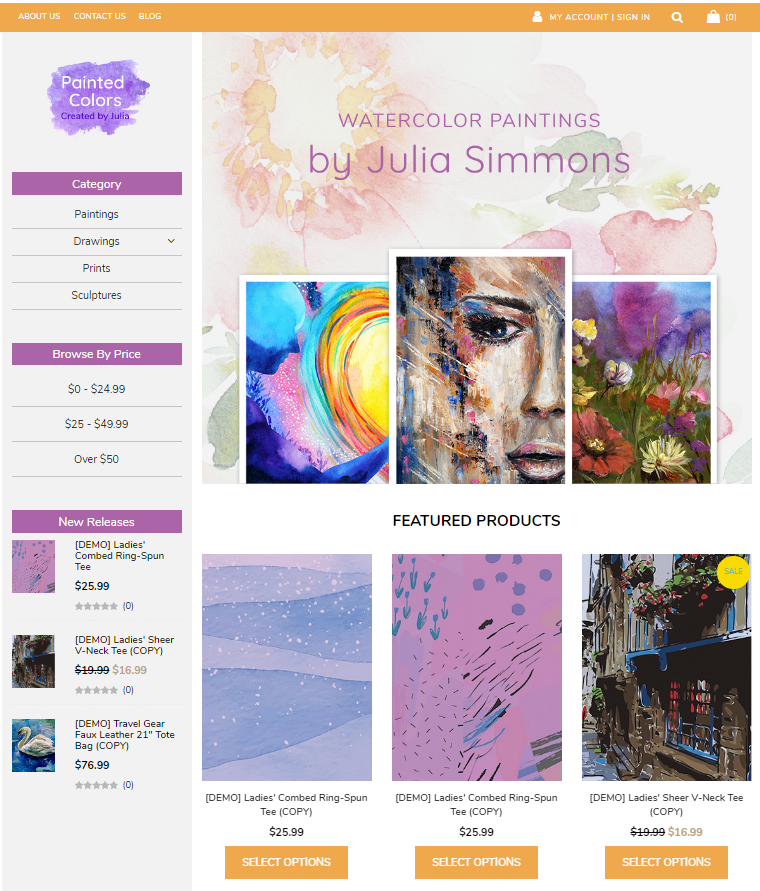
Here is an art gallery website template that does it well:
Function
Function describes how your website works. If your site doesn't function well, it will fail no matter how beautifully-designed it is.
Your ultimate goal is to make it as easy as possible for customers to buy from you, from beginning to end of their purchasing journey. This means every aspect of your website needs to behave perfectly and be as convenient as possible. Shopping should never feel like work, even if your customer is a B2B buyer choosing products for their business.
Your eCommerce software plays a heavy role in how well your website functions, in both performance and available features. Some platforms are much more limited than others when it comes to the type and quality of optimizations you can make. Keep this in mind as you choose an eCommerce platform for your startup.
• Easy Checkout
Customers like to shop online because it's convenient. If your website takes any of that convenience away, they're likely to decide to do their shopping elsewhere. Since the checkout process is the most technical part of your site, it's the leading cause of "friction," i.e. loss of convenience.
In order to boost sales and conversions, you must reduce friction at every opportunity. Your checkout is one of the most important functions on your website (if not the most important) and should be optimized in every way possible, from beginning to end:
1. Add to Cart
Every product page needs a visible Add to Cart button. This may seem obvious, but there are definitely ways to do it wrong. The customer should be able to see the Add to Cart button instantly, without scrolling, and with no question in their mind that it's the right button. Make sure your Add to Cart buttons are in a prime location on the page, clearly labeled, and easy to spot.
To accomplish this, check your product page layout on multiple devices so you can discover if a smaller screen size pushes the button too far down. Since Add to Cart buttons should catch a customer's eye without effort, try testing your store by showing your product pages to friends or colleagues. You already know where the Add to Cart button is, so it's better to get feedback from fresh eyes. If your testers have too much trouble finding it, change its color to achieve better contrast with the rest of your page. Contrast is even more important if you have other buttons nearby as well, as it will prevent your Add to Cart button from blending in with the rest.
You can give your Add to Cart button an extra boost by spicing up its design with a slight gradient or shadow to make it look 3D. Buttons that look more "real" are more likely to be clicked because our brains still live in a real, 3D world and are constantly seeking tactile feedback, even while we're looking at a flat surface like a computer screen. You can also make the button more appealing (and even increase sales) by adding a small arrow to it. This subconsciously tells people that the button "does something" which makes it more tempting to click.

Lastly, be careful if you decide to alter the text of your Add to Cart buttons. "Add to Cart" is a perfectly familiar phrase that customers have no trouble deciphering. All your buttons should always communicate their function to the customer very clearly.
Adding to Wish Lists
A wish list lets a customer select products they want to purchase later on. This is a great convenience for customers (and a great sign that they intend to come back to your store!) and can also draw word-of-mouth attention to your business. This is because customers often share wish lists with others to help friends and family shop for gifts for them.
To get wish lists on your online store, your eCommerce software will need to support them. For best results, choose a platform that supports multiple wish lists per customer (e.g. so they can make a personal shopping list alongside a "birthday list" to share with others) and has built-in social sharing capabilities. Your "Add to Wish List" buttons should be placed on product pages in an easy-to-spot location near your "Add to Cart" button.
2. The Cart Itself
Customers must be able to view and edit their cart at any time, so make it accessible from every page on your website. Most online stores place a "View Cart" link near the top right side of the website, so that's where customers will usually look for it. Adding a small shopping cart icon can make it even easier to find, and as a bonus, you can add a small overlay that will display the number of items in the cart.
Carts can also be made more convenient and useful in a couple ways, both of which customers will appreciate. The first is to make your website's shopping cart persistent. This means the cart will be temporarily saved in the customer's browser through use of cookies. This prevents loss of the cart if the customer should close their browser, restart their computer, or otherwise leave your website before completing the purchase. This is a very helpful feature because it prevents customers from needing to pick out all their items again if they happen to have a browser mishap while shopping. If they have to start all over again, they may give up altogether.
The second convenient feature is the ability to save a cart for later. This means the customer can save the state of their shopping cart, complete with all items, to be accessible from their account when they return to your website. Customers enjoy this feature because it takes off some of the pressure they may feel while shopping and gives them a chance to fully evaluate their purchase without worrying that their selections may disappear. Some customers also like to start shopping from one device and then finish the purchase on another, and saved carts allow them to do that.
3. Checkout
Checkout is where the customer enters their payment and shipping information and completes their order. It's critical that your checkout runs smoothly and doesn't lag, freeze, or otherwise fail to work — if it does, you can be sure that customers will abandon their carts and your business altogether. Checkout must be bug-free and run smoothly at all times on all devices.
Beyond the technical side, you can improve your checkout by ensuring that all the text fields and checkboxes a customer needs to fill out are presented in a straightforward manner so none can be easily missed. We all know how annoying it is to fill out information and click "Check Out" only to be presented with a red error message saying that we didn't click a box or fill out a required field. It's even worse when all the information we did put in is gone and needs to be redone, in which case we may abandon the website out of pure irritation. If this has ever happened to you, you definitely understand why you don't want to do this to your customers. Solve this problem by organizing your checkout pages to be as clear as possible so customers won't accidentally skip a box or a field, and ensuring that even if they do forget to fill out a required section, their other information doesn't disappear when the page reloads to display the error message.
Many checkouts take multiple steps, in which the customer enters different information on different pages. To further streamline this process, you can introduce a single-page checkout in which all the required fields are on one page. However, a single-page checkout isn't perfect for all businesses. For example, some payment gateways require a multiple-page checkout.
A single-click checkout is even faster than a single page. Amazon owned the patent for single-click checkouts for almost 20 years, but their patent's expiration allowed other payment providers to introduce similar options without needing to pay licensing to Amazon for the technology. A single-click checkout is exactly what it sounds like: the customer checks out with a single click (or tap, on mobile) without needing to enter information. You can add this functionality to your online store by integrating with a digital wallet like Apple Pay, Google Pay, and others. Customers will then be able to check out with one click using their previously-saved information from these services. If you decide to offer this payment option, include it alongside traditional credit card processing so you can serve the customers that don't want to save their information for later use.
Account Signup
Speaking of saving information for later, give customers the chance to sign up for a store account near the end of the checkout process. At this point, the customer has already decided to buy from you and enter their data, so they're more likely to sign up just for the convenience of saving it. Don't force customers to sign up before checking out — or at all, for that matter, unless your business's structure absolutely relies on customer membership with your site.
Unless you're a programmer, optimizing a shopping cart is completely dependent on the capabilities of your eCommerce software. Since the cart is so important, always investigate this part of an eCommerce platform before you commit to using it.
• Mobile-Friendly Design
While plenty of people still use desktop computers, eCommerce statistics show an ever-increasing number of consumers who prefer to browse and shop from mobile devices. To compete in today's internet, your website must be friendly to all devices including desktops, smartphones, and tablets.
A mobile-friendly design doesn't just mean the page is the right size and proportions for a phone. It needs to take into account how the device is held, which places on the screen are easiest to reach with thumbs, and more. This means some of the conventions for desktop design don't work very well at all for mobile, and even different mobile devices have different needs.
This is why responsive design is considered the best approach to making a website mobile-friendly. A responsive website adapts to different devices of different sizes, which makes it easy to use whether the visitor is browsing from mobile or desktop. Responsive design also prevents the problem of a website's "mobile version" only looking its best on one particular device size.
Responsive design has become so important that Google is likely to rank a responsive website higher than a non-responsive one, even if the latter site does have a mobile version. This means going responsive is better for your SEO as well as your visitors.
• Easy Shipping Process
Unless you only sell digital downloads, shipping is the only way your customers can receive the products they purchase from you. Just like everything else on your website, shipping needs to be "done right." After all, the customer has already decided to buy something, so it would be a shame to lose them this late in the process!
If you use carrier shipping rates rather than a simple flat fee (or even free shipping), one of the most important steps you can take is to include real-time rates visible to your customers at all times. Surprise shipping costs are the biggest cause of cart abandonment, as customers see their total jump up unexpectedly. Real-time rates will make your shipping charges transparent and allow the customer time to get comfortable with the shipping costs they'll be paying on their purchase.
• Security and PCI Compliance
Hackers and massive data breaches just can't stay out of the news. It's no wonder people are concerned about the safety of their personal data. Today, this goes beyond the fear of a credit card number being stolen, and into the realm of identity theft, loss of personal accounts, and other horror stories.
This is why your website must use top-of-the-line security. An SSL certificate is the bare minimum, but to accept credit cards online, your website also needs to be PCI compliant. PCI compliance was introduced into the eCommerce industry to help establish a set of security standards meant to counter the issues of hackers and breached data. It includes the usual security measures like SSL and firewalls, but goes beyond them into a vigorous process including audits and inspections of your business.
Handling PCI compliance alone is time-consuming and expensive, but fortunately, some payment providers and eCommerce platforms have PCI compliance built in, and manage it so you don't have to.
• Easy Navigation
To understand the importance of navigation in web design, you just have to look back at human history for a moment. Navigation has always been essential for travel across land, sea, and air. It's just as essential for websites.
Without great navigation, a website visitor won't know how to find what they're looking for or how to get back to where they came from. Bad navigation is frustrating and will cost you sales, simply because customers won't be able to find the products they need! You can implement great navigation on your website in a few ways, and be assured that customers will look for these navigation options. They are part of user expectations nowadays, and if your site lacks them, the visitor may give up quickly.
Categories
Product categories are an obvious navigation aid that you can find in both eCommerce and brick-and-mortar stores. In the physical world, stores enhance navigation by breaking up their product types into different sections and aisles for easier browsing. Online, you do the same thing with product categories and subcategories.
Menu
Your online store's menu is another essential navigation tool, in which you can list your categories (and other website sections) to be viewed at a glance. The brick-and-mortar version of a menu can best be imagined as the signs that hang in front of every aisle, letting customers know which products can be found in each.
Breadcrumbs
Breadcrumb navigation provides a website visitor with a means to quickly backtrack through a category without needing to hit the "back" button in their browser, and is especially important when you consider that a customer may not have traveled through your category structure to get to that product page in the first place. For example, a customer may find one of your products through a Google search and then decide to see what else you have to offer. Breadcrumb navigation allows them to do so easily. It looks like this:
Home > Category > Subcategory > Product
Each of those entries is a link the customer can click to be brought to the relevant page. The "real life" comparison would be the act of retracing your steps in a brick-and-mortar store, as if by following the trail of breadcrumbs from a fairy tale.
Search
The internet is built for convenience, and searching exemplifies that. With a search bar on your website, customers can plug in a product name or related keywords and be brought straight to the relevant results. This is the online version of asking a store employee for help finding a product!
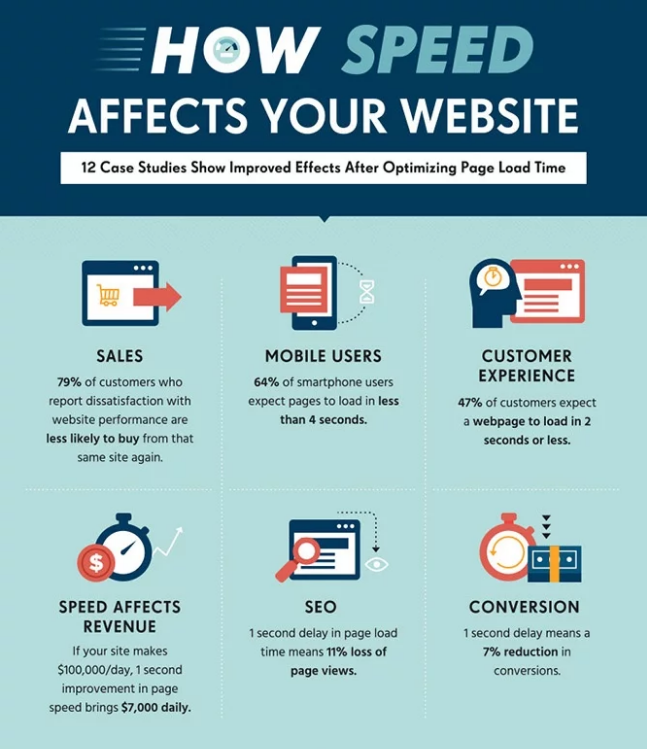
• Site Speed
Internet users have notoriously poor attention spans. This isn't a personal judgment whatsoever — rather, it's the inevitable side effect of having millions of websites available at any given time. We are overwhelmed with choice, so we need to be selective. If a website doesn't load fast enough, we know there are others out there that won't waste our time.
Google reports that most internet users will wait no longer than 3 seconds for a website to load enough to become usable. If the website takes any longer than that, the visitor will most likely abandon it in search of another. This is why your site speed is crucial.
Website speed is influenced by several factors, including the efficiency of the coding in your store's layout, the capabilities of your eCommerce software, the power of the server where your website resides, and more. To get a fast website, you'll need to take all of this into account — and choose your providers carefully.
Here is a snapshot of an infographic that shows the importance of page speed:
• SEO-Friendly
Search Engine Optimization (SEO) is essential for helping customers find your website. Paid advertising and word-of-mouth can only go so far in a world where the majority of online purchases begin with an internet search.
SEO revolves around getting your website to show up in search results for users who are looking for the types of products or services you offer. This primarily takes the form of adding relevant (and appropriate) keywords to your website, but there's a technical side to it, too. It can take some time to generate SEO results.
Your website's pages need unique titles and descriptions, which you define through meta tags. The meta title and meta description tag help search engines understand and display your content correctly, so it will appear in the proper searches and users will be enticed to click on it.
Your pages' heading structure is also important, as it provides another signal to the search engine as to what the page is actually about. The URL of each page can serve a similar purpose if you structure it to include human-readable keywords.
There are also a couple of ways you can "teach" search engines how to crawl and index your site. An XML sitemap will list your pages and how they relate to each other, serving as a map for search engine robots. These robots can be given further instruction with the robots.txt file, in which you can list pages that should not be crawled or indexed (like utility pages such as "View Cart").
Some website builders make these tasks needlessly difficult — if not impossible — by preventing you from customizing or even accessing the things you'd need to optimize. However, the best eCommerce platforms go the opposite route and let you edit everything you need to, through a convenient, easy-to-use interface.
Using the latter type of platform will give your website a fighting chance.
User Experience
User experience (sometimes abbreviated as UX) is where aesthetics and function come together in perfect harmony. UX describes how it feels for the user to "experience" your website, just as you might guess from the name. Everything you do to improve your website's appearance and functionality is with the goal of providing the best user experience possible.
But there's more you can do to make the user experience even better.
• Everything Must Be Easy to Find
Earlier in this article, we discussed the importance of site navigation and highly-visible Add to Cart buttons. We also spoke about uncluttered design and a comfortable layout. We've mentioned speed and convenience several times. Are you noticing a theme?
To provide the smoothest user experience possible, your website must make everything so easy to find that customers stand no chance of getting lost or confused. This is where reducing friction comes in again — every extra step a customer needs to take will harm your conversion rate.
Great navigation and site design are essential for helping your visitors stay interested in your website and converting them into customers, and by providing an easy shopping experience, you'll get those customers to keep coming back. They'll start to see your brand as a business they can rely on.
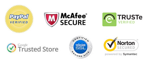
• Trust Logos and Reviews
Trust logos tell customers they can believe in the integrity of your business. There are several types you can use, including security logos to communicate to customers that their data is safe with you, and reputation logos to prove that your business is honest and your customers are satisfied. Security logos include PCI compliance and fraud protection logos, and reputation logos include BBB accreditation and the Google Customer Reviews badge.
Google Customer Reviews allow visitors to opt in to receive a quick survey in which they can rate their satisfaction with your website overall. Displaying a five-star rating from Google is sure to increase trust in your website.
Your trust badges and reviews should be easily visible to help ease any customer concerns immediately. The footer of your website is a great place for trust logos, and the Google Customer Reviews badge can slide in on the side of your website, where it's easily seen but out of the way.
Product reviews play a part as well. Customers nearly always turn to product reviews to help them with their buying decisions, so having a prominent review section on each product page can boost your sales. This also shows customers that you care about their feedback and invites them to speak their minds.
• Calls to Action
Maybe you've designed a beautiful website that works perfectly in every respect, and filled it with engaging content that will have customers lining up to buy from you, but there's another important step you can't skip: you have to tell those customers what to do next!
The call to action (CTA) is how you tell customers the next step to take. Each CTA is dependent on what you want the customer to do, whether it's to sign up for your newsletter, create an account, or add an item to their shopping cart. CTAs are most effective when there's a single one on any given page, because this allows the CTA to draw the maximum amount of attention. They should also be placed prominently on your website so the customer can find them instantly.
Creating effective call-to-action buttons is an art in and of itself. They must stand out sufficiently from the rest of your website's design that they draw customer attention effortlessly. Contrasting colors and descriptive button text are vital, as is their placement on a page. If you have other graphical elements that lead the visitor's eye towards the button, even better.
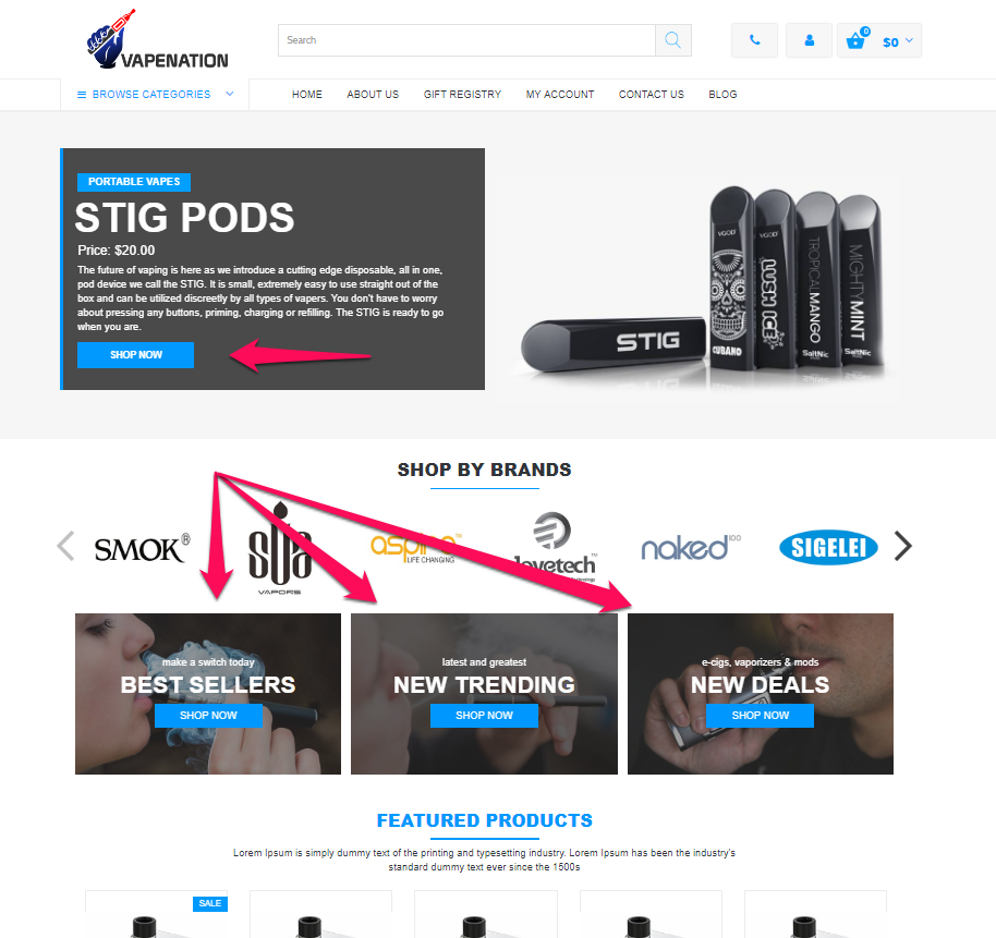
Here is a vape website template that makes good use of calls to action on the home page:
• Provide Unique Offers to the Customer
You want every customer to feel engaged and valued. They need to know you see them as an individual person with needs and preferences of their own, not as a number or a demographic. By providing personalized offers, you can demonstrate to customers that you're paying attention to who they are and what they want.
Upselling is the practice of offering upgrades or accessories for a product a customer is buying. Many store owners don't realize that some customers want the upsell, especially those customers that buy more often than browse. These customers want to see the other products that will enhance their purchase. If there are great accessories to complement their latest purchase, they appreciate knowing about them!
Recommended items, based on a customer's browsing history, can also be very helpful. Even though on a base level, customers know these recommendations are automatically provided based on settings in your store, it still makes them feel like you're paying attention. You can bring this up to the next level by personalizing your email marketing newsletters to include product recommendations based on past purchases. Toss in a coupon code, and your customers will thank you.
• Take Them on a Journey
In the spirit of showing your customers you see them as humans, not numbers, you can structure their entire shopping experience to reflect this relationship. Essentially, you want the whole experience of being your customer to be pleasant every step of the way.
Of course, respecting the customer's time and effort by providing them with an easy-to-use website is part of this, but you can go far beyond that. Be available through live chat to help them at any time. Send them a reminder (with a coupon) if they abandon their cart. Toss in a small, free bonus with their order, and ship it to them in careful, attractive packaging. Even add a handwritten note, if you have the time.
You are a business and your customer is a customer; that's not in doubt. But you can change how the experience feels. If a customer feels less like they're buying something from you, and more like you're walking by their side through the uncertain world of internet shopping, you're well on your way to earning their loyalty for life.
• Conversion-Friendly
We've mentioned conversion a few times throughout this article. As a refresher, conversion is simply the act of getting a visitor to do what you want them to do, whether it's to sign up for a newsletter, or more commonly, buy a product. In short, the entire purpose of eCommerce is to convert.
A high-functioning website that follows the design and structure guidelines in this article will always convert well. Trust, simplicity, and ease-of-use must flow through every aspect of your website. You can improve your conversion rate in other ways, too. Here are some tips for increasing conversions:
- Write compelling content without being pushy. The quality of your content is important, as you need to make customers understand why they need your products.
- Use lifestyle photos to help customers picture themselves using your products. Lifestyle photos show your products being used by people or kept in homes.
- Use subtle design elements to draw attention towards your call-to-action buttons. A simple pattern in the background, with lines that converge on the button location, can do wonders. Likewise, if the people in your lifestyle photos are looking in the direction of the CTA, visitors are more likely to click it. This is because the human brain is primed to look at other people for cues.
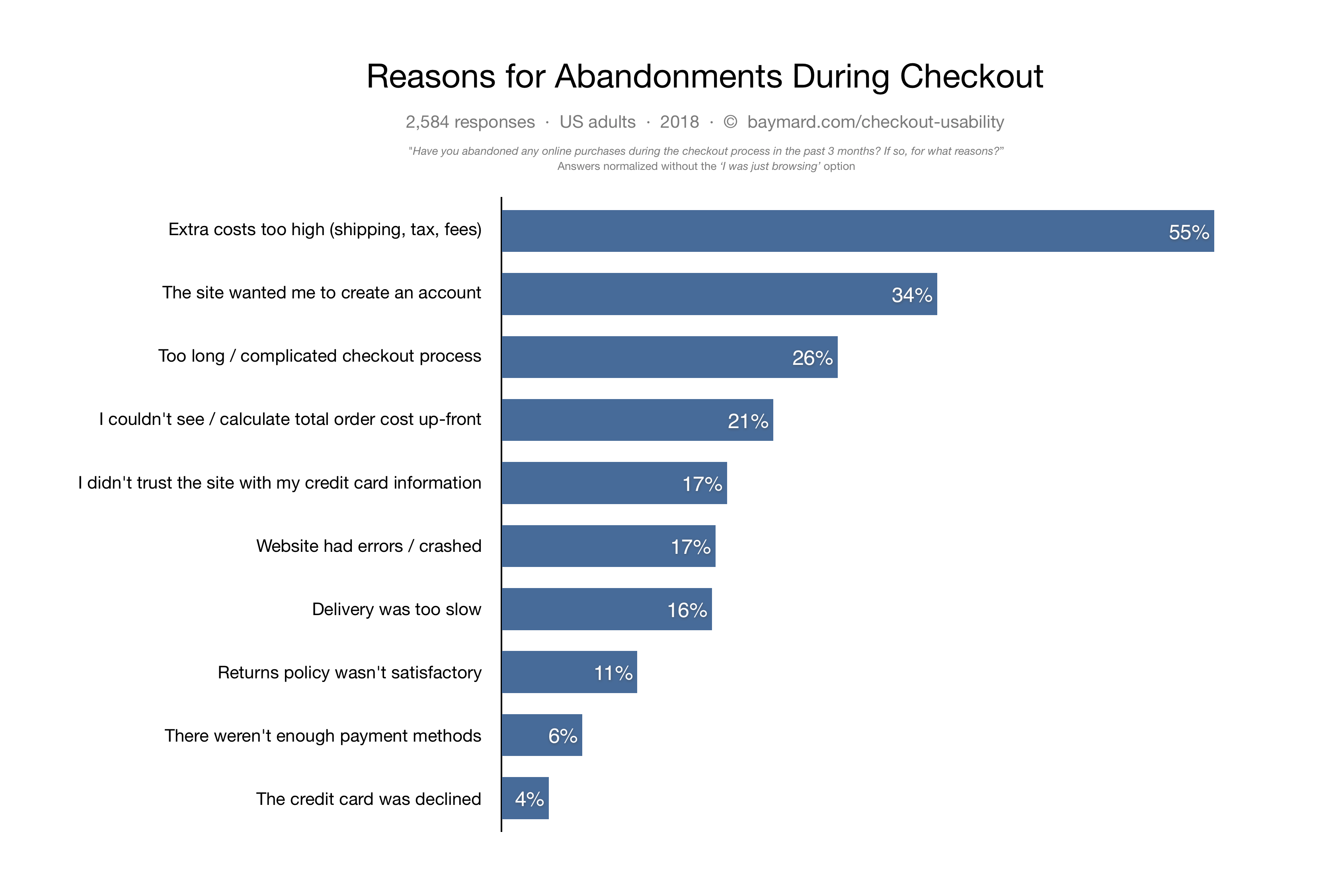
- Use cart abandonment tools to recover purchases that customers did not complete. In some cases, the customer got distracted and simply forgot, and will be happy to come back and finish their purchase. In other cases, you can use the customer's reason for abandonment to help identify and improve a problem with your store, cutting down abandonment in the future.
- Hold promotional events, like storewide discounts, limited-time group deals, daily countdown deals, and more. There's no such thing as a customer that doesn't love a bargain, and the additional time limit will create a sense of urgency that spurs customers to buy.
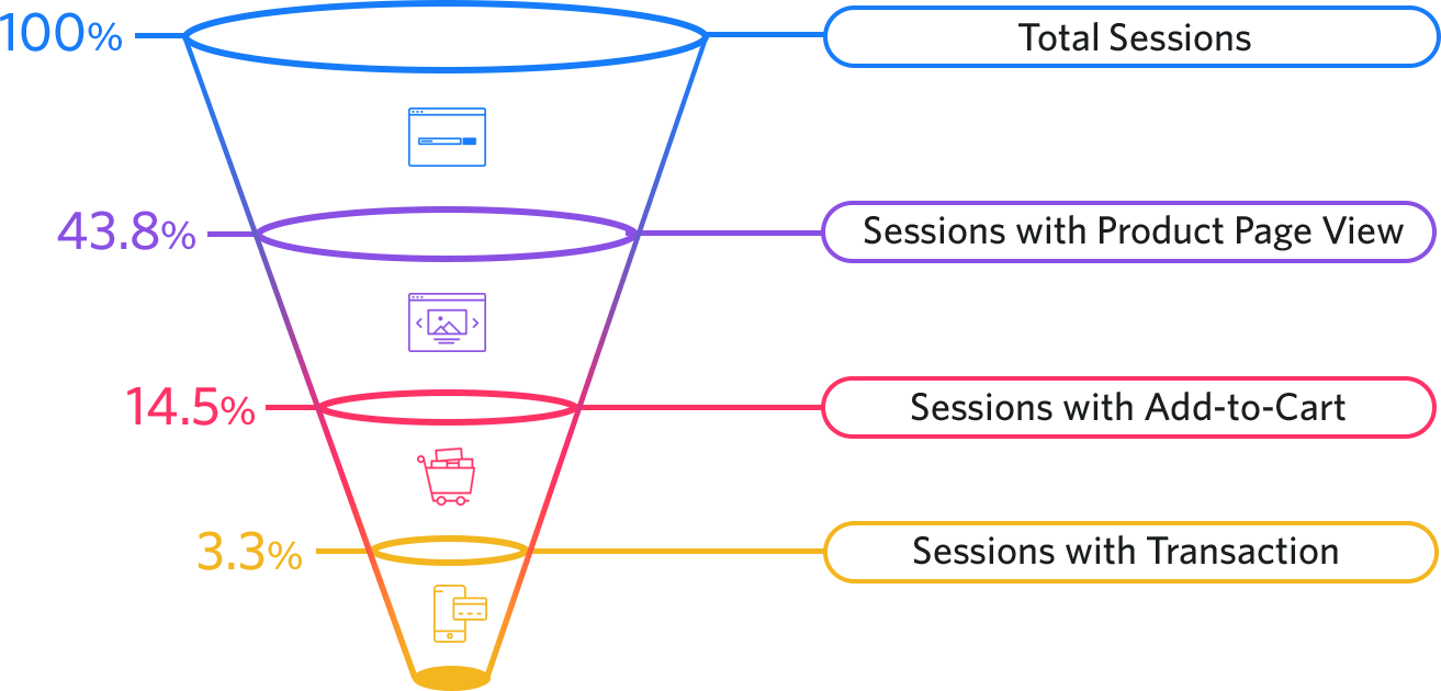
eCommerce Conversion Funnel:
• Post-Purchase Treatment
Too many online store owners ship out an order and think that's the end of the customer's journey. Instead, it should be the beginning of a long and fruitful relationship! You want to improve customer retention as much as possible, because it's more expensive to gain new customers than to keep existing ones.
The way you treat customers after their purchase can determine whether or not they come back. It's crucial to have a means of getting in touch with them so you can provide post-purchase care. In eCommerce, you're almost certain to have their email address — you needed it to send them their order confirmation, after all — so that's where you can start.
Send an email to request a product review for the item they bought after enough time has passed for them to use it and form an opinion. This will encourage them to provide you with valuable feedback, as well as entice them back to your website. If you include a coupon, they're even more likely to return, especially if it applies to a product related to their purchase or even an item on their wish list.
If the customer has opted in to your email newsletters, even better. They'll be reminded on a regular basis about your business. If you have a few customers who made an order long ago and haven't bought anything since, but have remained subscribed, create a special email marketing segment so you can send targeted offers to this group and potentially win them back.
Sometimes, customers will be the ones initiating contact — perhaps to ask for help with their purchase, or maybe even to make a return. This is a great opportunity to show them just how much you care and are willing to help. Provide the customer service they need, whether it's through a quick support email or an easy returns process. Customers who have never had a problem with your business are great, but the ones who have had a problem can be even better: if you solve that problem to their satisfaction, they'll never forget it.
How to Build a Website that Gets It Right
Understanding everything we discussed in this article is one thing. Putting it into practice is another. With such high standards for web design, you may feel that a perfect online store is out of your reach. Not everyone is a developer or designer, and many new businesses can't afford to hire one, either. So where does that leave you?
This dilemma is why website builders were invented. Today, anyone can build a website that looks great, runs fast, and has all the features you need to run a successful business. For an online store, the best option is to use an eCommerce platform, which is geared toward selling online rather than just building a regular website.
3dcart is a full-featured eCommerce platform you can use to build the perfect website for selling anything online. Every part of the software is engineered to help you create a website that meets all the standards we mentioned in this article, from aesthetics to customer interactions and beyond. If you'd like to give it a try, we invite you to enjoy a 15-day free trial with no credit card required. Technical support is also available 24/7, every day of the year, from our home office in the United States.
In Summary
A lot goes into the perfect eCommerce website, and we mean a lot. If you've made it this far, you certainly understand that by now. Fortunately, the tools you need already exist, and you'll be able to build the perfect website for your business without reinventing the wheel. With great platforms like 3dcart on the market, the perfect online store is well within your reach.


Leave a reply or comment below