


When building a website, one of the primary elements that you’re going to have to take into consideration is website navigation. This will be a huge factor in your site’s user experience (UX). This is essentially the way that your customers are going to be experiencing your website, using subtle cues to make their visit more enjoyable and profitable to you. This includes various elements that will guide your customer on their buying journey, such as optimized navigation designs, search bars, and menus.
Why Navigation is Important for eCommerce
Naturally, your website navigation will be integral to so much more than just letting your customer find and purchase their items. It allows them to clearly access and understand promotions and various offers that may be available on your website. Well done website navigation will also help ensure that the customers you want find your store, as these elements can and will be a huge boon to your SEO.
While there is no one correct way to create an online store, there is a reason that certain methodologies have become exceedingly common in website design throughout the years. By understanding certain basics of human psychology, such as what keeps us on a website and likely to make us come back, we can improve any eCommerce shop’s navigation experience in no time. To start, here is a comprehensive guide to 10 types of navigation to use on your eCommerce website, and how they can benefit you in the long term.
10 Types of Navigation to Use on Your eCommerce Website
1. Sticky Navigation
Source: contentsquare.com
One of the most important aspects of UI design that you’re going to have to take into consideration is navigation. Remember, user navigation is going to heavily influence how your user sees your site, their overall experience on it, and the amount of time they spend looking at certain things. Within recent years, elements known as sticky menus have been known to be one of the best ways to assist your user through their navigation journey.
“Sticky” menus are elements that float at the top of your webpage as the user scrolls down. By having an easily accessible menu that can take a user to the most important parts of the site constantly in view, you dramatically reduce user friction and allow for a more intuitive, logical, and seamless experience. If you need further proof on the efficacy of sticky navigation, check out this study that concludes that these types of menus are 22% faster to navigate than static ones.
Before you proceed, a word of caution: if you do decide to implement sticky navigation on your site, remember that it’s important to make the element minimally intrusive. No one wants a large block of menu following them around and obstructing their view.
2. Mega Menus
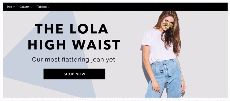
As much as designers want their pages to be ultra-clean and minimalist, the simple fact is that a basic drop down menu just isn’t enough sometimes. That’s where mega menus come in.
This particular type of menu is simply a way to give your user a variety of options when investigating a menu tab.
This gives the visitor a visually pleasing, easy-to-read space to investigate all of the options that logically follow the menu they just came from. When done well, mega menus should reduce nesting, and may even give you the option to visually show off your products before your shopper even arrives at the product page.
With Shift4Shop’s mega menu builder app, implementing this kind of UI feature onto your online store is easier than ever.
3. Faceted Navigation
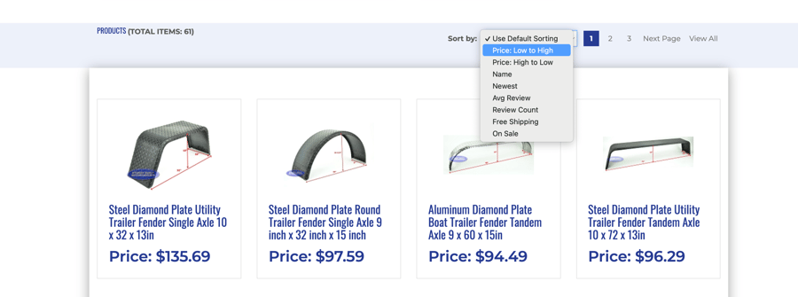
Source: Sturdy Built Trailer Parts
Faceted navigation is the practice of implementing features that help refine search results for the user, such as filters. Your user can narrow down their search from a variety of specific attributes, such as price, color, size, newness, and availability.
This helps your customer to better understand what’s in your inventory as they explore it on their terms. By doing this, you give your customers the agency to personalize their shopping trip without any additional friction or restrictions that may slow them down. This allows them to find what they need easily and quickly, which not only boosts conversions, but also makes your visitor more likely to come back.
An additional way you can increase conversions in your eCommerce site with faceted navigation is by utilizing site search merchandising. This is essentially promoting certain products on specific search results. This helps to further customize your visitor’s shopping experience and give your high-intent customers more of what they want.
4. Non-Linear Navigation
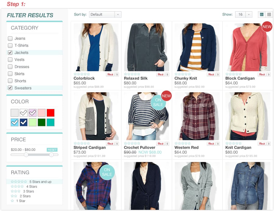
While linear navigation has its uses and can be a helpful tool to your customer’s shopping experience, it often neglects your customer’s personal needs. It also often creates a complicated process with lots of exploring into different menus. This is especially true if your shop is on the larger side. That’s where non-linear navigation comes into play.
Non-linear navigation is the practice of putting the power of your customer’s search in their hands. Instead of making them hunt for a specific item through a bramble of nested menus and categories, you allow them to select multiple categories that filter out products. This is commonly done through several smaller menus that allow you to specify certain attributes, such as the specific color, item type, or size your customer wants.
5. Advanced Search Bar
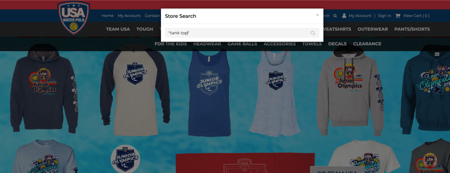
Source: Water Marque Sports
Advanced site search is a built-in feature of site search bars that allows the user to specify additional parameters to the search. This can include the user providing specific operators in the search (like “and,” “or,” etc.) to include search results that include either word.
While properly using advanced search does require a bit of know-how due to the fact that there aren’t any obvious instructions on your website, it can be an incredibly powerful tool for getting exactly what you want. Any user that needs it will be grateful to have it and will be less likely to give up the search.
Fortunately, Shift4Shop integrates with a variety of site search solutions like SearchSpring that can be used to implement advanced search on your website.
6. Categories for Sales and Discounts
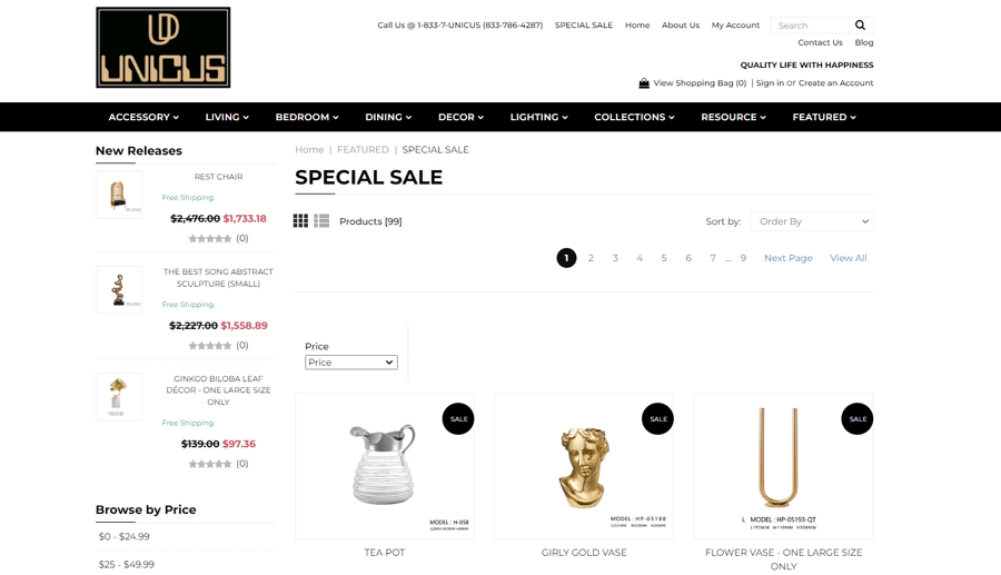
Source: UNICUS
When creating an eCommerce shop, you are going to want to specify categories that your customers can easily find for promotional sales and discounts. Perhaps you’re running a one-day flash sale for your shop. Or perhaps you want all of your clearance items to be available on one page.
If you are running a special sale and have spent the time to advertise it, chances are many customers are going to be flocking to your site for the items that are specifically being promoted. You want to make their experience as seamless as possible by putting your discounted items on a clearly marked page. As you can imagine, this is a lot better than forcing them to rummage through a bunch of irrelevant categories.
With Shift4Shop, there’s no limit to the number of categories you can specify in your website navigation. The built-in SmartCategories feature also allows you to automatically create categories for Best Sellers, Sales, and more.
7. Hover Animations
Source: freefrontend.com
By attaching a “hover” animation to a link or image, you can help emphasize an important part of that element, or even help clarify what that component is trying to describe. For instance, you can show off a product by creating a zoom effect when a user’s mouse hovers over an image. If you want to clarify that your user is going to a page about sweets and candies rather than cakes, you can attach an image of candies to that hover event.
With a little bit of imagination, the possibilities of hover animations are endless. No matter what you sell, we are sure that you can find a way to utilize this tool to make your site more accessible and engaging.
8. Vertical Navigation

Vertical navigation bars (sometimes called side menu bars) are a useful way to organize and display a menu. Instead of having your entire menu situated at the top, your links are organized and displayed on the side of the page. This may be useful if you have a lot of menu options and categories that you want immediately available to your user.
By opting for this style of navigation, you will also have room for small elements that will help your user. This includes margins and icons, which can improve the layout and appearance of your pages.
9. Search Suggestions
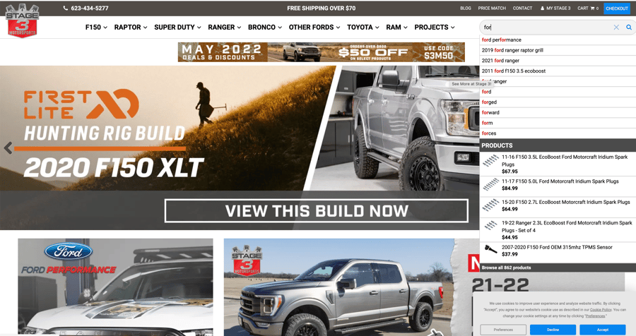
Source: Stage 3 Motorsports
Every site visitor wants their search to be as quick and seamless as possible. By implementing a powerful search suggestion tool on your website, you can help accomplish this. This kind of feature is not only useful when your customer may have misspelled something, but also when they might not have found the item they want.
This can also help some motivated users find and purchase items that they may have been seeking out already that were related to what was already being searched for. This will help save them one (or possibly several) additional searches.
10. Responsive Design
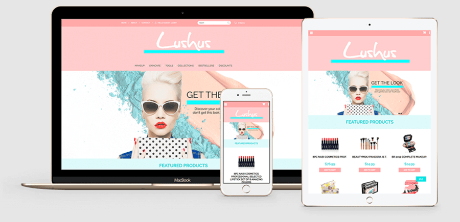
It’s no exaggeration to say that responsive design has become one of the most pervasive and important UX/UI concepts in recent years. People may check the same site on several different devices on the same day — they should have a seamless experience on all of them.
The days of creating separate sites for mobile and unconventionally sized devices are long gone. It is now important to develop a site that takes a responsive-first approach. That’s why Shift4Shop offers hundreds of responsive themes to ensure optimal experiences across all devices.
Tip: To see if your website is responsive, try playing around with the size of the browser window and see if your various elements adjust to fit the page.
Final Thoughts
Regardless of what you sell on your eCommerce site, navigation is an incredibly important part of your user’s experience. It can also help to increase your overall conversions and keep your customers coming back. In fact, according to this study by Invespcro, improving site navigation increased conversions by more than 18%. Best practices work.
While trying to modify navigation throughout your site can be a difficult and time consuming investment, it is well worth it in the end. Just remember some basic UX principles, and before you know it, your customers will have a much better time on your website — and the increase in sales will show it.
If you are hesitant to give your website a major redesign based on your navigation, fear not. Simply try slowly introducing a few different tools at a time. This will help you to gauge the performance of what you’re doing and will be easier for your customers to adjust to in the long run.


Leave a reply or comment below